a case study: ava & oliver
8/5/26
recent work
a case study: ava & oliver
if your customers only know you because they searched “baby bib” on amazon, you’ve got a branding problem. see how we revamped ava & oliver to make a bigger direct-to-consumer impact.
Ava & Oliver founder Emma didn’t set out to create the next big baby brand. It just kind of happened.
While dreaming about starting a family, Emma found herself in a season where she was buying baby gifts practically every weekend. She was always on the lookout for something special, but everything on the market felt like it was falling flat. Where were the baby goods that were safe, practical, AND stylish? It was one extreme or the other: practical but boring, or cute without much thought behind it.
So she did what any entrepreneur would do. She started making things herself.
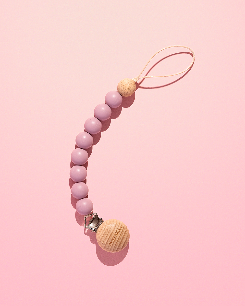
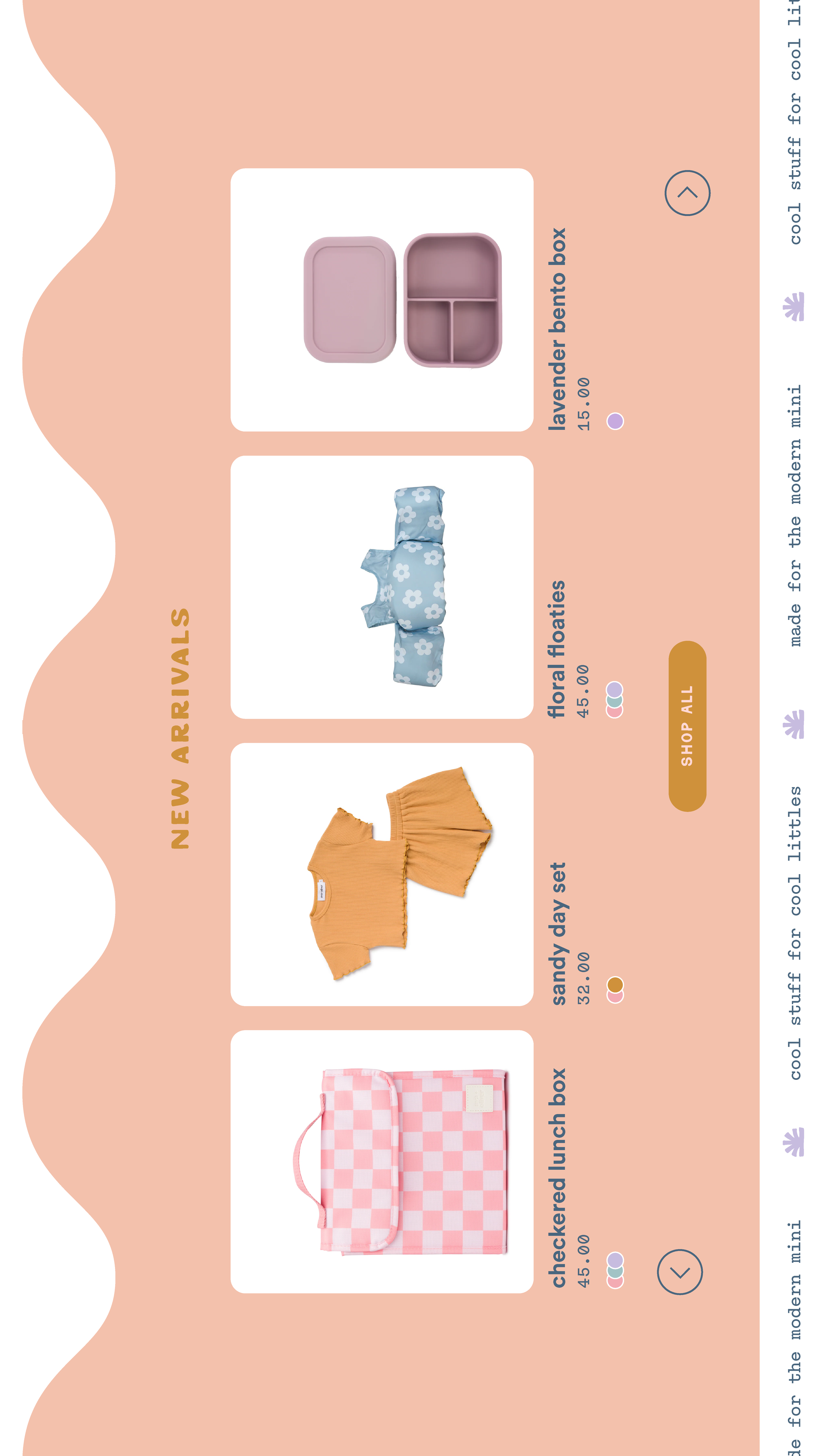
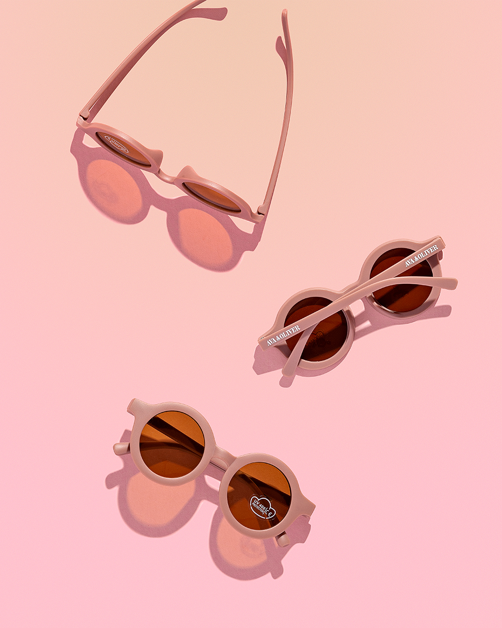
Fast forward to today, and Ava & Oliver has grown into a collection of thoughtfully designed baby and toddler essentials that make the everyday feel a little more fun. Think colorful bento boxes, mealtime must-haves, and products that are just as cute as they are functional.
The struggle
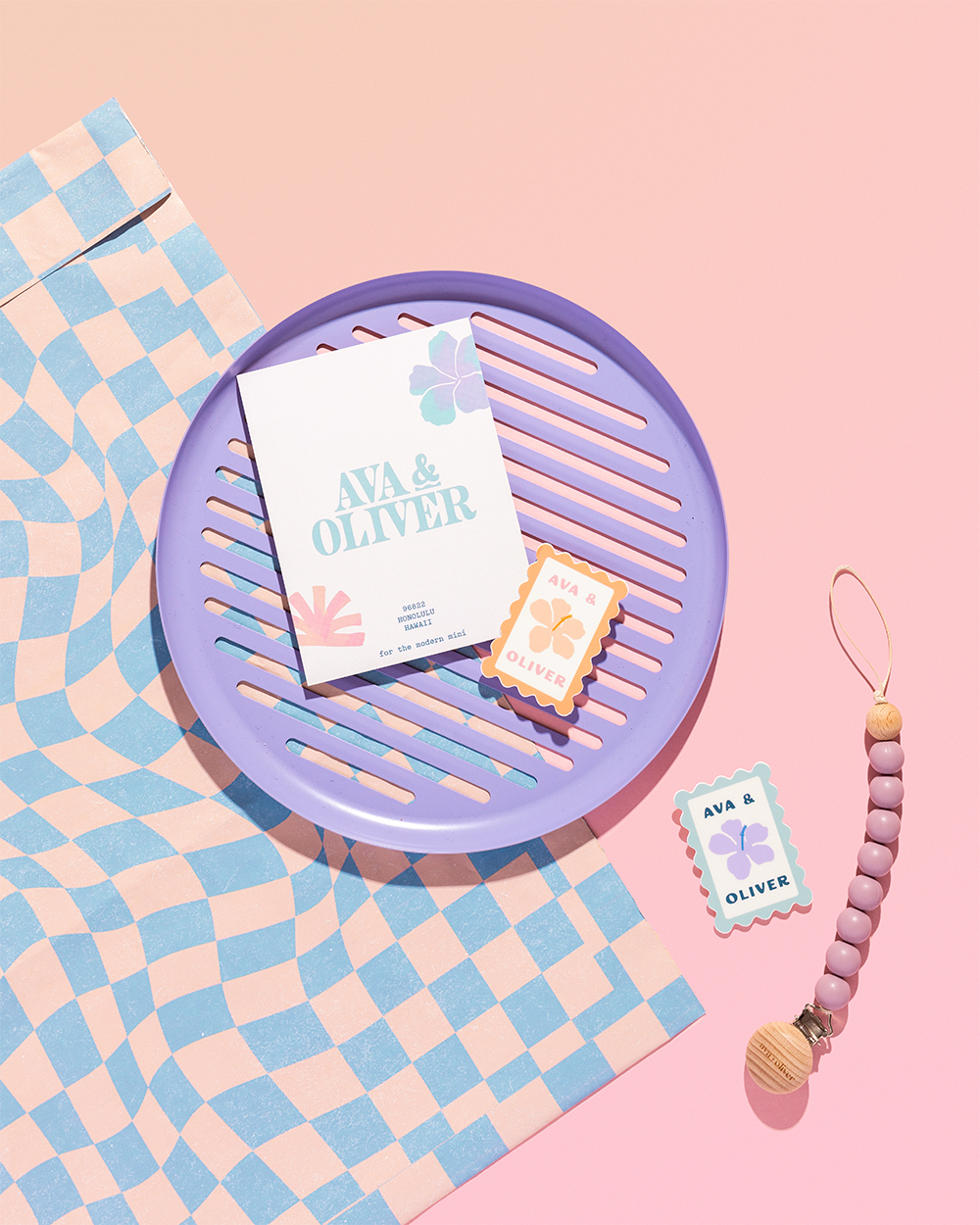
Here’s the thing. The business wasn't struggling. In fact, it was doing really pretty well. BUT the challenge came in how it was growing. Nearly 75% of Ava & Oliver’s sales were coming from Amazon. And while that’s an incredible place to start and build momentum, it’s nearly impossible to build a memorable brand and retain loyal customers. You’re constantly surrounded by cheaper alternatives, endless lookalikes, and customers making a split-second decision based on price alone.
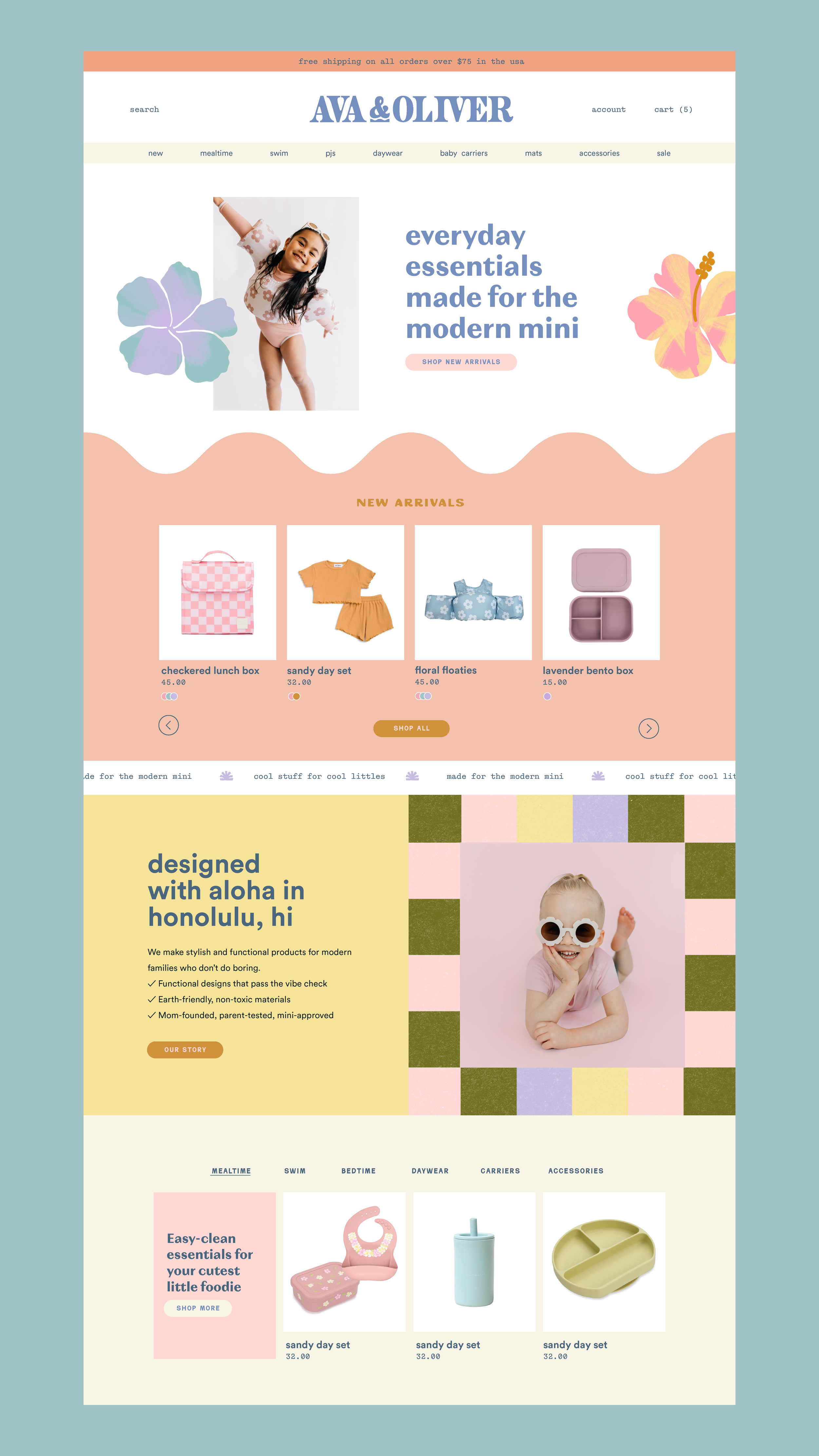
Emma knew Ava & Oliver had so much more to offer than that. She was ready to invest in a revamped direct-to-consumer experience, starting with a rebrand and website overhaul. She also wanted to focus on expanding the brand into new product categories like carriers, wraps, and apparel. All while becoming known for thoughtfully designed collections instead of competing in the race to the bottom. Ava & Oliver products already had personality. The branding and website experience just needed to pull its weight.
The goal
We wanted the branding to feel like the products themselves: playful, modern, colorful, and a little adventurous. More importantly, we wanted Ava & Oliver to feel like a brand parents sought out — not just another product they happened to toss into their Amazon cart.
The goal was to build a flexible brand system that would grow with the business as new products launched, collections expanded, and the direct-to-consumer side of the business became a bigger focus.
The solution
One thing I kept coming back to during the strategy phase was Hawaii.
Not because I wanted to create another tropical brand just for the sake of creating, but because Hawaii lives at the heart of Ava & Oliver. There’s something about growing up surrounded by sunshine, beaches, and adventure that feels naturally playful. I wanted to bottle up that feeling.
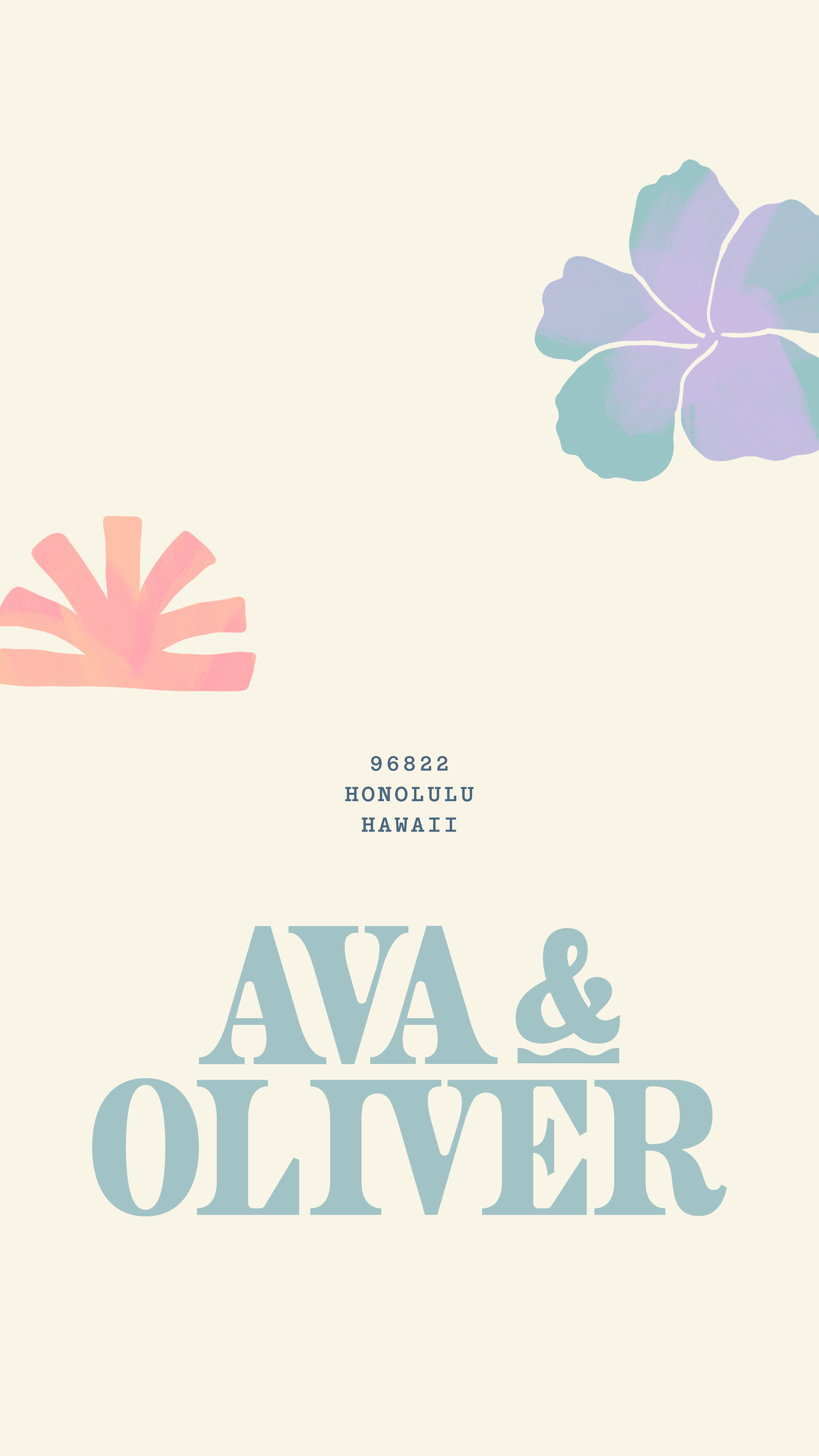
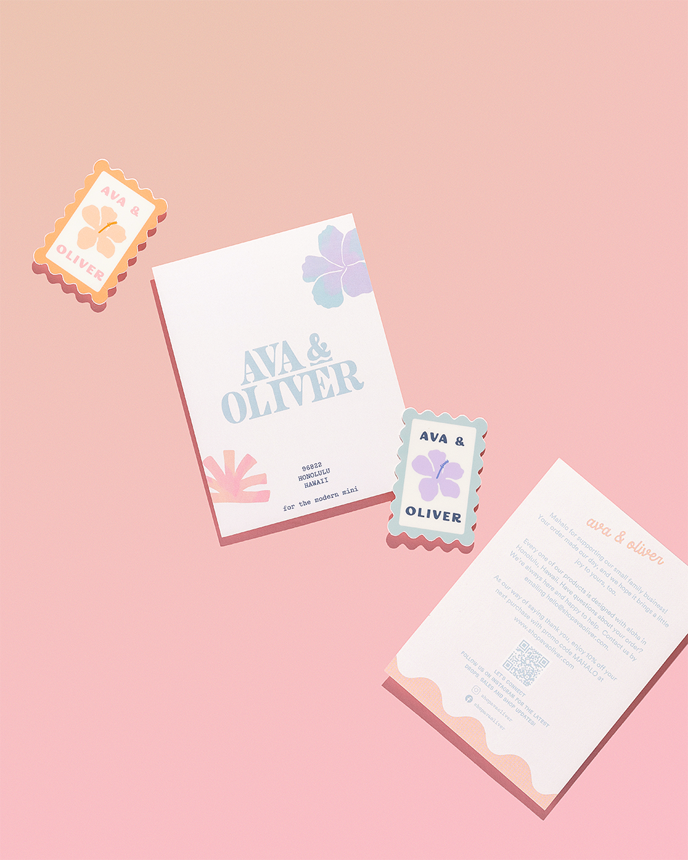
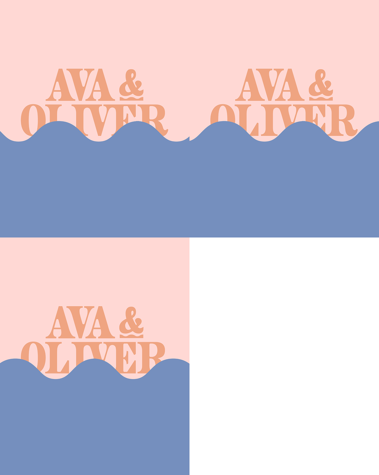
So I dug into the primary logo. Playing with typography that felt elevated enough for a growing brand but still approachable enough for parents buying everyday essentials. A whimsical serif became the foundation, while a sans serif and script added warmth and personality without stealing the show.
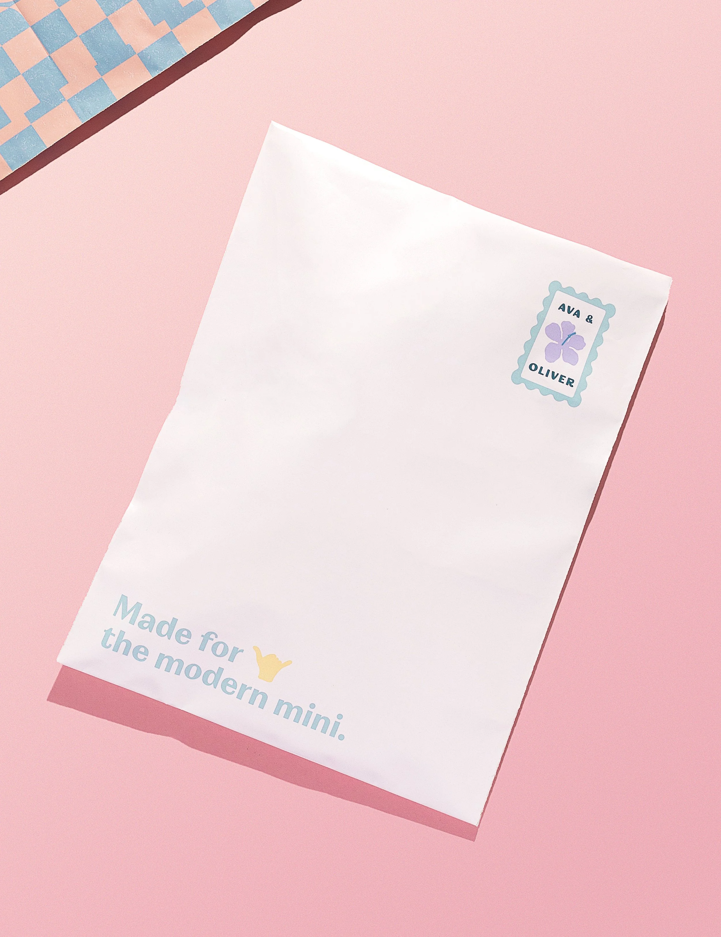
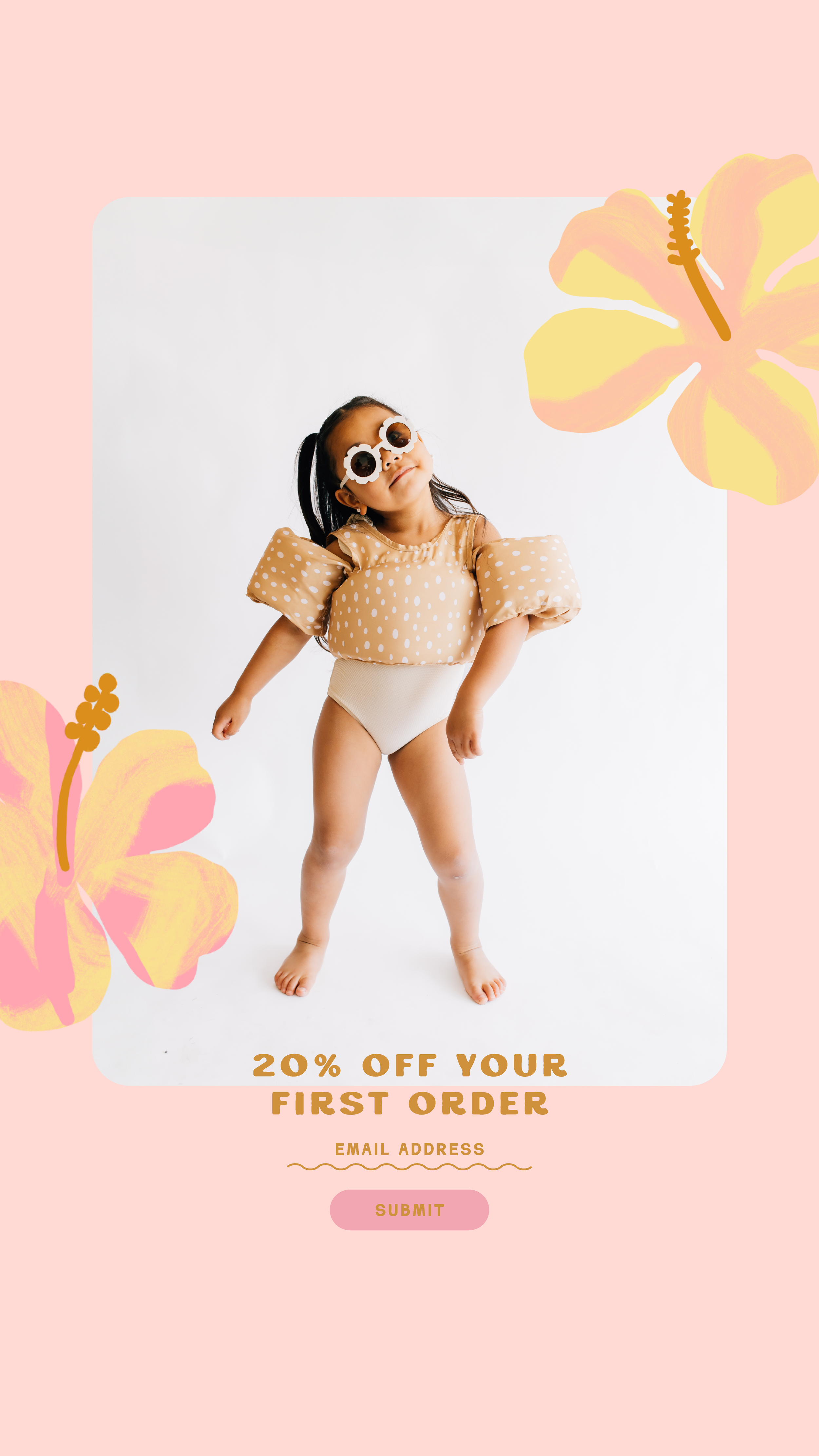
Then came one of my favorite parts of the project: the illustrations. Since Hawaiian florals already play such a big role throughout Ava & Oliver’s product line, it made sense to build from there. We paired those with hand-drawn palm leaves, surf-inspired details, and other organic elements that added so much personality. The result feels fun enough for littles while still feeling elevated and trustworthy for parents.
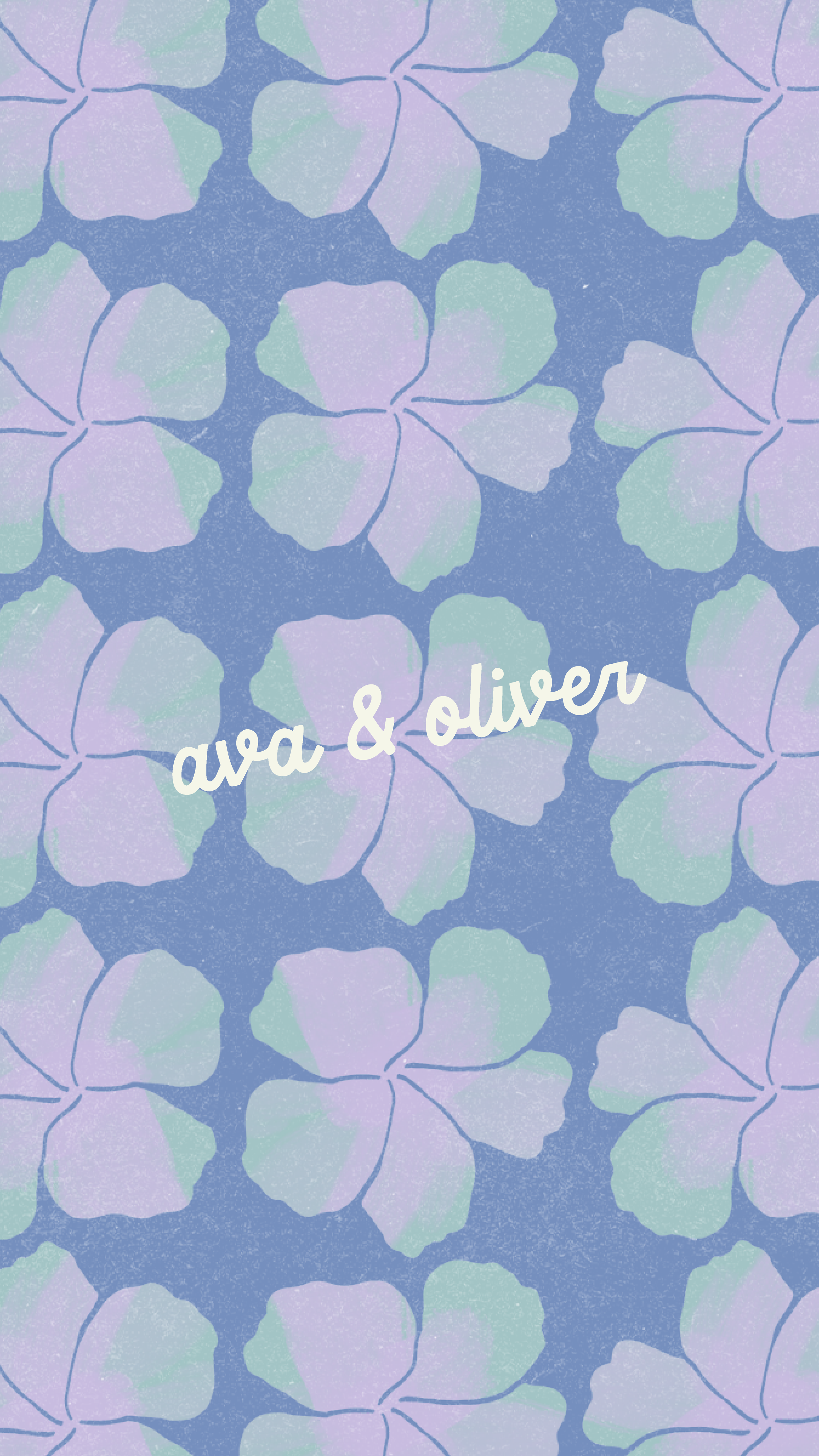
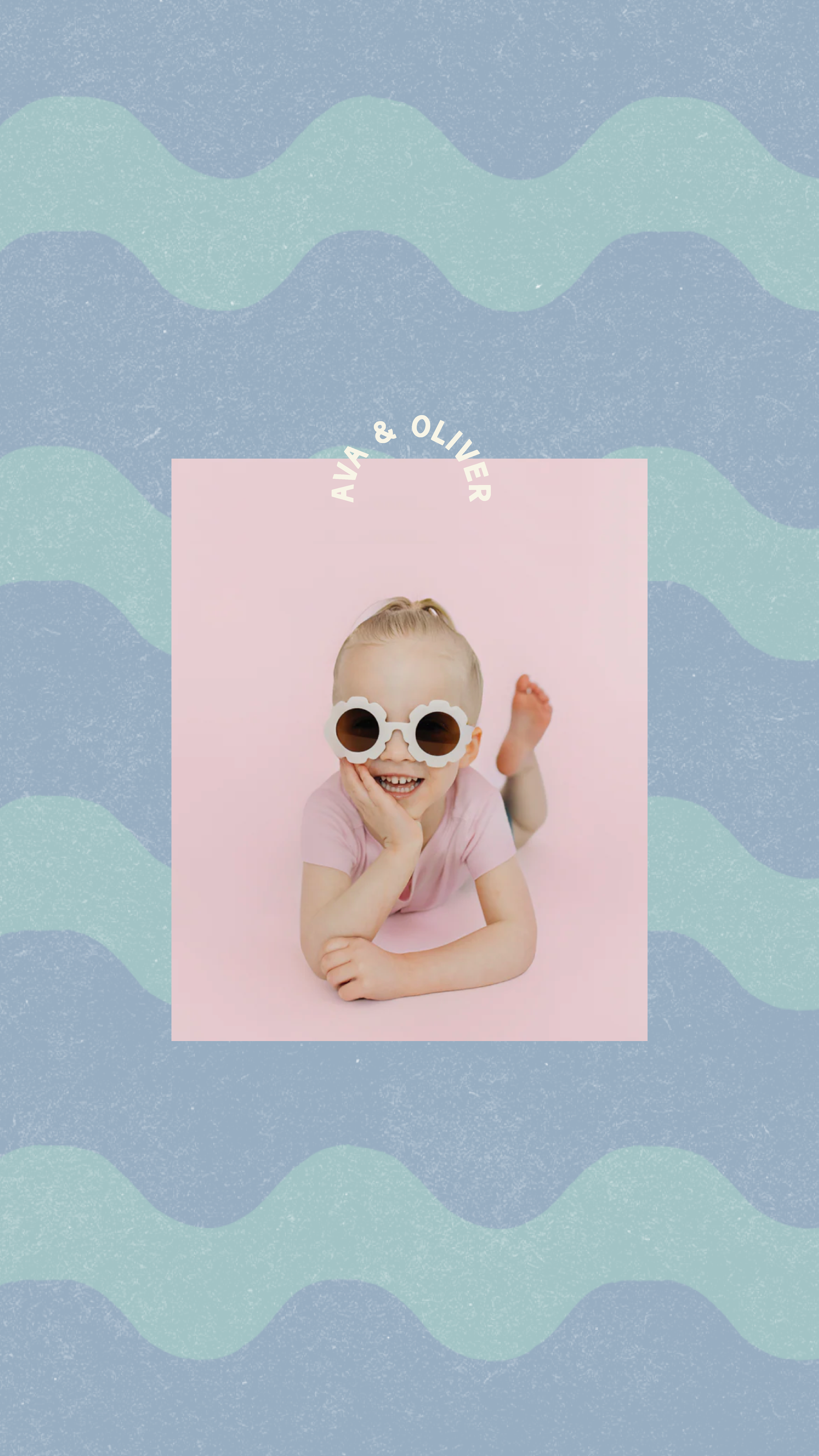
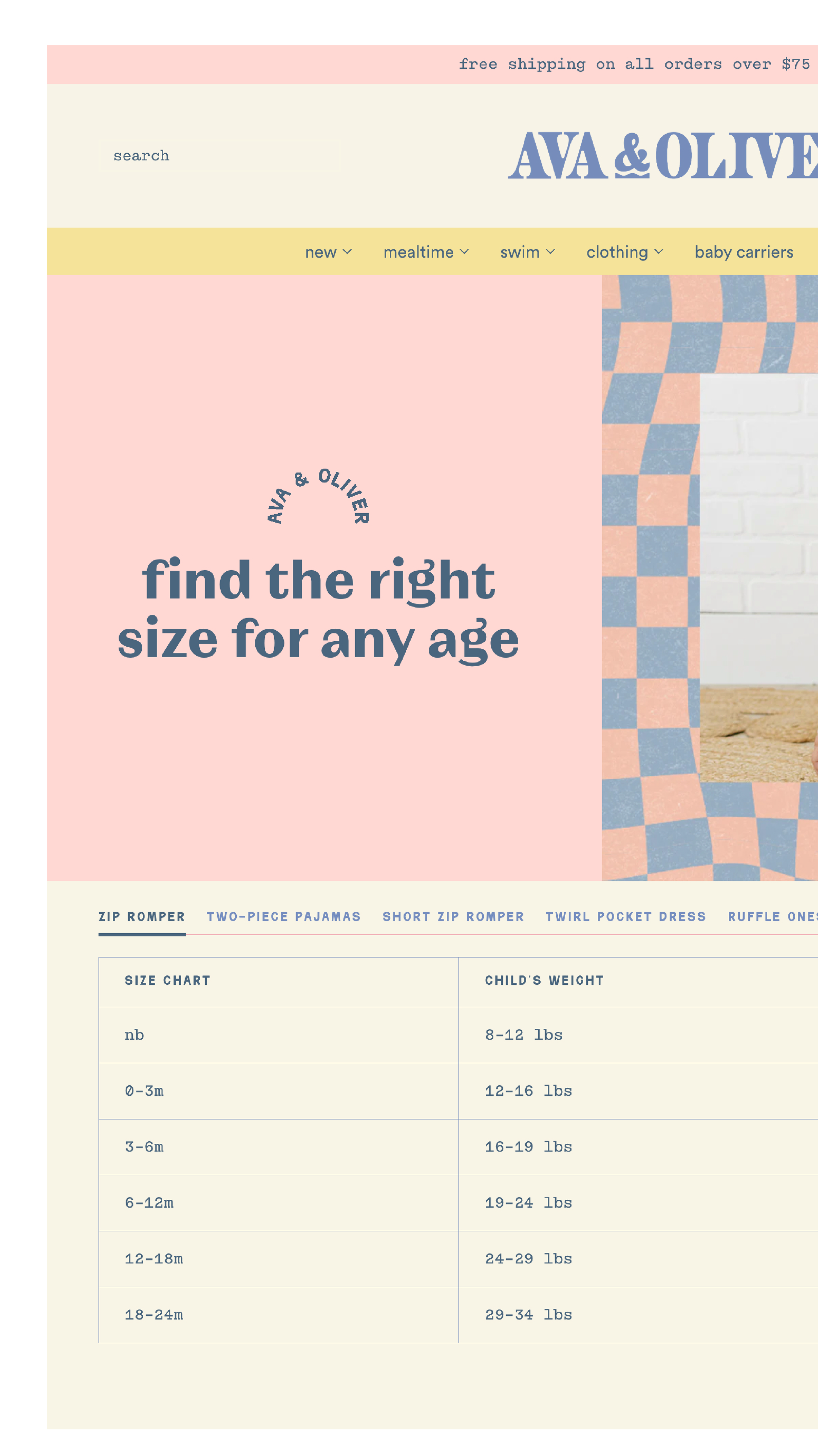
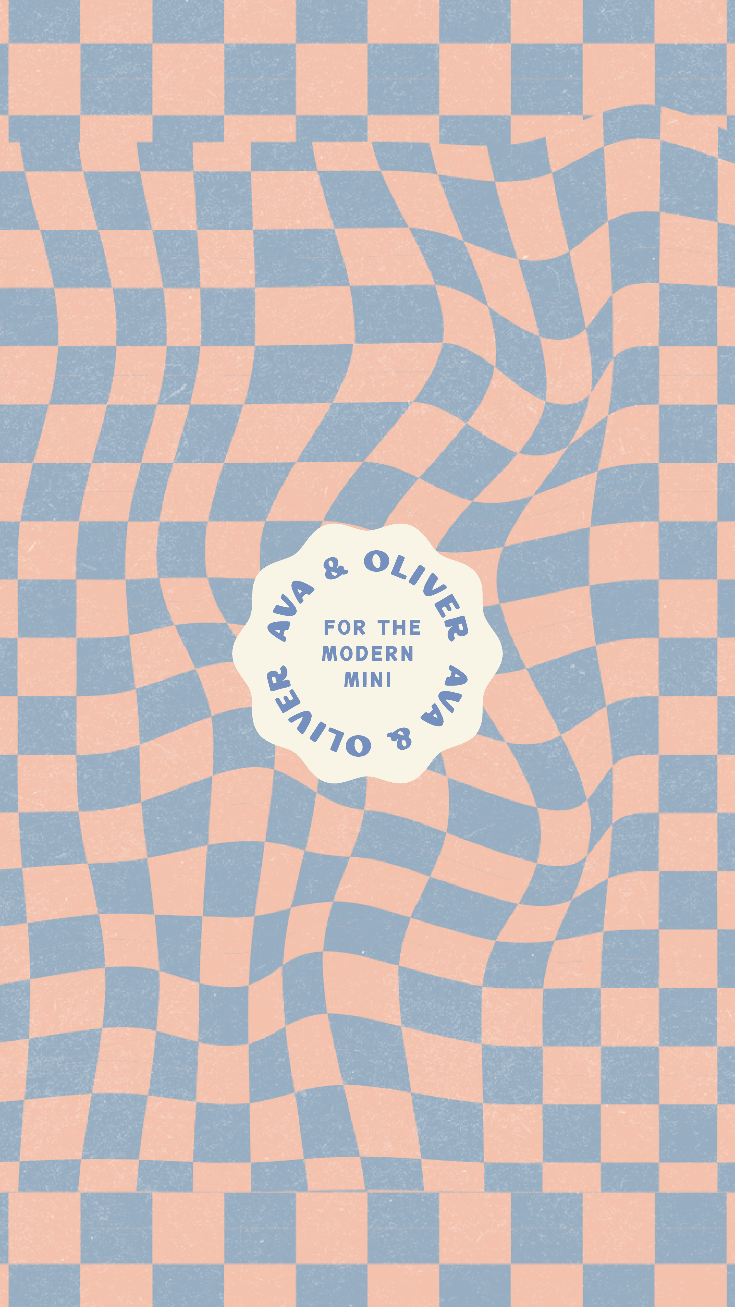
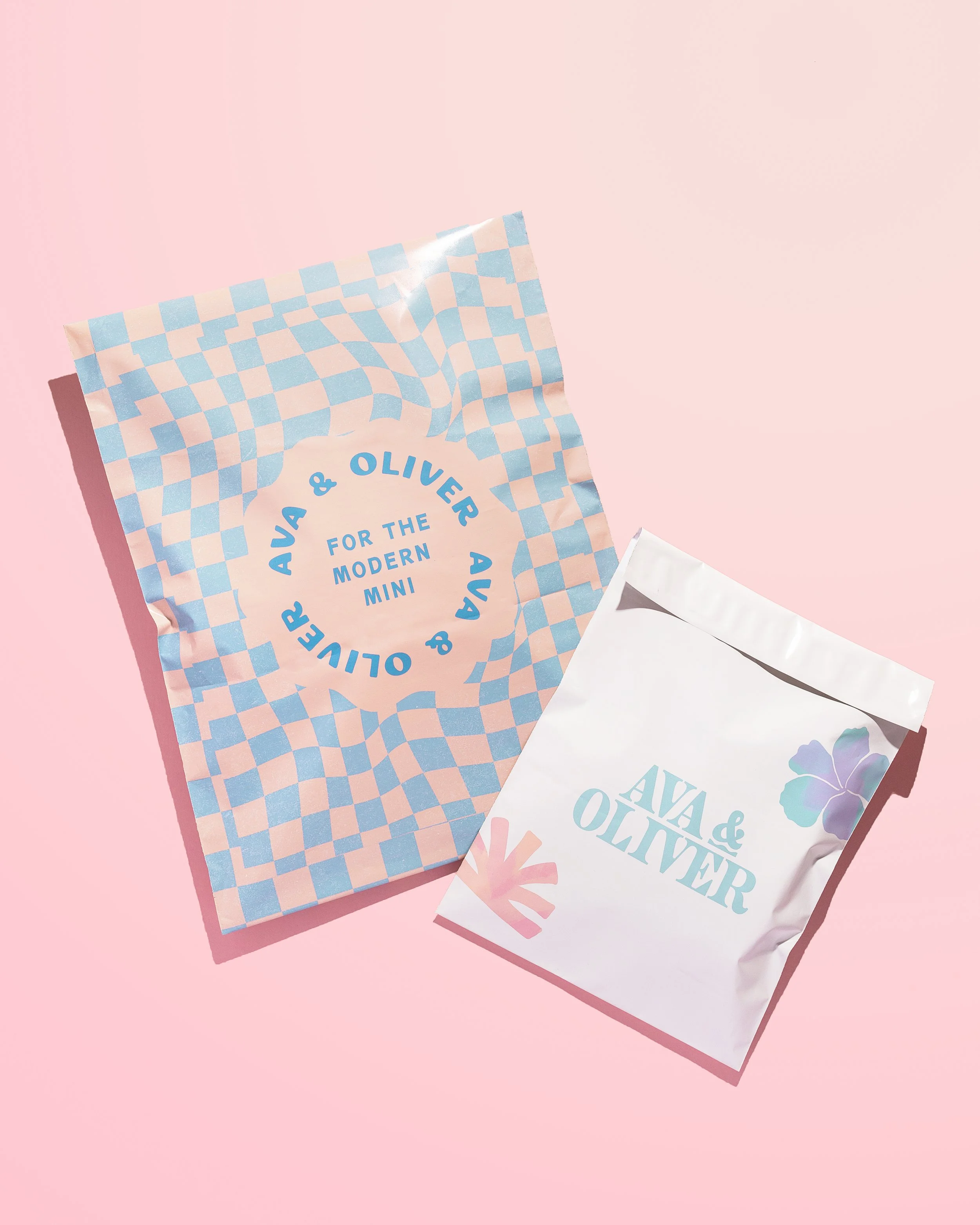
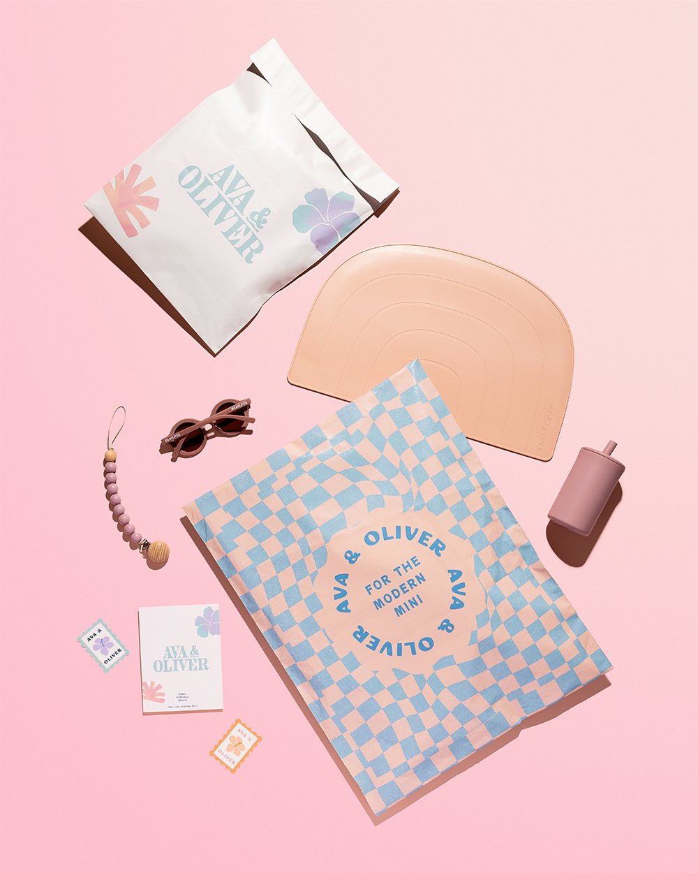
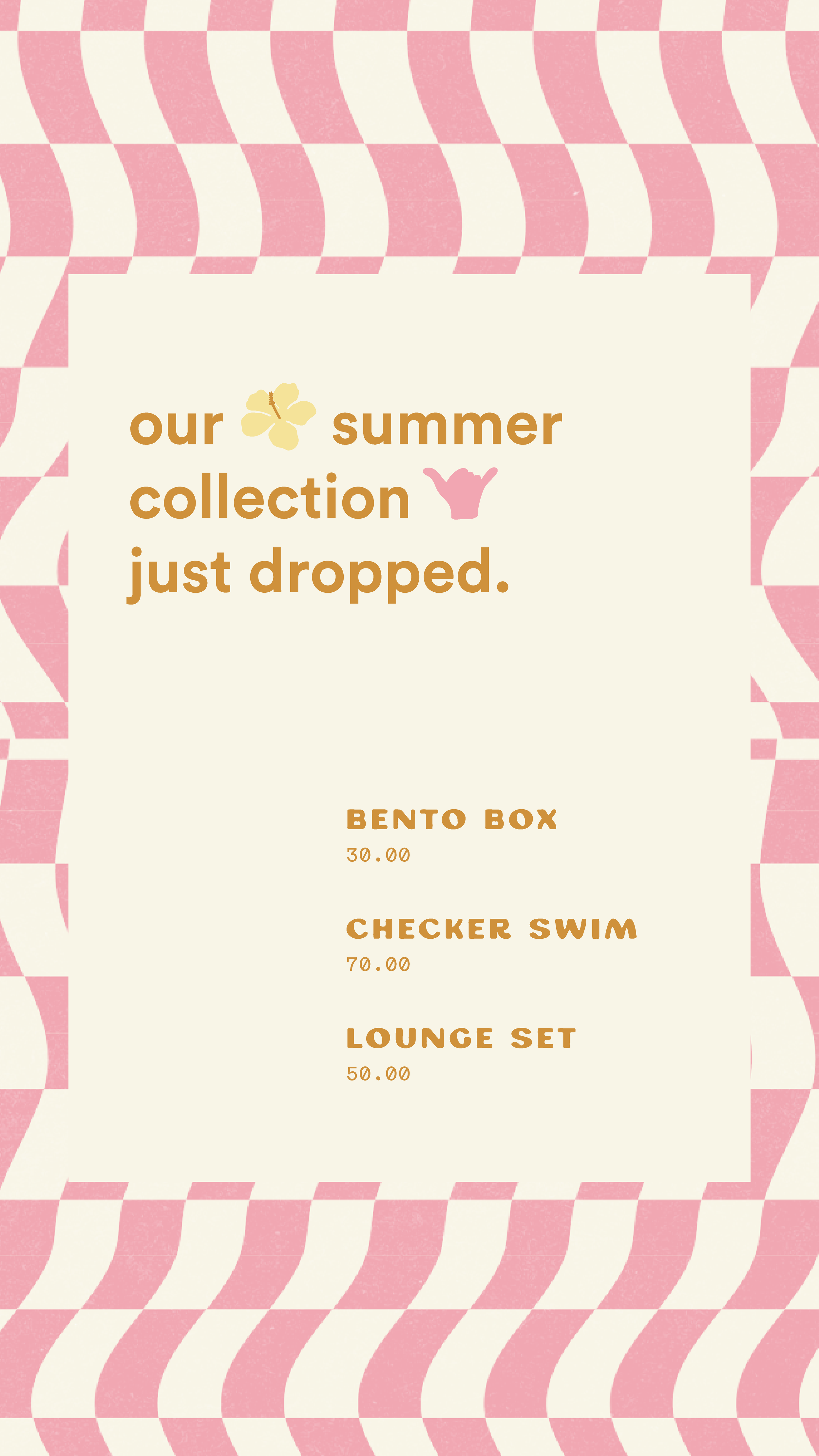
From there, we turned some of those illustrations into custom patterns. We furthered the brand with additional patterns inspired by waves, checkers, and other cheerful motifs to give the brand flexibility across packaging, social media, marketing materials, and future product launches.
To further the brand’s joyful feel, we created a color palette that complemented the products themselves. Sunny yellow, peaches, playful pinks, a fresh green, and ocean blues all work together to create a brand that’s bright without feeling too loud, one that feels modern without chasing trends, and is, of course, flexible enough to work season after season.
The end result is a brand that finally feels as fun, thoughtful, and full of personality as the products Emma has been creating all along — and one that’s built to grow far beyond the Amazon marketplace.
The results