
the fastest way to ruin your website
2/25/26
web design
the fastest way to ruin your website
three seemingly harmless moves that are killing your website design
PSA from your designer friend. Tiny updates may seem harmless in the moment. A quick font swap, a new image dropped in, a last-minute “this should be fine” tweak. But spoiler, these are often the fastest way to mess with a good site design. Individually, they might not feel like a big deal, but collectively? They add up fast. Suddenly, your site feels inconsistent, clunky, and just off. If your website isn’t converting like it used to, feels visually chaotic, or just doesn’t hit the same anymore, chances are it’s not one big mistake; it’s a handful of small ones.
So, Bri, how do I avoid that!? I’m SO glad you asked. Here are the fastest ways we see business owners accidentally sabotage a good site design and how to avoid doing the same.
Ignoring your brand guidelines.
This is like branding 101, and it miiiiiight seem like a no-brainer, but let me just say, you’d be surprised how often this is an issue. Your brand palette and typography aren’t selected at random. There’s strategy and intention behind these choices to work with your full brand identity and stand out from your competition. When you start swapping these out willy-nilly, your site instantly feels disjointed, amateur, and untrustworthy.
WE GET IT. You love the holidays and want to update things accordingly, but when you tweak your brand colors and elements, you end up with something that feels hodgepodgey and unprofessional. Instead, stick to your defined color scheme and type hierarchy (hey, we spell this out for you in your brand guidelines after all). As a general rule, if it’s not in your brand system, it doesn’t belong. Keep everything aligned: colors, fonts, icons, illustrations, the works.
Swapping images without strategy.
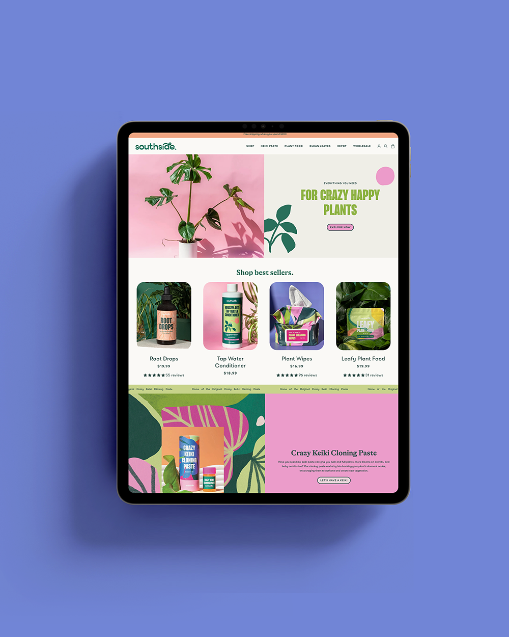
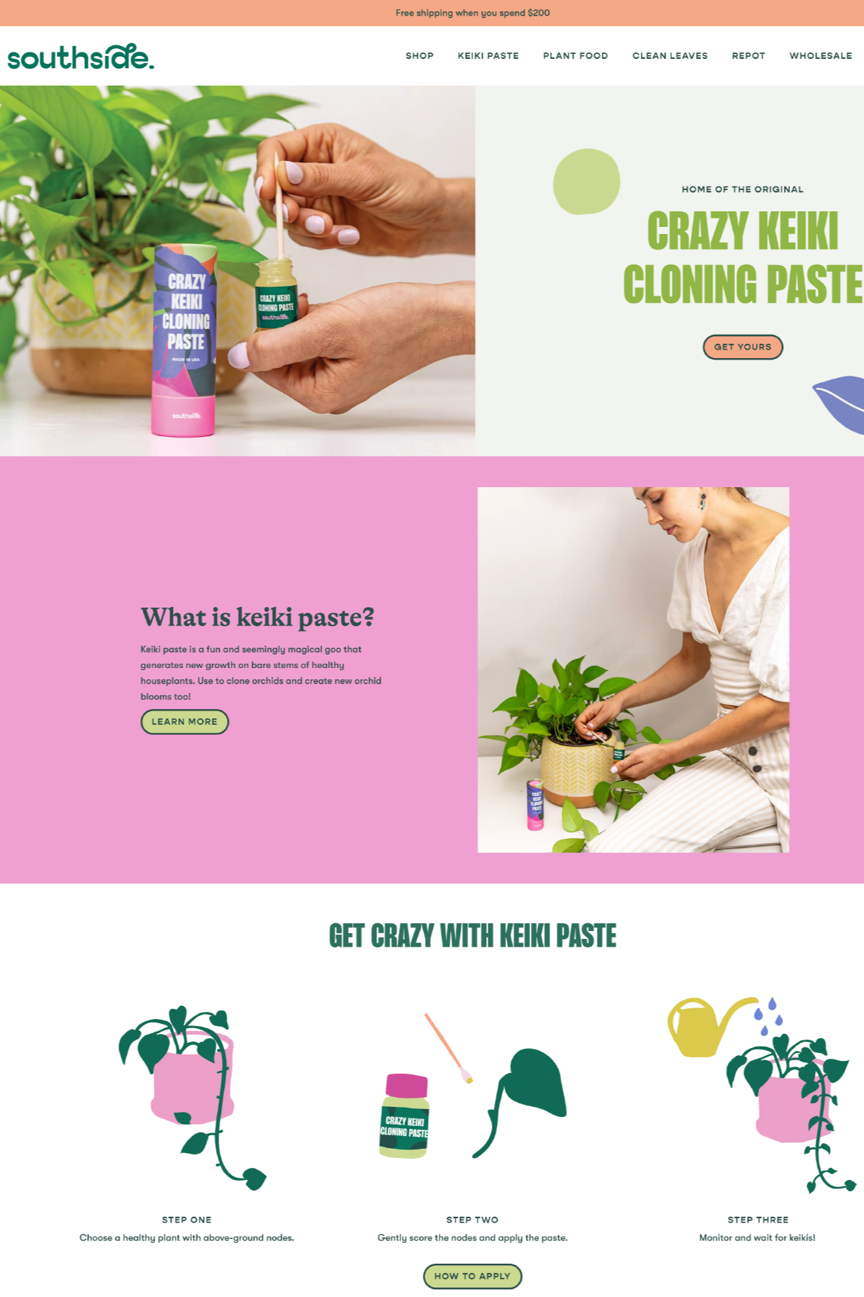
A horizontal hero image is horizontal for a reason. Slap in a vertical photo in its place, and suddenly the layout feels off, your text overlaps, mobile likely looks terrible, and the flow goes out the window. Even small image changes can throw your website off balance. Keep orientation, size, and style consistent to avoid chaos.
Templates are your friend. They’re built to give you structure, consistency, and an easy way to make updates. If we designed your website (hey, friend!), we provide image templates any time there’s something special at play, like a frame, special shape, or Shopify banner. Ignoring the templates we created in favor of ‘freestyling’ often results in weird spacing, broken layouts, and frustrated visitors. Don’t reinvent the wheel. Use templates strategically to preserve your design integrity while still keeping things fresh.
Treating photography like an afterthought.
Your website visuals do a lot of heavy lifting. Before anyone reads your copy, they’re already clocking the quality, vibe, and credibility of your brand through your images. Blurry photos, dark lighting, overly busy props, or obvious iPhone shots (yes, even shot on a Pro Max…) instantly cheapen the experience, even if the rest of your site is solid.
Good photography is intentional. Clean, well-lit images. Simple styling. Backgrounds and colors that actually support your brand instead of competing with it. A strong mix of close-ups, detail shots, and lifestyle imagery helps your audience understand what you offer and trust your offer too. If you want people to invest in your biz, your visuals should show that you’ve invested in it too. Professional imagery isn’t just a “nice-to-have,” it’s part of your brand identity.
TL;DR
Random updates ruin good websites. Ignoring your brand system, swapping images without strategy, adding off-brand extras, and cutting corners on photography all chip away at trust. Stick to your guidelines, respect the design, and treat your site like the strategic tool it is — not a Canva free-for-all.