
a case study: wander & root
8/27/25
recent work
a case study: wander & root
a mobile plant shop with major main character energy, botanical vibes for days, and branding that finally matches the magic.
Wander & Root started with a big idea (and a whole lot of plants): create a business rooted in joy, connection, and the kind of community you’d find wandering a weekend market. Founder, Amanda, traded in her corporate career for a more grounded lifestyle, literally, and hit the road with a mobile plant shop that brought plant care, education, and curiosity to Pittsburgh.
From self-serve plant stands to live workshops and DIY kits, Wander & Root was growing in every direction. While the business had a strong foundation, the brand needed some love. The visuals didn’t fully capture the quirky, warm, one-of-a-kind energy that the in-person experience offered. That’s where we came in.

The struggle
While Wander & Root had a growing customer base and a one-of-a-kind plant shopping experience, the brand identity didn’t quite reflect the charm, creativity, and joy people felt when visiting the mobile shop or attending a workshop. Without cohesive branding in place, it was difficult to consistently attract the right audience or build brand recognition.
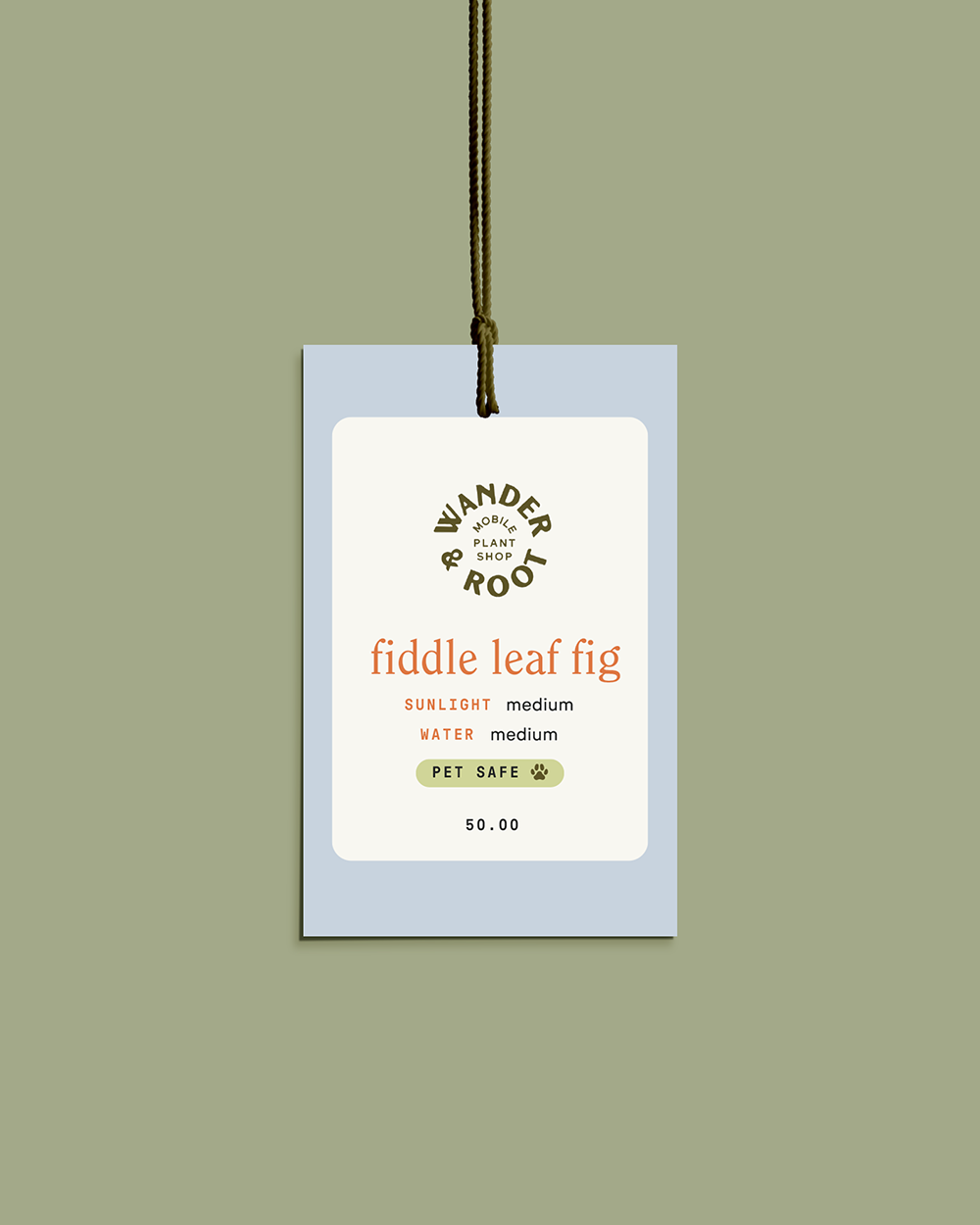
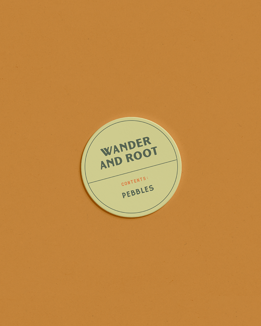
Plus, packaging and plant labeling presented a challenge. The current system was time-consuming, felt DIY, and wasn’t built to scale. With the business expanding across more markets and workshops, there was also a growing need for more visual assets than what Amanda was currently working with.
The goal
To create a cohesive, modern brand identity that feels vibrant, playful, and true to Wander & Root while also helping create packaging that would support long-term growth. Through branding, messaging, and custom collateral, we wanted to create a more consistent experience from every touchpoint.
The solution
We began by diving into the brand and forming a concrete strategy before moving into branding. At its core, Wander & Root is a mobile plant shop built on curiosity, creativity, and the belief that plant care should feel fun and accessible. With a clear direction in place, we set out to build a visual identity that felt layered and as inviting as the experience Wander & Root offers in person.
We started with a hand-drawn, modern sans-serif logo to reflect the brand’s organic, approachable personality. Then introduced a mix of playful and structured typefaces that added eclectic energy while staying grounded in legibility and versatility. We furthered the warm, inviting aesthetic of the brand by creating a custom color palette with muted, mossy greens and warm terracotta, blush, and burnt orange tones.
Custom illustrations, including a whimsical take on Amanda’s original “gypsy plant shop” tagline and a few standout plants, gave the brand flexibility and personality across packaging and marketing. Altogether, these elements brought consistency and a vibrant sense of identity to every corner of the business.