we rebranded brighten made—here’s what the team really thinks

9/17/25
business
we rebranded brighten made—here’s what the team really thinks
fonts, colors, chaos, and coffee: the Brighten Made team tells all about our rebrand
ICYMI (which, how could you…), Brighten Made got a full-on GLOW UP. And I’m freaking out. There were a few moments of chaos, plenty of second-guessing, and enough caffeine consumed to power a small city, but we made it happen.
And because Brighten Made isn’t just a team of one anymore, I polled the team to share their favorite parts, biggest challenges, and hot takes on the new look.
Meet the crew
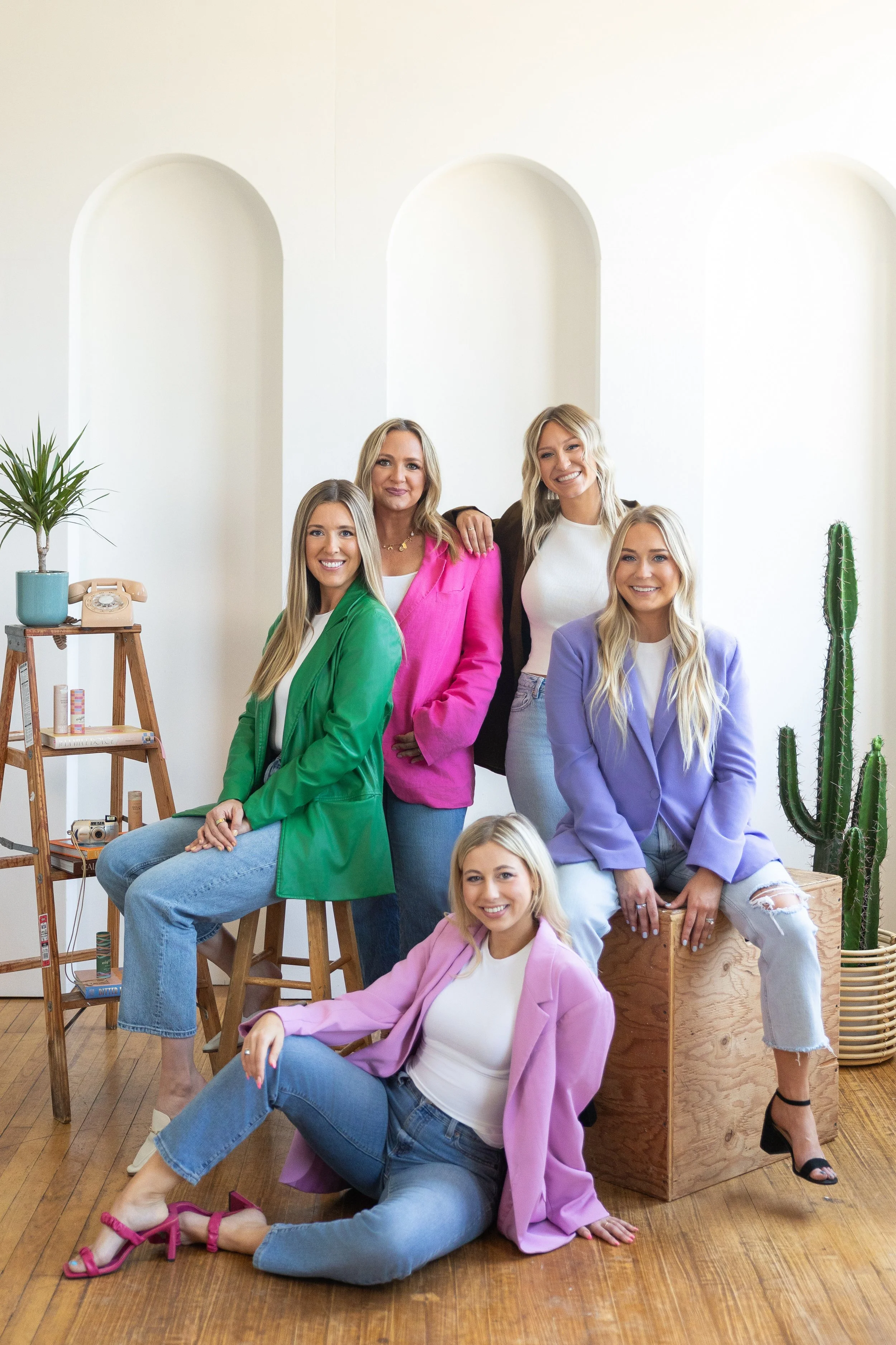
Like I said, rebranding Brighten Made wasn’t a one-woman show. Our team brought their expertise, creativity, and personality to every detail. Here’s who worked on what:
Bri (Owner & Creative Director): Hi, it’s me. I led the creative direction, designed the brand, and helped with parts of the website.
Lauren (Project Manager & Copywriter): Messaging and copy, baby! Plus, handling all the time and scheduling of the project.
Rachel (Senior Designer & Web Girly): Lead and created the new digital home of Brighten Made. Plus, brainstorming photo direction for the team shoot.
Erica (Senior Designer & Illustrator): Created the brand illustrations, supported the website design, and helped with photo direction for the team shoot.
Jayda (Junior Designer & Details Devotee): Exported allllll the brand files and helped support the website redesign.

Why we needed a glow-up
Our old branding had served us well, but it was time to evolve. The girls and I all felt the same way. The original Brighten Made vibe we loved didn’t quite match where we were at creatively anymore. The colors felt muted, the tone a little soft, and the visuals didn’t fully capture our personality or the bold energy we bring to our clients.
“We just did not connect with the old brand anymore! We’re all leaning into more color and quirkiness. It was time for a change.” — Erica
“At some point, our client work started looking brighter, bolder, more daring…our brand needed to catch up.” — Rachel
MY THOUGHTS — After I became a mom, I feel like my entire identity shifted, including my business. I found that the team and I LOVED working on really epic brands that were full of color and personality. These brands all had one thing in common: they weren’t boring. I was sick of falling into the sea of sad beige. While I still love neutrals and believe they have a place in every palette, I was no longer connecting with the disco balls and pampas grass vibes. I didn’t want Brighten Made to be known as the boho-only design studio!
Basically, we’d outgrown the OG brand, and the biz was screaming for something more vibey, confident, and unapologetic.
Hot takes on the new look
Deciding on colors, fonts, and logos isn’t for the faint of heart. In fact, I found myself second-guessing everything about a million times. When we first started tossing around the idea of a rebrand, I thought to myself that just some color changes would be good enough, but then, when I dug into the process and strategy behind it all, I realized we had to scrap any quick fixes and commit to the full thing. And THANKFULLY that’s what we did.
“I’m #notadesigner, which is a good thing because when I first saw the new palette, while I thought it was rad, I was like, how the heck will that work together. Boom. Designer magic.” — Lauren
“Hot take…the brand feels less pretty and pink. And while I’ve always loved every version of Brighten Made throughout the years, this new one just feels like US. Confident, vibrant, powerful, and unapologetic.” — Rachel
“This miiiiight sound a bit contradictory, but sometimes people think that a rebrand needs a totally different logo and, in my opinion, some of the best rebrands are just subtle improvements and fresh takes that bring a recognized or beloved logo up to speed and into current times.” — Erica
“The new branding makes us feel more like a friendly personality than just a ‘design studio’” — Jayda
MY THOUGHTS — I’m so glad I listened to my gut and didn’t just apply a bandaid on our rebrand... Hot take, there are still parts I like from our old branding, but this rebrand was less about what I liked and more about strategically designing what would attract the type of clients we WANT to work with.
Vibey parts we’re obsessed with
It’s kind of obvious that the new brand has energy to spare. Sharing the first look at the rebrand with the team is definitely going down as a favorite moment for me, and hearing each person's favorite, vibey part has been too good.
“The colors! And imagery! I think we reallllllly hit the brand home with our insane photoshoot. The outfits and giant moodboard with so much of our brand work on it — chef’s kiss.” — Erica
“I feel like the messaging is super vibey this time around. We definitely leaned into a punchier tone of voice, and I’m SO here for the sass and wit. ALSO, when we use the ABC Prophet font huge. I’m obsessed with that and feel like it’s just total vibes.” — Lauren
“Ooo honestly, I’m so obsessed with the shapes. They feel so on-brand and versatile. Also the color palette ofc just so vibey.” — Jayda
MY THOUGHTS — I love how versatile the brand is. I love how we can go full send color, or pull back and have more of a sleek moment if we want. I am obsessed with our new messaging and how witty, punchy, and natural it feels. I think design agencies fall into the trap of who can look the coolest. I feel like our rebrand is just so unapologetically US.
Basically, the color palette, typography, shapes, new photography, and messaging all work together to make the brand feel alive, playful, and so full of personality. We created the kind of vibe that demands attention, helps tell our story visually, and just feels true to the direction of the brand!
Aha moments
The magic moments of the rebrand were the ones that made us go AHA and also realize the chaos and crazy pushes to get things done were all worth it.
“For me, it was realizing howwww punchy we could take the brand tone and voice, which was exciting! I feel like initially I was still playing it safe, but Bri really challenged me to go bold. Now, it feels so different compared to the old brand voice in a powerful way.” — Lauren
“Creating the illustrations…I think this was an aha moment because it instantly brought in more of that fun, playful, and nostalgic feel that complemented the graphic vibe of the logos.” — Erica
“First aha moment was when we started applying the rebrand to our website, it was like OH this is how this is all going to come together and it’s going to be epic. And second, was getting together to shoot the new brand photos. It felt like everything was coming together.” — Rachel
Old branding we’ll secretly miss
Even with all the excitement, some elements of the old Brighten Made still have a soft spot in our hearts. Lauren will miss the simple icon-style marks that just felt iconic. Erica will always love the arches. Jayda loved the cute little CTA squiggles. And Rachel…well, she has a special place for Pickles and Tito (my two pups) from our about page on the website.
“Admittedly, I’ll miss so much. Including Pickles and Tito’s about feature.” — Rachel

Hardest parts
Here’s the truth: rebranding isn’t all glamorous. Lauren and Rachel both thought the timing of things and tiny details were the hardest parts. Between juggling client work and internal deadlines, it was easy to push our own project to the back burner.
“As the team’s project manager, timing is always going to be the most challenging part of any project, in my opinion. It’s just way too easy to push our own internal deadlines back to prioritize client work instead.” — Lauren
“Executing all the details takes time…so much goes into branding to make it actually cohesive. And then there’s all the behind-the-scenes stuff — messaging, copy, photography prep, saving out assets, making sure you bought the right fonts — it all adds up fast.” — Rachel
Even though it felt chaotic AF at times, there was a lot of fun sprinkled in, too. Between planning photoshoots, testing a billion fonts, and seeing it all come to life on the website, every coffee-fueled late night and moment was part of the process. By the end, any and all chaos just made the rebrand feel even more exciting to launch and share with the world.
Lessons learned
Rebranding Brighten Made wasn’t about keeping things “safe” or being “pretty.” It was about being bold, unapologetic, and true to where the brand has evolved. Every messy deadline, internal debate over fonts, and coffee-fueled work session brought us to a brand that feels confident, artistic, and ready to show off the kind of work we’re proud of.


