
a case study: brave little ones
11/19/25
recent work
a case study: brave little ones
taking Brave Little Ones from visual chaos to a cohesive, joyful identity.
Brave Little Ones got its start in 2015 as a college passion project. With $200 to invest in the business and one big dream: create something joyful that actually makes a difference, owner Tiffaney chose courage and went all in with Brave Little Ones. Fast forward, and those initial dreams turned into buttery-soft bamboo pajamas that are modern, cozy, and safe for sensitive skin. Even better? Every purchase helps fight childhood hunger in Rwanda. Snuggly PJs with impact? We were sold.
The struggle
Here’s the thing: the product and the mission were golden. The pajamas were everything parents wanted — soft, safe, and stylish. The brand had heart, meaning, and a loyal community that loved what it stood for. But when it came to the visuals, the branding just didn’t match the magic.
Without consistent colors, patterns, or type, Brave Little Ones often relied on random picks that didn’t feel cohesive or intentional. Packaging, emails, and social posts sometimes landed flat because they didn’t carry the same thoughtful touch as the pajamas themselves. And with more growth on the horizon, it was clear the brand needed an identity that could scale, speak to its intentionality, and keep the charm.
The goal
To create a modern, inviting brand identity that captured the warmth, softness, and playfulness of Brave Little Ones while giving the team tools to stay consistent across every touchpoint. Through a strategic brand strategy and brand identity, we created a brand that felt as organic and comforting as the pajamas themselves but polished enough to stand out in a competitive market.
The solution
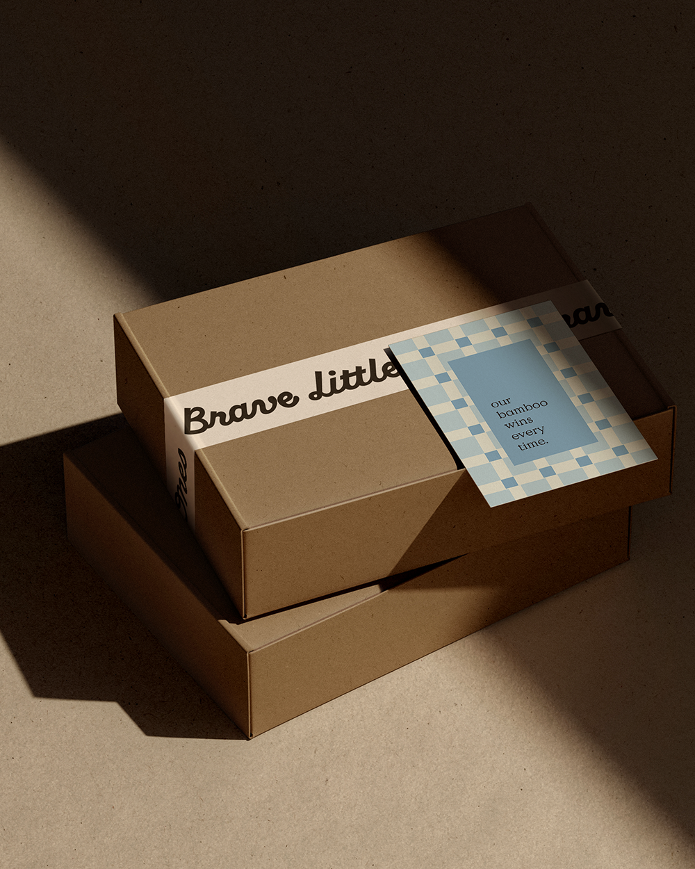
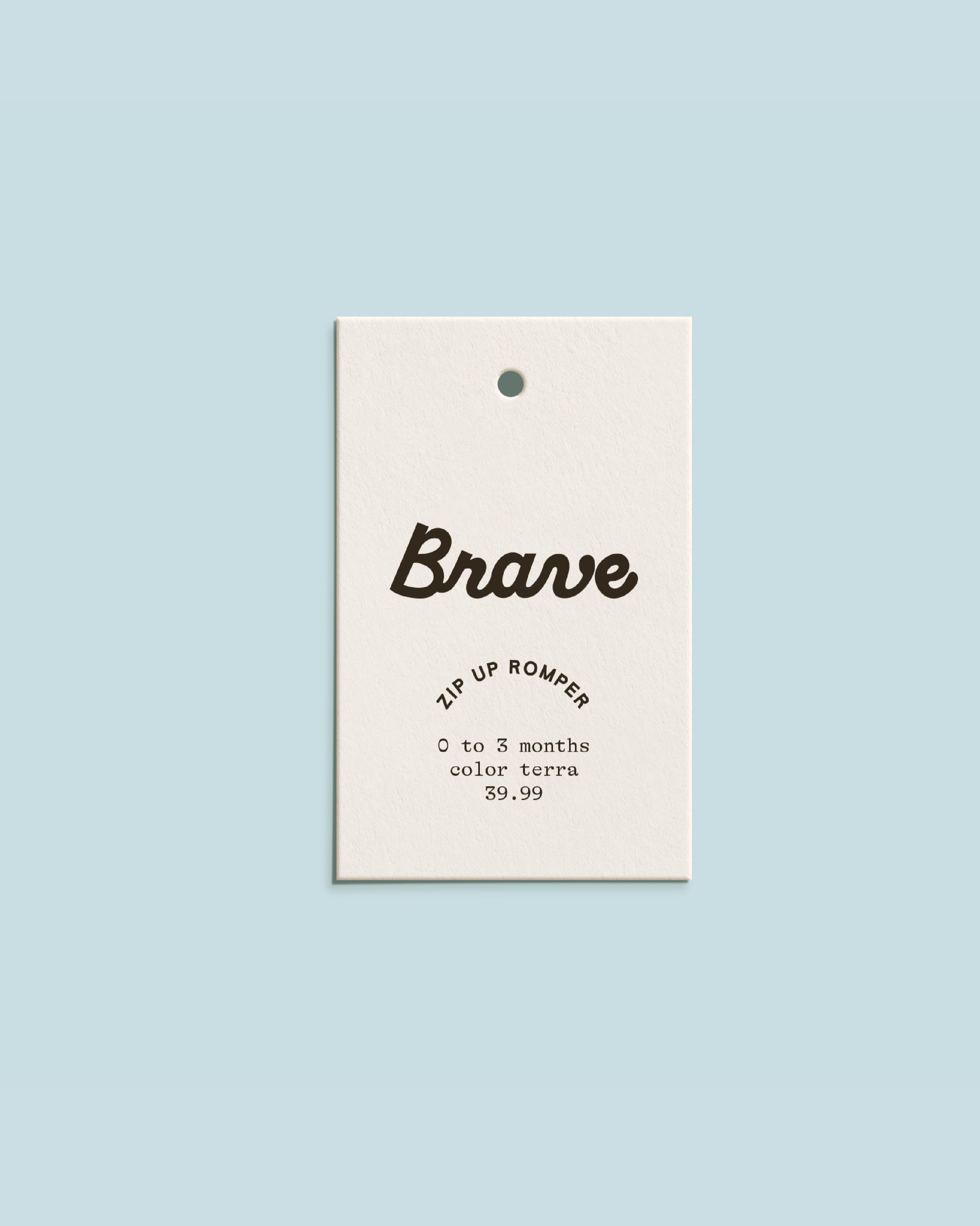
We started with the logo. The original mark had a hand-drawn quality that had heart, but didn’t reflect the quality and modern feel of the brand. We completely reimagined it. We kept the warmth and playful energy with a script font but took a more refined approach. At the same time, we didn’t want things to feel too formal — after all, we wanted to keep that warmth and fun, kids-brand energy, so we added a bolder weight and curves to bring the right balance and make sure it still felt approachable and appealed to parents of littles.
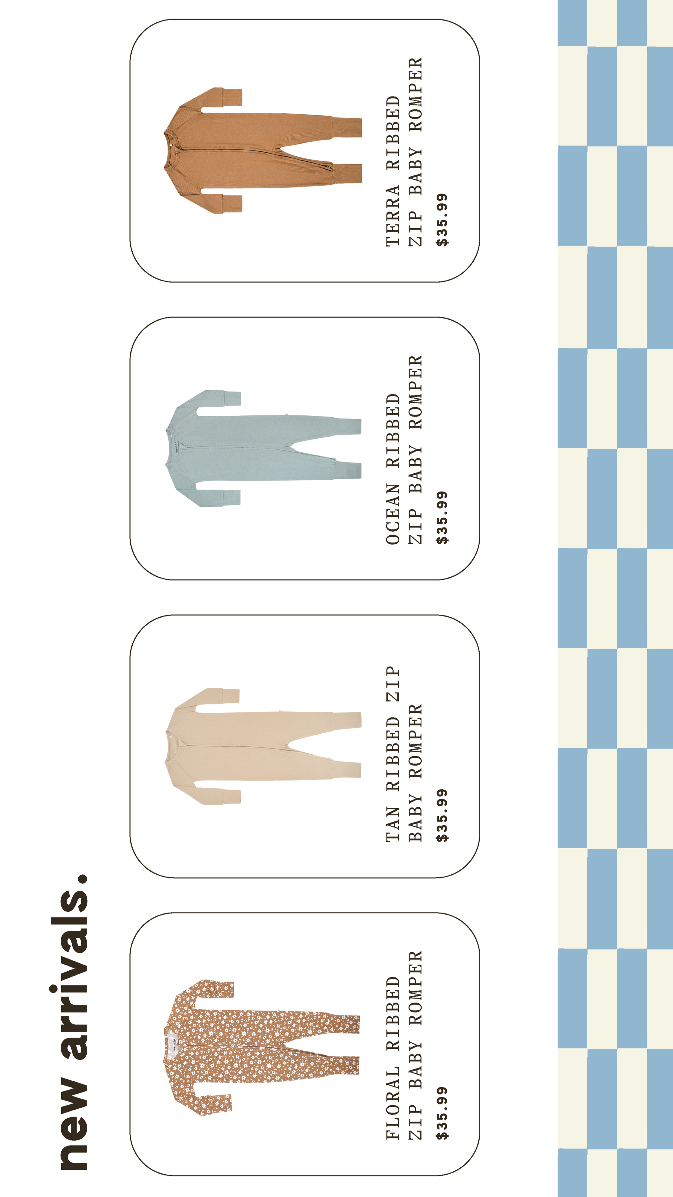
By pairing the refined script with clean, minimal sans serifs, we created hierarchy, readability, and brought in a subtle touch of personality to the rest of the brand type. Patterns and backgrounds added another layer of depth. We leaned into playful, abstract shapes that felt reminiscent of childhood, yet still polished and simple linear patterns and gentle weaves that helped to create a clean, cohesive look without overshadowing the designs of the pajamas themselves.
Finally, we brought it all together with a thoughtful color palette. Neutrals anchored the brand while pops of soft peach, pink, yellow, and cool blue added to the playful, inviting energy. The combination kept the brand feeling dynamic and flexible for seasonal launches, packaging, and future product expansions.