
logo types + placement tips to make your brand look dang good
1/14/26
branding
logo types + Placement tips to make your brand look dang good
it’s more than a graphic. here’s how to show your logo off like a pro.
It’s no secret — we’re huge believers that branding is way more than just a logo. But let’s be real: your logo is still the MVP of your brand, the first impression, and the face everyone typically remembers. Knowing when to show off your headliner, your flexible sidekick, or your subtle mini-me can make all the difference in keeping your brand polished, cohesive, and totally unforgettable.
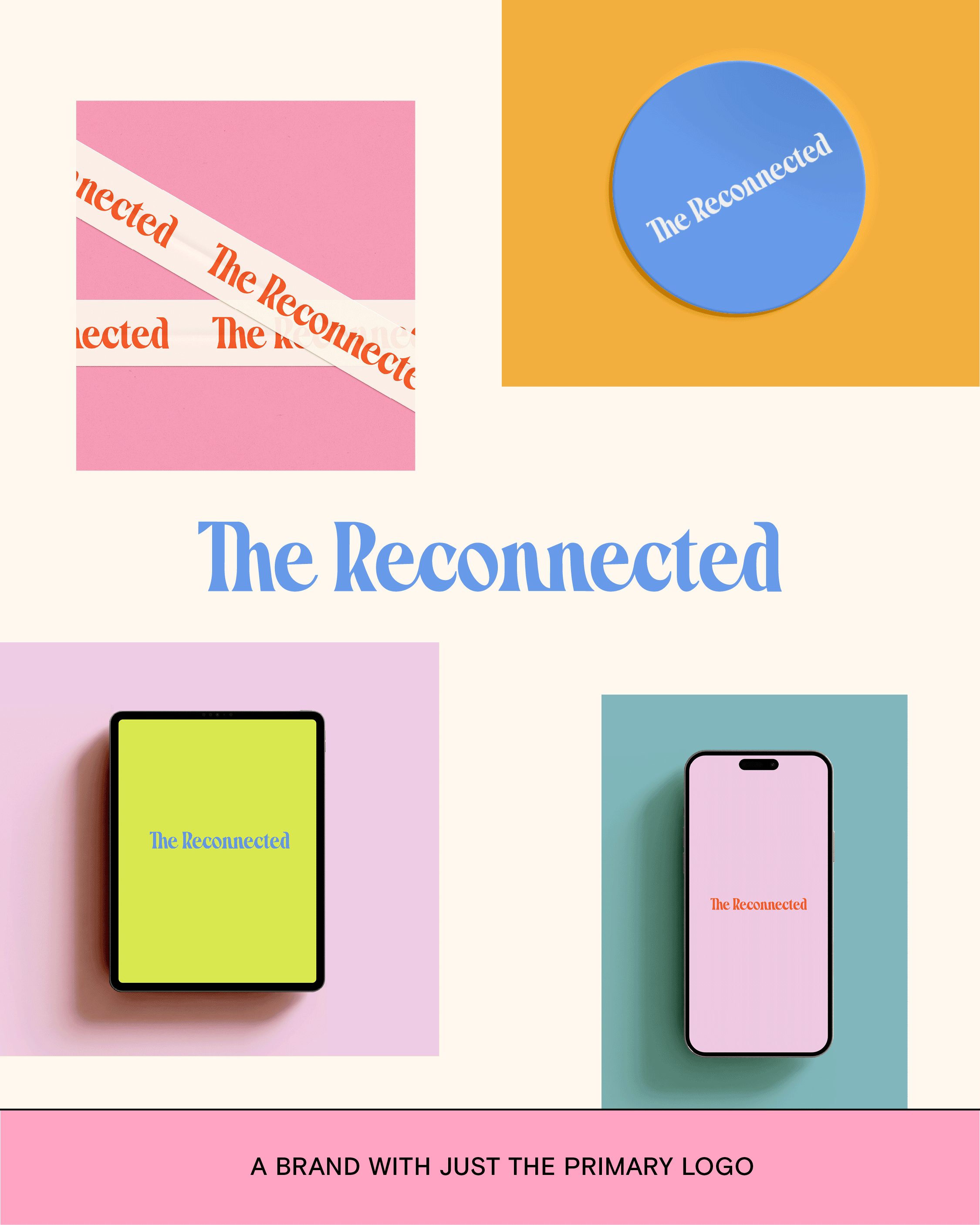
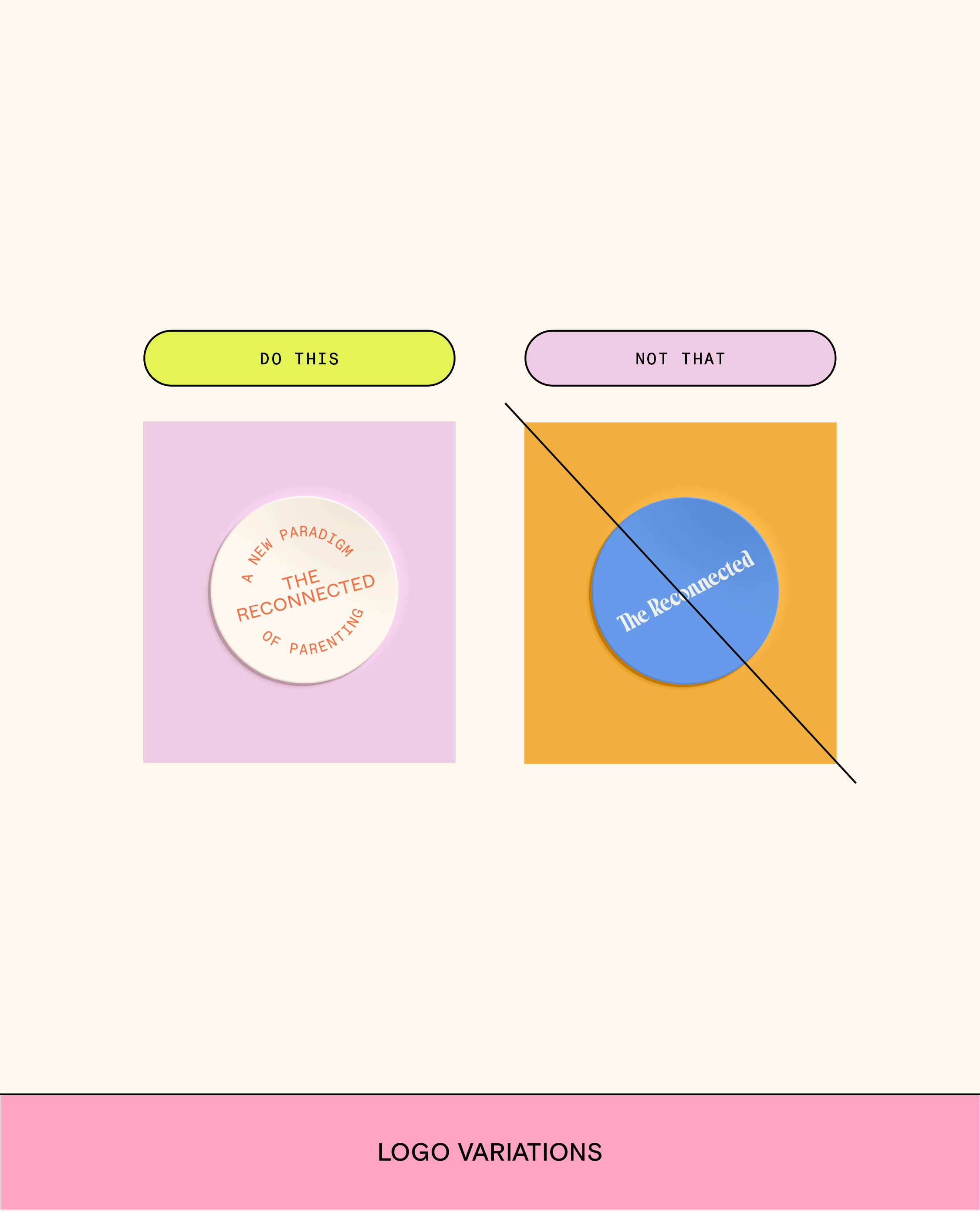
Primary Logo: The Main Squeeze
Your primary logo is your main player, but it’s not the whole team. Use it most often. It anchors your brand and sets the tone, but remember it’s just one part of a bigger visual story. Think of it as your brand’s headline act: it introduces your identity, but everything else (colors, typography, messaging) keeps the performance going.
When to show it off:
Anywhere you need max visibility.
Whenever you want a balanced, polished look (center it if you can).
Exceptions: Space is tight, a different orientation works better, or you want to drop something a little unexpected for extra flair.
Pro tip: Give it room to breathe. Crowding this superstar with other graphics is a no-go.
Secondary Logos: The Flexible Wingman
Secondary logos are your versatile BFF. They add context like taglines or established dates and give your brand some wiggle room without losing style points. Plus, they let you adapt your branding across multiple platforms while keeping it fresh yet instantly recognizable.
Perfect for:
Social graphics
Stamps or seals on collateral
Situations where your primary logo just won’t fit
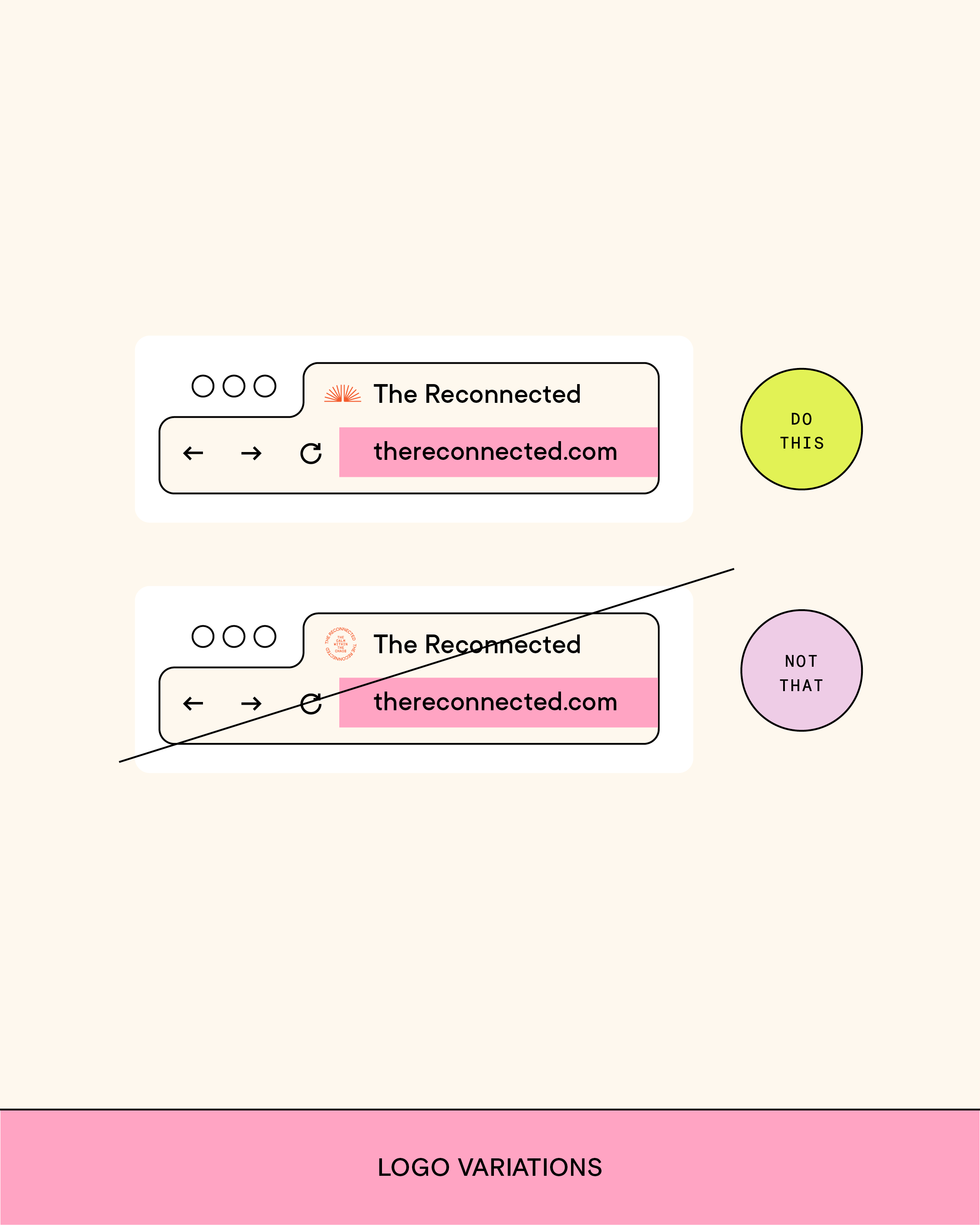
Brand Marks: The Tiny But Mighty
Brand marks are your simplified, small-scale logo versions. They’re subtle, sleek, and stand alone when your full logo feels too extra. Think of these as the microdose of branding: small but still instantly yours.
Use them for:
Social media profile pics
Favicons in your web browser
Small-scale print materials where subtle wins
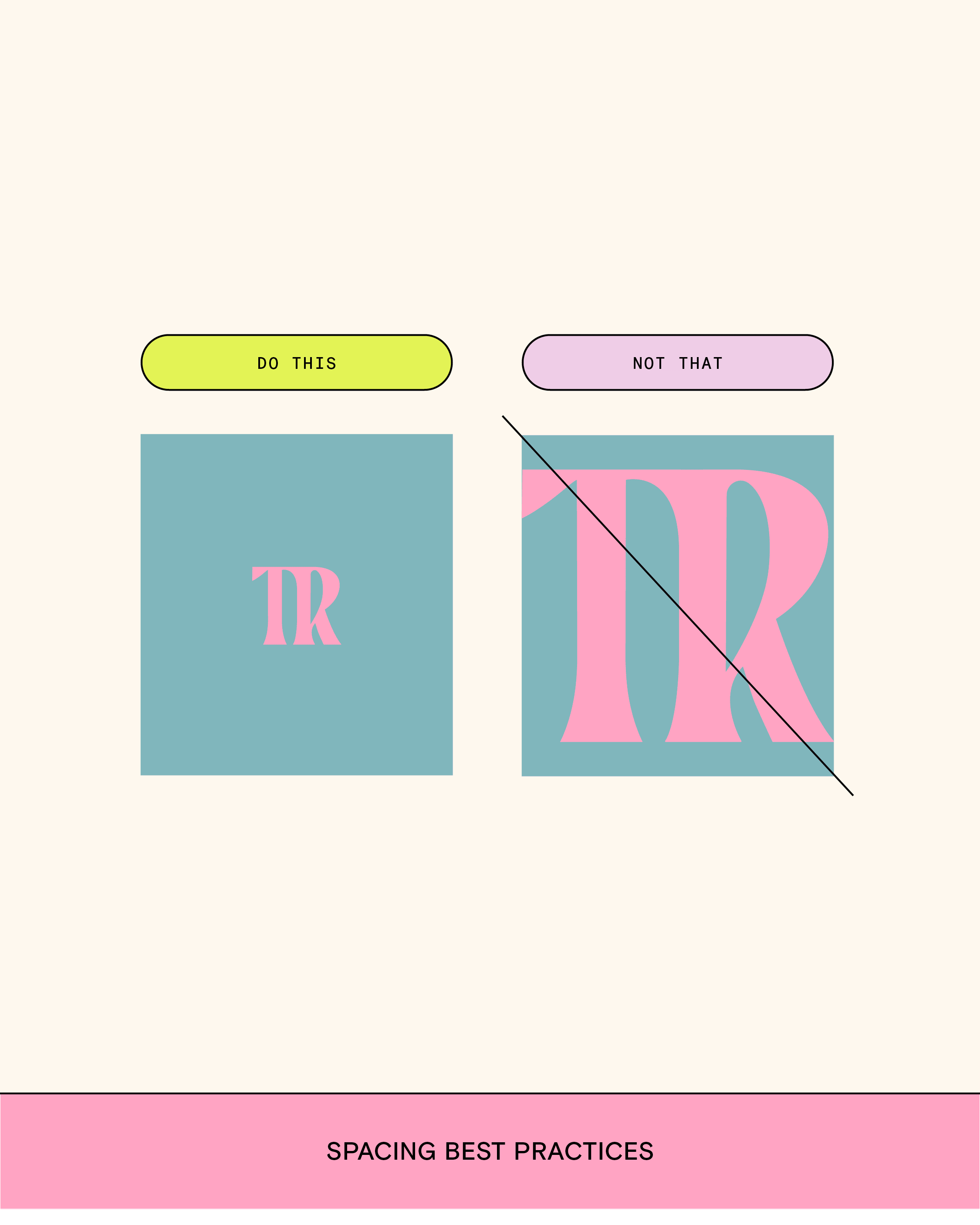
Bonus: Placement Tips
Center it when you can to keep everything balanced and clean.
Size matters. Don’t shrink your logo smaller than 100 pixels wide.
Give it space. Let it breathe. No one likes a crowded logo.
Match the vibe. Horizontal layouts, hang tags, or weirdly shaped collateral? Pick the logo variation that fits best.