a case study: doc lizzie
1/21/26
recent work
a case study: doc lizzie
a brand that moves with women’s bodies, inspires confidence, and makes wellness feel doable — say less.
When Lizzie decided to leave her underpaid, overworked PT clinic job in 2020, it wasn’t just about starting a business. She wanted to create a space where women could feel truly seen, supported, and empowered through every stage of motherhood AND womanhood.
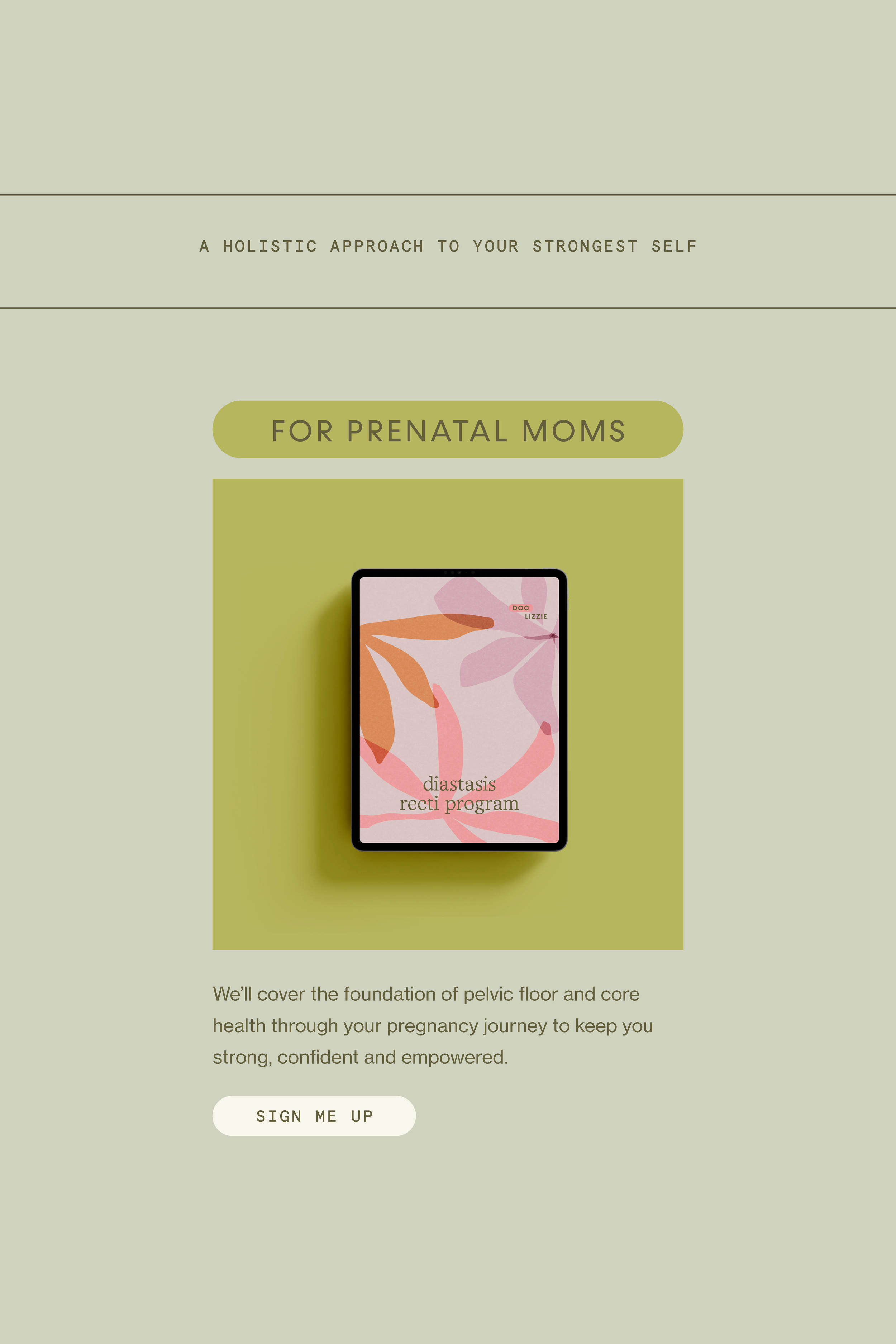
What started as a small office physical therapy clinic in June 2020 quickly grew into Doc Lizzie DPT, a fully online platform offering pregnancy, postpartum, and pelvic floor-focused courses and resources. By 2024, Lizzie was reaching women across the world, sharing her expertise and holistic approach to rehab and fitness as a whole, but her visuals just weren’t matching the impact. She needed a brand that could communicate warmth, professionalism, and approachability while still feeling modern, playful, and true to her.
The struggle
Lizzie was killing it with her expertise. Women trusted her, loved her programs, and felt supported through every stage of motherhood. But here’s the thing: her brand was lacking consistency. The content was there. She just needed some support when it came to delivering it more consistently and efficiently for her subscribers.
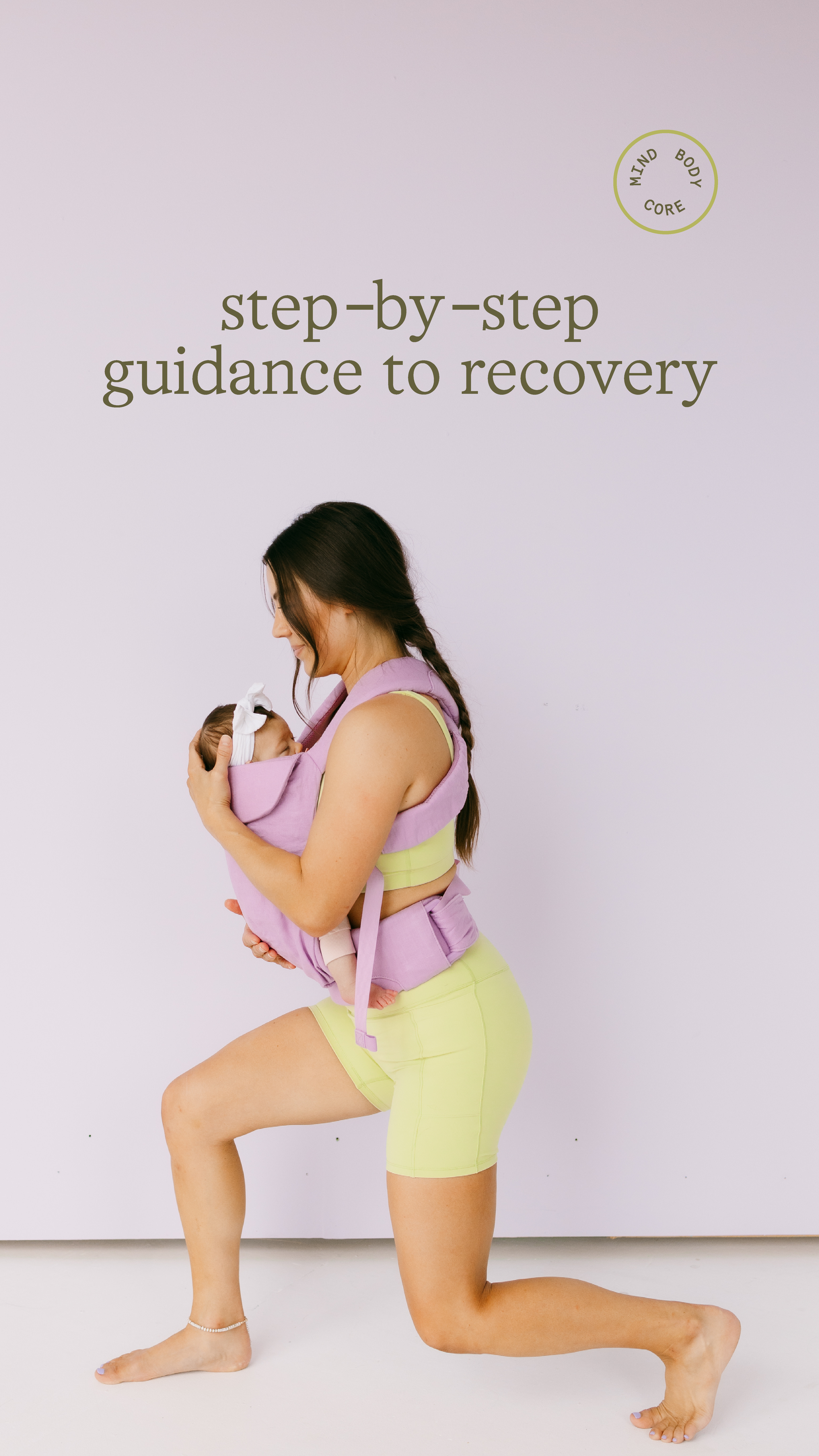
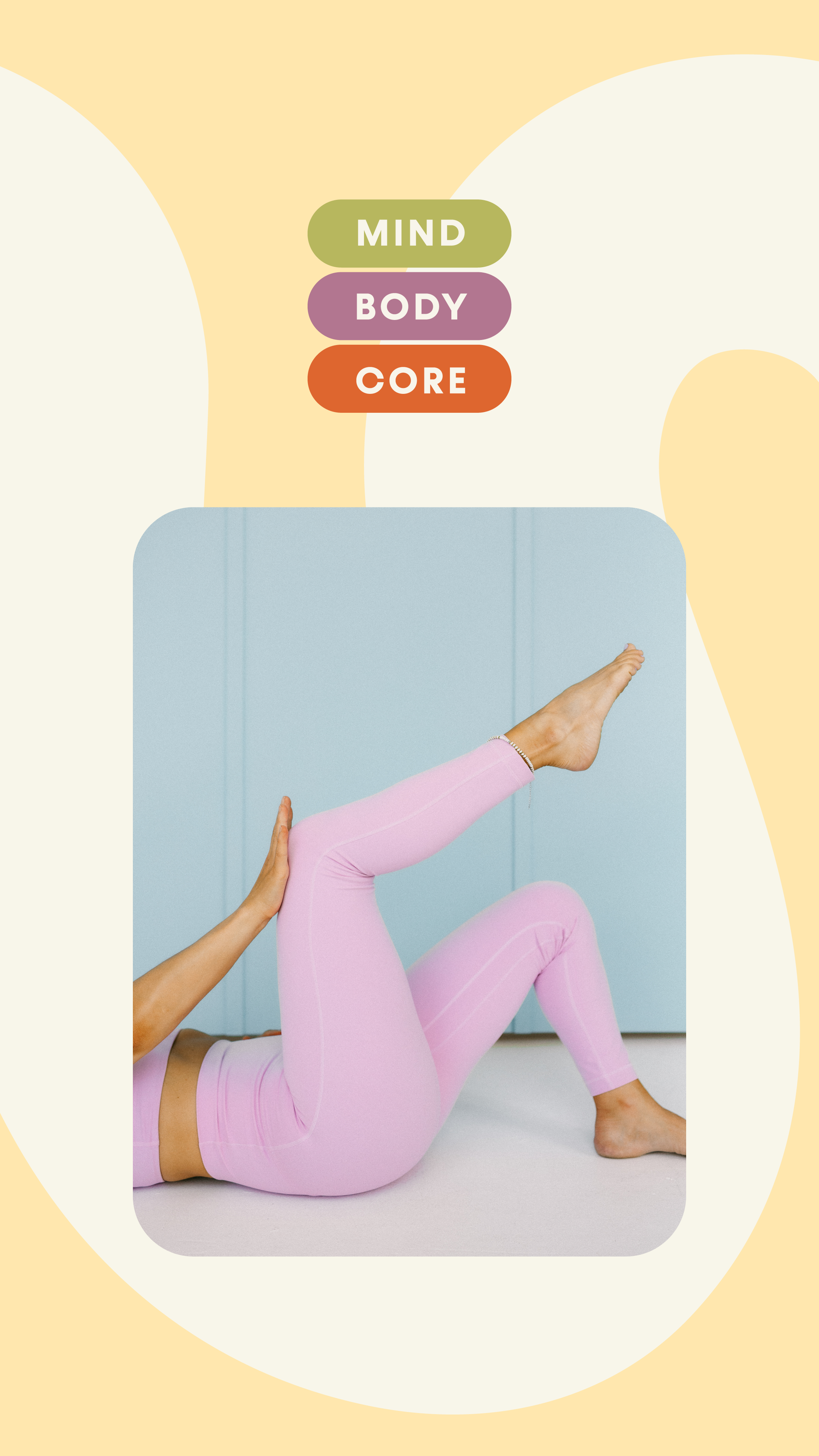
On top of that, Lizzie needed a brand that could grow with her. She wasn’t just posting content. She was building a full online platform, creating courses, and dreaming up what could come next for her signature program, Mind Body Core. The brand had to be flexible and memorable, something that would let her shine, scale, and show up like the confident, playful, expert physical therapist she is.
The goal
To create a brand that finally matched Doc Lizzie’s energy. We wanted something that felt modern, playful, and approachable while building out a full system that could handle everything from social media and PDFs to her digital course and expansions in the future. It had to feel professional enough to speak to her credibility, but fun and human enough for moms to instantly feel like, “yep, she gets me.”
The solution
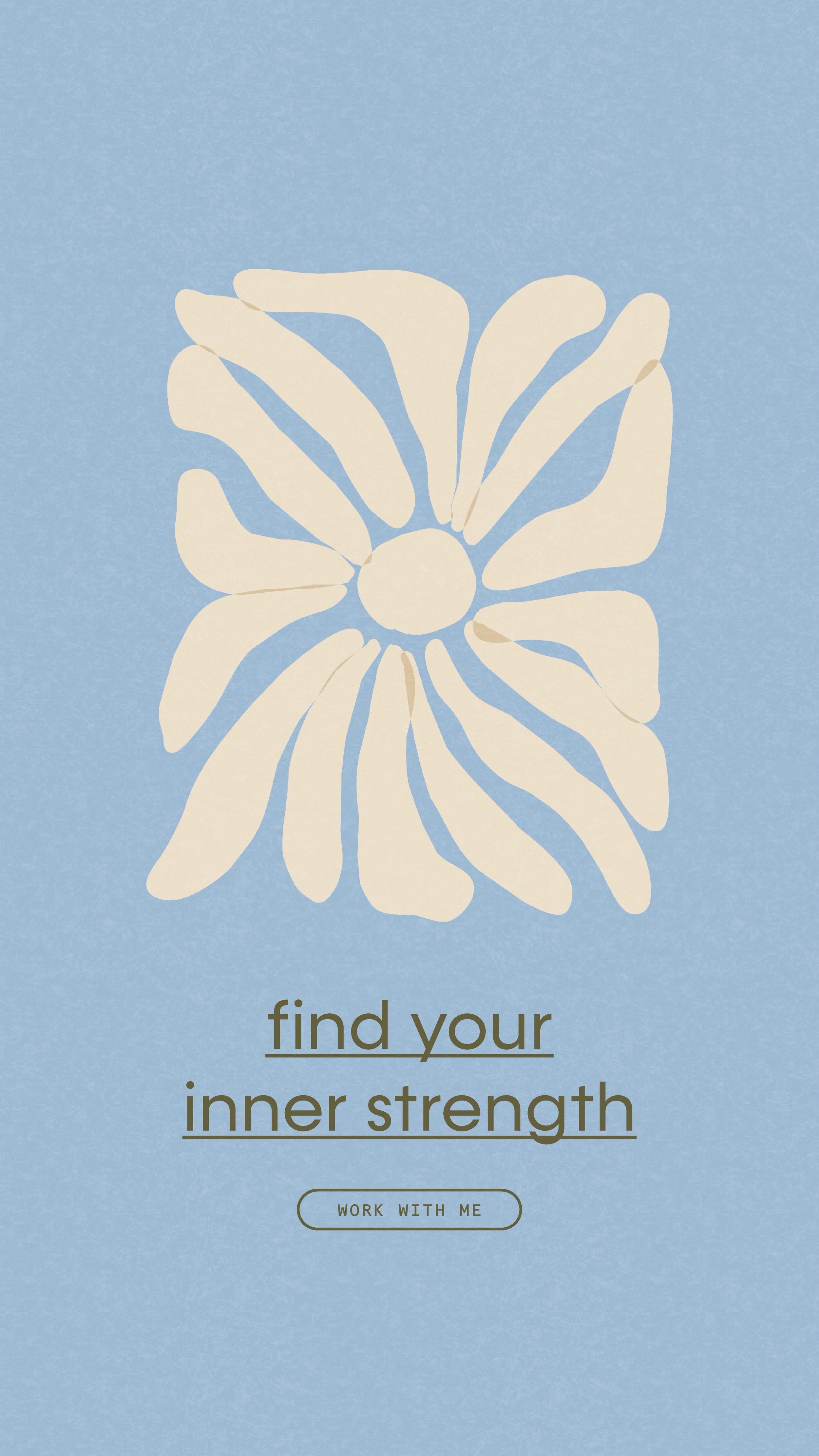
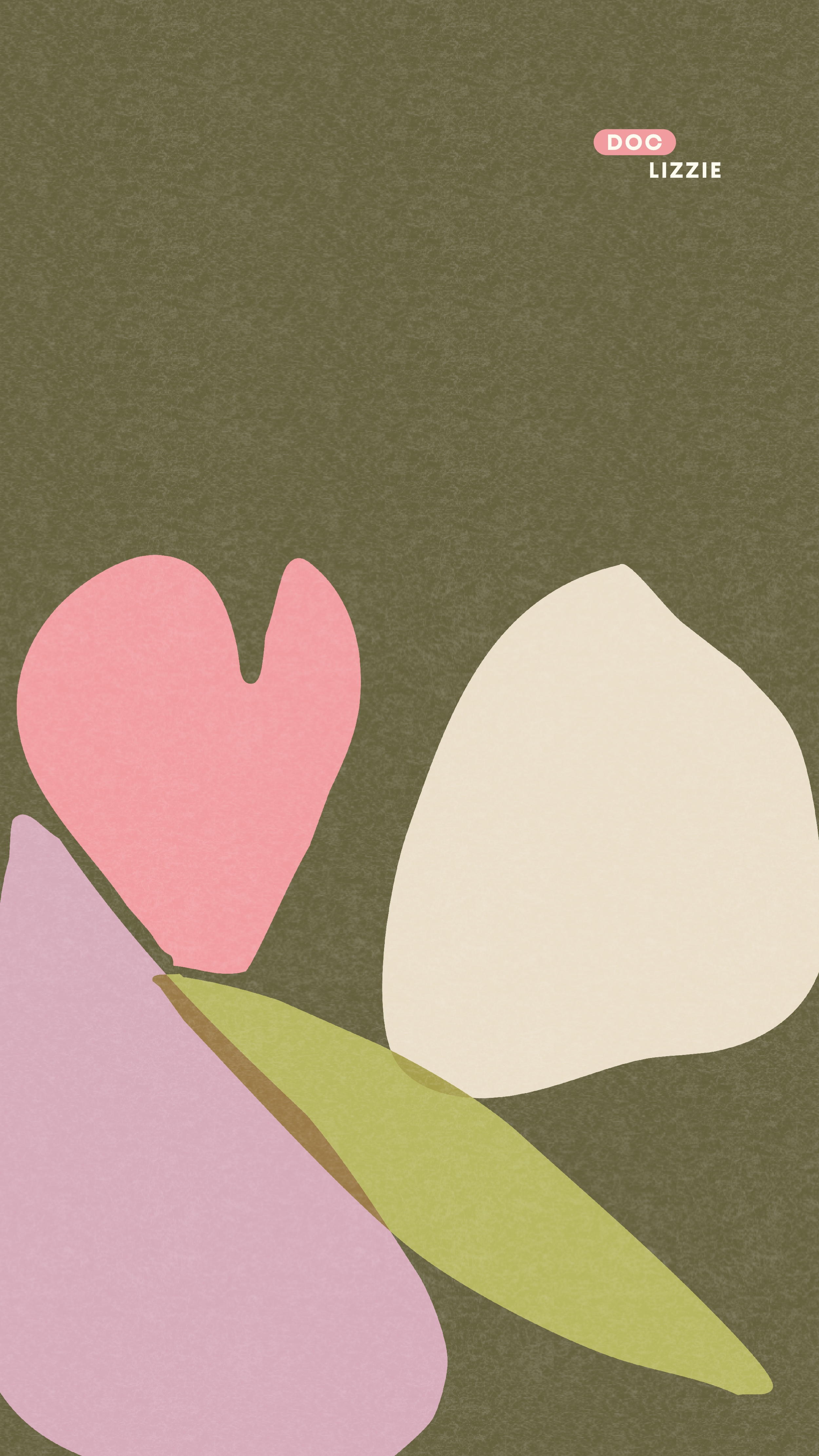
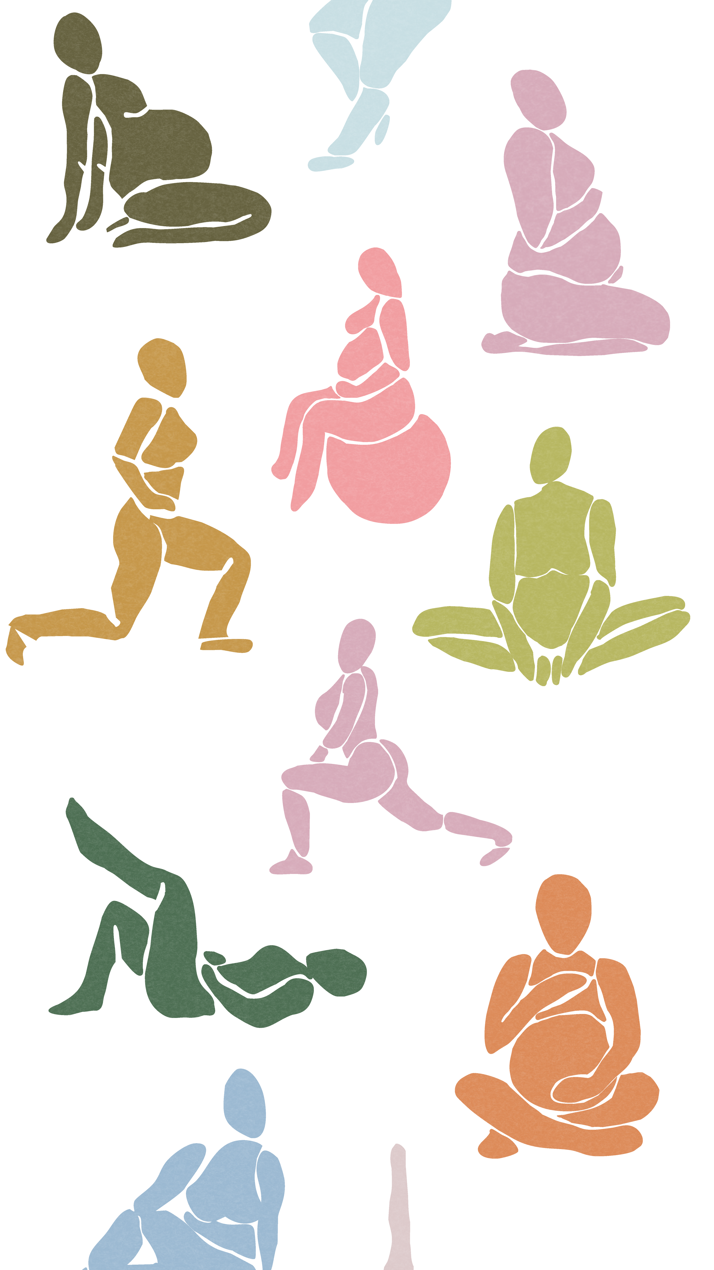
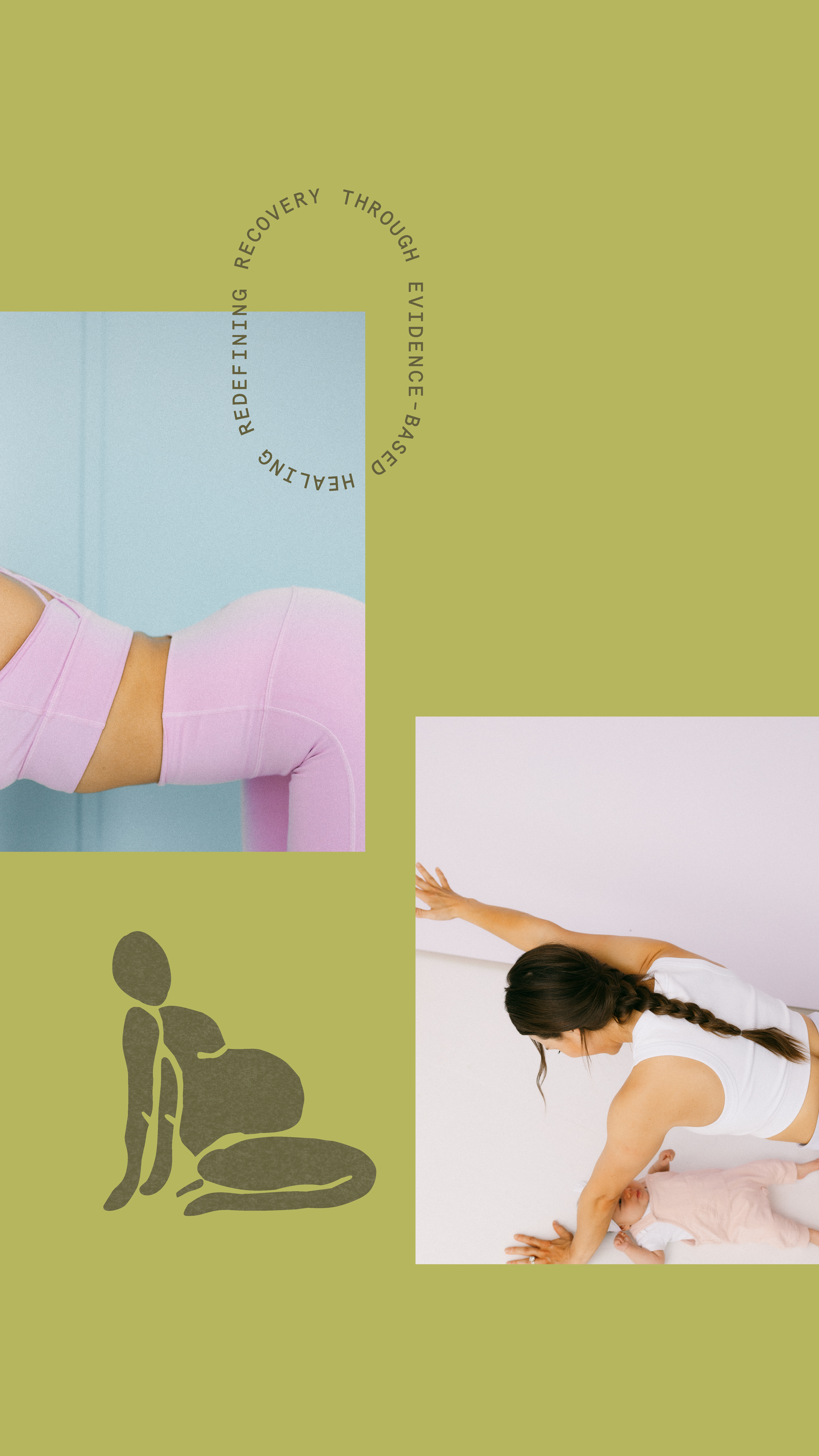
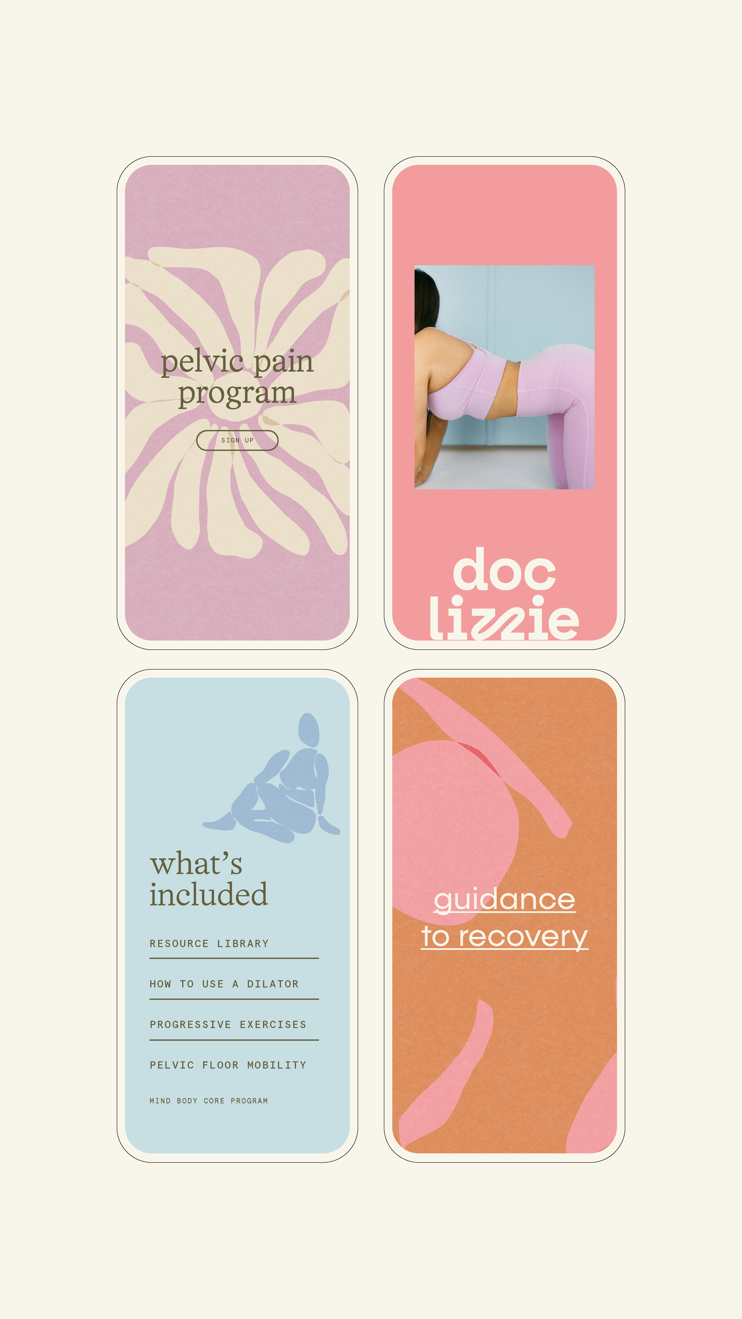
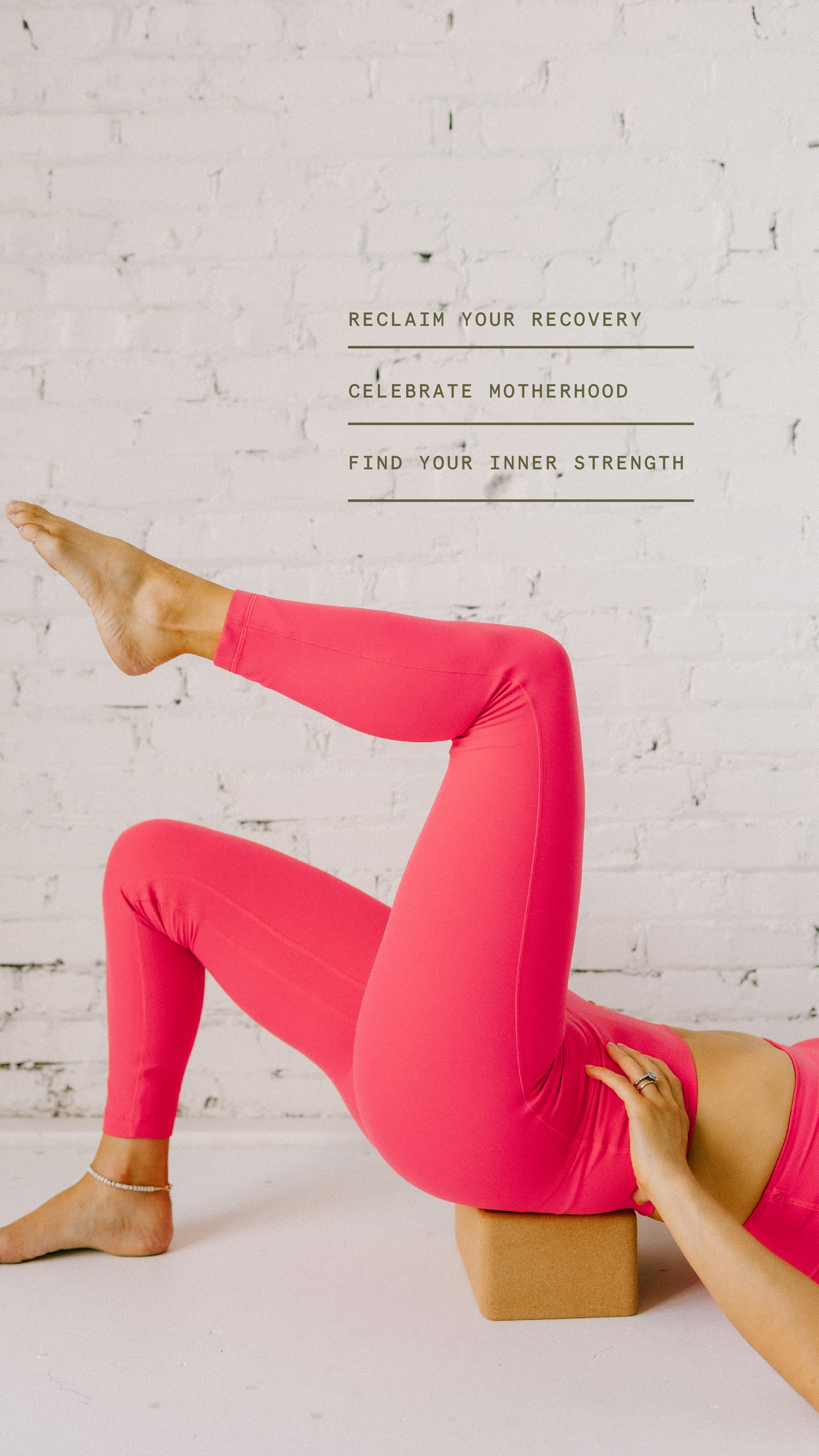
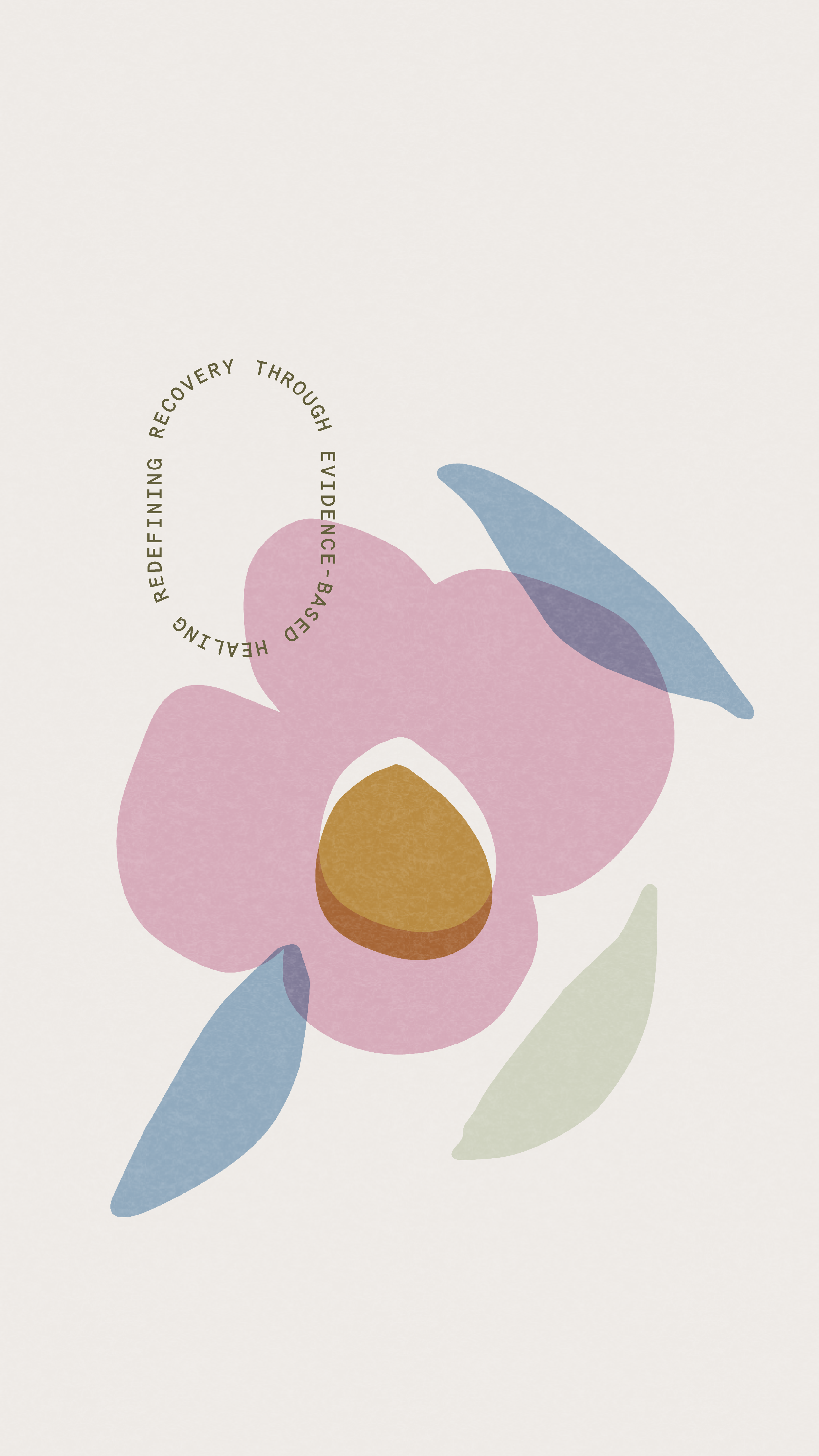
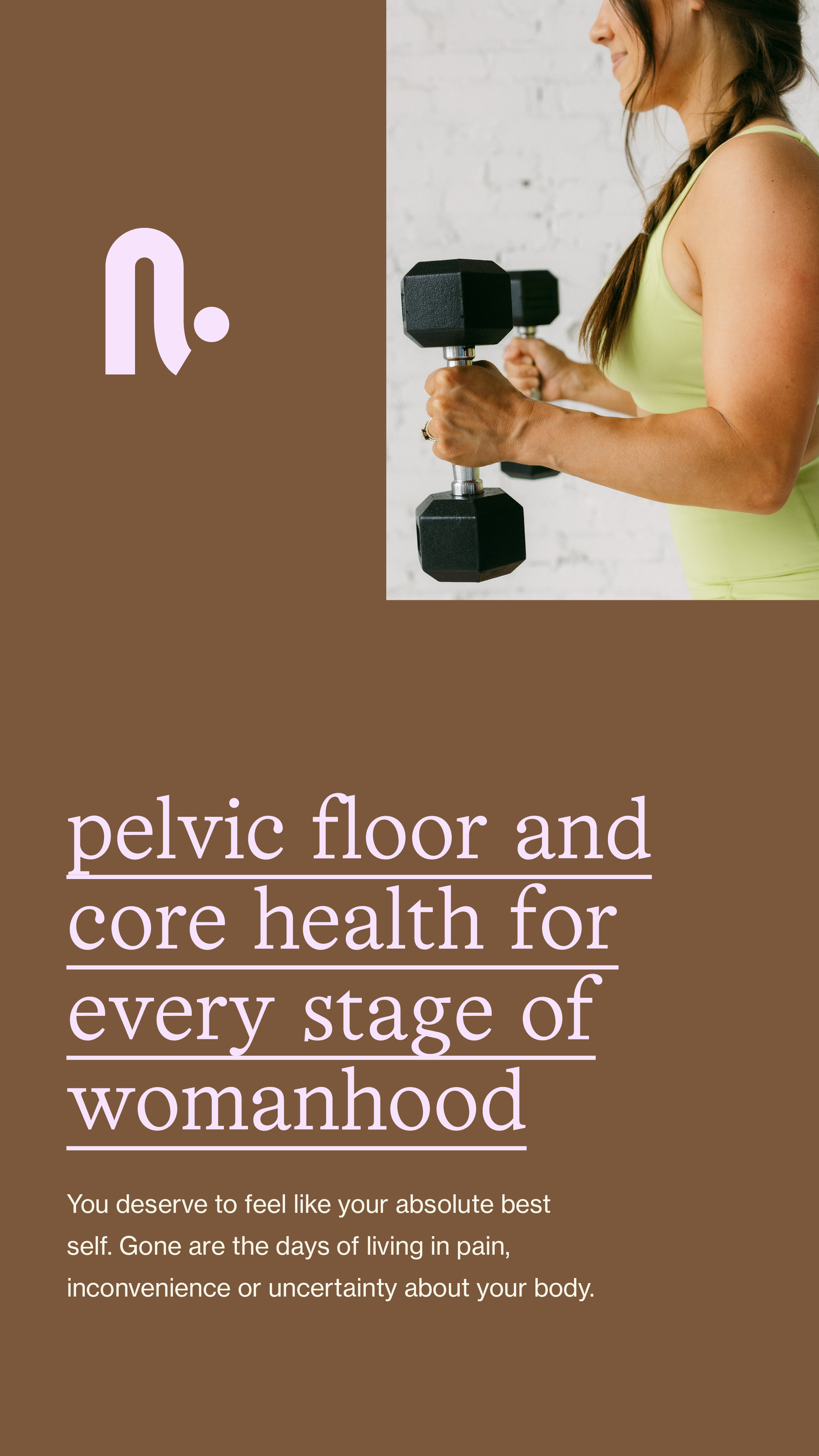
Lizzie’s previous logo had warmth, but didn’t feel modern or polished. Enter: a custom sans-serif with swoops, curves, and connection points that subtly nod to the female form and her mind-body-core approach. From there, we built a full system of secondary logos, brand marks, illustrations, patterns, a color palette, and supporting typography. The illustrations and patterns felt playful, organic, and full of movement as we leaned into abstract, Matisse-inspired shapes to reference the female body. They helped create a visual language that’s flexible enough to work behind text, in PDFs, on social media, and across her digital platforms, while still feeling cohesive and memorable.
The color palette furthered that balance. Inviting pops of pink and lavender were paired with earthy greens, calming blues, neutrals, and deeper tones for contrast. Creating a brand that felt warm, modern, and emotionally grounded without skewing overly soft or feeling sterile.
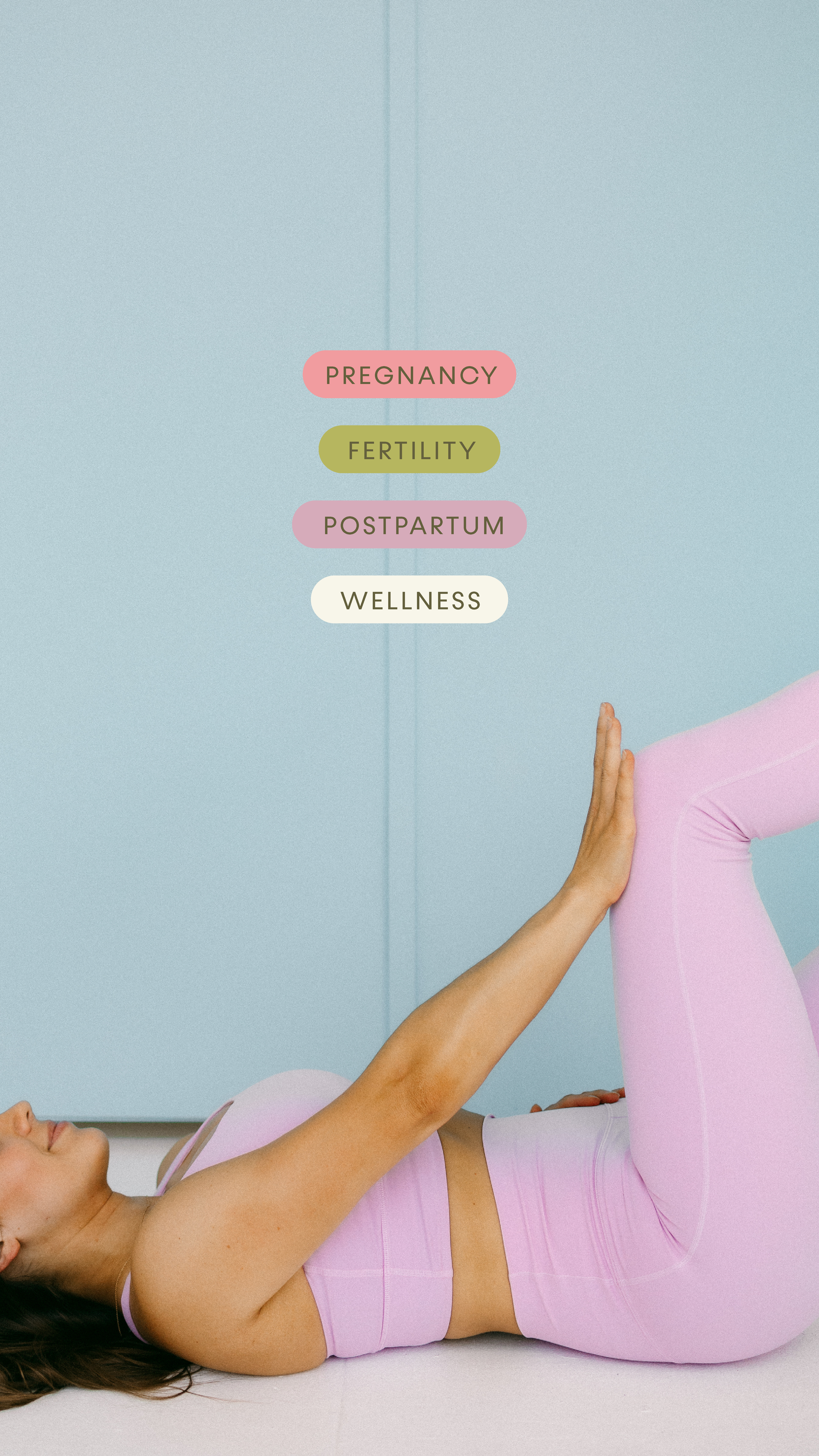
From there, we extended the palette into image direction. We guided Lizzie on how her photography should feel, from color tones and lighting to overall mood and subject, so her visuals would work hand-in-hand with the brand. And she absolutely did the dang thing. The result was imagery that felt so cohesive and intentional, and helped set the stage for a website that could carry the brand forward.
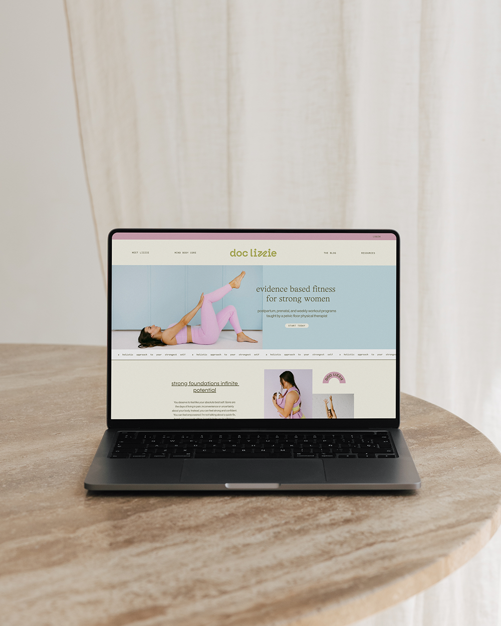
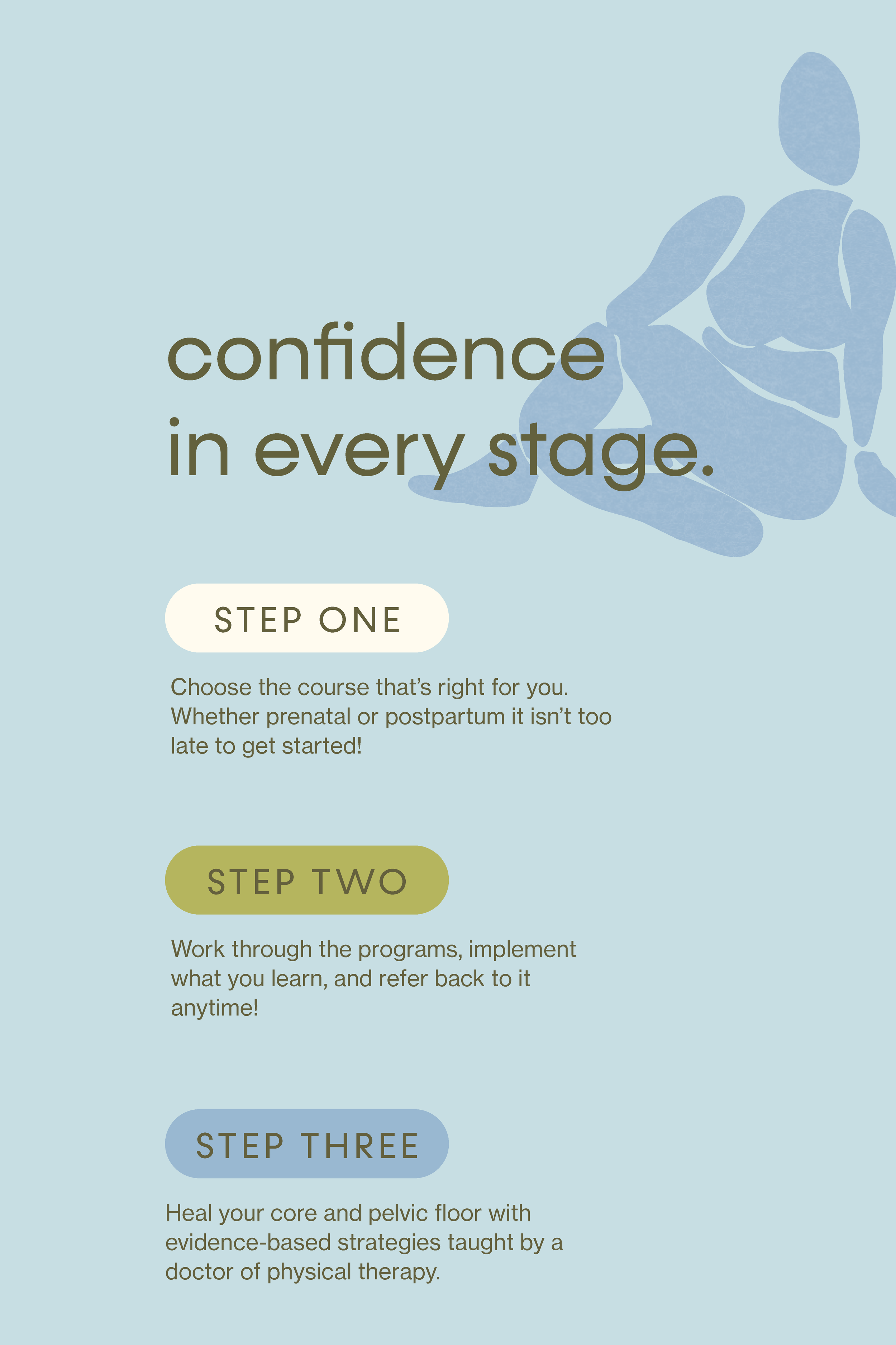
Lizzie’s website was redesigned to showcase her programs in a way that’s effortless to navigate and simple to digest, so visitors could immediately understand the support she offers during pregnancy, postpartum, and beyond. Copy and layouts were carefully structured to make her programs and free resources easy to find and engaging to explore.
The result was a full brand identity and website that elevated her presence, made content creation effortless, and, most importantly, helped her audience feel seen, supported, and empowered at every touchpoint.
The results
Doc Lizzie’s rebrand went so well that she returned to have us help build out Mind Body Core — a sub-brand designed to live within the same ecosystem while still standing confidently on its own. Spoiler: It’s a whole app that we couldn’t recommend more.
“Brighten Made is the BEST in the biz. From the first consult, I knew they were the ones for my branding and website revamp. They have such a unique spin on branding and messaging, and they delivered exactly the vibe I wanted. It’s already so worth the investment — my business finally has a home, with a clear message and direction. They took the time to understand my audience and nailed it. I’m so grateful and would recommend them wholeheartedly to anyone (and will be back myself!).”