
how to stop playing guessing games when it comes to brand color palettes

2/4/26
BRANDING
how to stop playing guessing games when it comes to brand color palettes
learn how to build a color palette that hits the right vibes, every time.
I hate to break it to you, but picking your brand colors isn’t as simple as scrolling Pinterest until you find “aesthetic beige #47.” When it comes to branding, color really sets the tone for everything. It’s what makes your brand feel calm and grounded or bold and like it just had a shot of espresso.
If you’re pulling together a palette for your biz all on your own, let’s chat through how to choose your brand colors with purpose.
Start with strategy.
Drop the color wheel and don’t go ordering that massive Pantone swatch book yet. You can’t pick colors if you don’t know what your brand stands for. Ask yourself: What do I want people to feel when they see my brand? What vibe do I want the brand to give off? Loud and bold, soft and minimal, earthy and warm?
Your color palette is basically your brand’s personality at a super quick, high-level glance. It’s the thing that communicates your brand style instantly and is further enhanced by the works (logo design, typography, patterns, illustrations, and elements — you get what I’m saying, right!?). If you’re confident and high energy, maybe a more saturated palette fits. If you’re grounded and calm, lean into warm neutrals. Regardless, don’t just pick colors because they’re pretty or you like them. Think intentionally.
From there, color theory can come into play. Every color has a job and is known to evoke certain feelings in people. It’s kind of wild once you dig into it! Red can grab attention, but a true red can often feel a little harsh. Yellow typically feels optimistic, green gives off a calm, sustainable vibe, blue builds trust, and neutrals help balance everything out. You don’t need to memorize the color wheel, but it does help to understand what emotions your colors might be communicating.
Then, take a look at your competitors. I knowwwww, no one likes to think about the competition, but when it comes to branding, it’s helpful to figure out what will make you stand out from the sea of competition. What’s everyone else doing? Is everyone in your space leaning into muted and minimal? Maybe your brand stands out with some saturation then. If competitors are loud and bright, something more refined might feel like a breath of fresh air.
Finally, pull some inspiration that feels true to you. Forget perfectly styled flat lays and curated brand color boards. Instead, you can start with textures, architecture, photography, packaging, or even fashion that evokes the mood you want your brand to carry. Look for patterns: tones, lightness, saturation, contrast. It’s a good starting point!
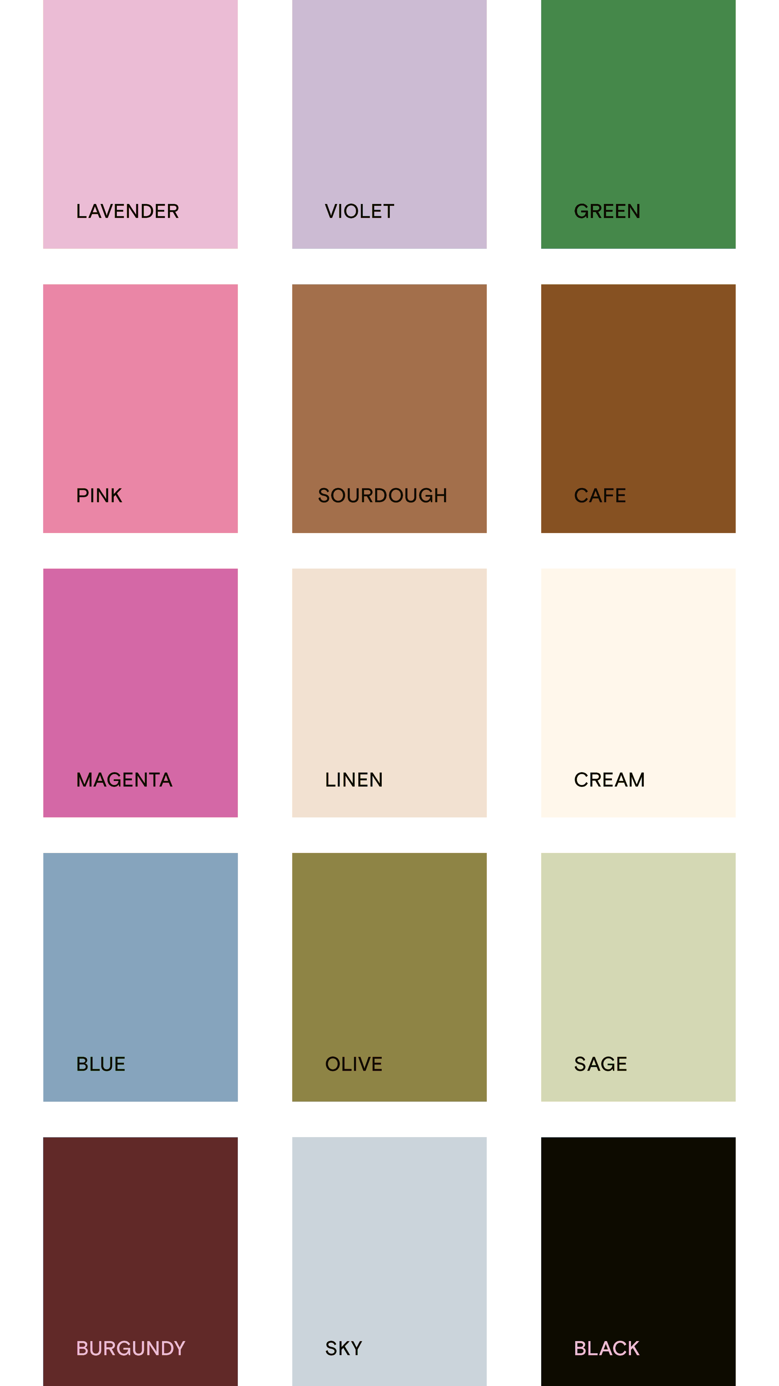
Build your palette
Now for the fun part! Start with a primary color (it’s cool if you have one or two of these), BUT this is your anchor. The color that will carry the most weight across your brand. It’s usually the shade that captures your core personality and is used most often for your logo. If your brand vibe is bold and energetic, maybe it’s a punchy coral or electric blue. If it’s grounded and elevated, think a deep olive, slate, or warm beige.
Next, add some secondary colors to bring your brand some depth and flexibility. These are supporting players that will help balance or contrast your primary color(s). Use them to add visual interest, highlight sections on your website, or differentiate content types. The key here is you want variety, but not chaos. A good mix feels cohesive across touchpoints without every project looking like it’s been a copy-paste.
Annnnnd let’s not forget about neutrals. Every good palette has to include some (even the bold ones). Creams, grays, charcoals, or muted tones can do a lot of heavy lifting, giving your brighter colors room to shine. Neutrals are the unsung heroes of every good palette — they make the rest look more intentional.
Contrast, baby.
It’s 2025, accessibility and usability aren’t exactly optional. You want enough differentiation between colors so your text is readable, your graphics pop, and your visuals don’t blend into one big soup of sameness. Run your colors through an accessibility checker, or just squint-test them. If your eyes hurt or the details disappear, adjust.
Once you’ve built your palette, test it in action. Don’t just look at color swatches in isolation. Drop them into mockups (oh, hey, that’s what a designer might be for). See how your colors behave on screen vs. in print. Does your brand still feel like you when it’s on packaging, Instagram, or a business card? How does it hold up when paired with photography or textures?
Play around, refine, and tweak if you need to. You’ll know you’ve nailed it when it feels both flexible and instantly recognizable. When every touchpoint, no matter how small, feels like part of the same visual world.
The takeaway
Picking your brand colors isn’t about chasing trends — it’s about building a visual language that feels like your brand from the inside out. When your palette aligns with your strategy, stands out from your competitors, and supports your personality, it doesn’t just look good — it works hard.