not every brand needs a script font

9/23/26
branding
Not every brand needs a script font
Script fonts aren’t the problem. Using one just because it’s trendy? Now that’s where things get messy.
I get it. Script fonts are having a MOMENT. And listen, I’ll be the first to admit that I love a good piece of hand-lettering just as much as any other millennial who spent way too much time scrolling Pinterest circa 2012. But sometimes too much of a good thing is actually a bad thing.
If your first instinct is insisting that you have to add a handwritten font to your brand because it makes things feel personal, feminine, or approachable, we need to have a little chat. While script fonts can be beautiful and absolutely evoke those feelings, they’re not automatically the right choice for every brand. And when they’re used without much thought, they can make an otherwise thoughtful identity feel dated, overly trendy, or suspiciously similar to about 400 other businesses on Instagram. No one wants that.
The goal of typography isn’t to just check a box in a branding package. It’s to communicate something about your business before someone even reads the words. Sometimes that DOES mean using a script. Other times, that means using a bold serif or a clean sans serif that lets the rest of the identity do the talking.
Here’s my main point, though. Your brand does not need a script font just because you like script fonts.
What’s the deal with script fonts?
Script fonts are designed to mimic handwriting, calligraphy, or hand-lettering. Depending on the style, they can feel elegant, playful, romantic, vintage, or downright fancy as heck. And I get it. That’s why they can be so appealing.
A well-chosen script can add personality. It can soften a bold wordmark, add a little movement to a headline, or bring an editorial or handcrafted quality to a brand. I’m not ANTI scripts, and when used intentionally, I think they’re amazing. The problem is that script fonts can also become a bit of a branding shortcut, and they’re showing up literally everywhere.
Want your brand to feel feminine? Add a script.
Want it to feel personal? Add a script.
Want it to feel elevated? Apparently, add a script.
Typography has a job. Every typeface should contribute something to the overall identity rather than simply being there because you just like the way it looks. I said what I said.
Not all scripts are created equal.
There’s a difference between a script font and custom hand-lettering. A custom hand-lettered logo is created specifically for your brand, which means it can have little quirks, variations, and details that make it completely one-of-a-kind. A script font, on the other hand, is still a font, which means anyone can download it, and there's a decent chance someone else is already using it.
That doesn't make a script font bad. It just means you need to think about where and how you're using it. Custom lettering can be beautiful for a logo or small brand element, but it isn't necessarily practical for every application. Your brand might eventually need to show up across a website, packaging, social media, signage, print materials, email marketing, merchandise, and approximately 47 things you haven't thought of yet.
And then there’s the fact that not every script gives off the same vibe. Classic calligraphy scripts tend to feel elegant, formal, and romantic. Casual handwritten scripts feel more relaxed and personal, while brush scripts tend to be energetic, expressive, and a little more imperfect. Retro and vintage scripts can bring a very specific nostalgic quality to an identity, which can be great when that aesthetic genuinely belongs to the brand. Then you have the ultra-decorative scripts. The ones with swashes, flourishes, loops, and enough personality to fill an entire room. They're pretty, but they're also usually best used sparingly.
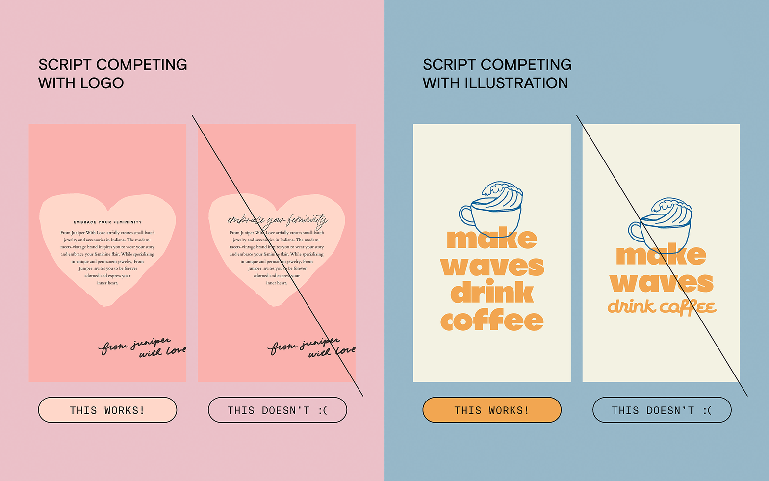
When they work vs. when they don’t
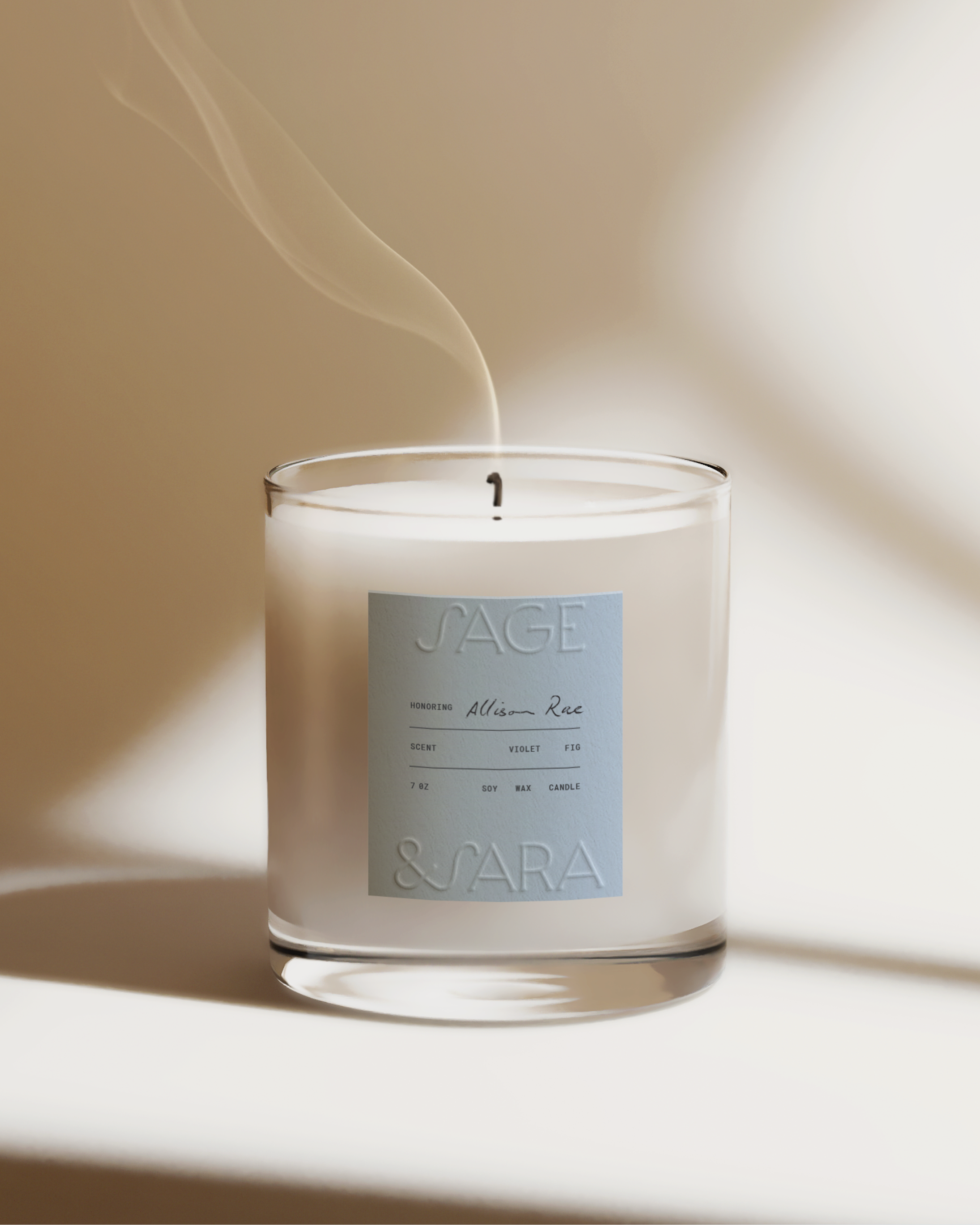
The best script fonts (and the only ones worth using) are the ones that make sense for the brand. A script might work beautifully when you want to add contrast to an otherwise clean type system. For example, our client Sage & Sara creates personalized memorial candles that honor loved ones. For her primary logo, we used a clean, refined serif to evoke a timeless feel. But within her candle labels and type system, we knew we wanted the personalized name on each candle to feel distinct from the rest of the information. This is where the script came in. Rather than using it everywhere, we intentionally used it as an accent, allowing the child’s name to stand out from the structured details around it. The contrast between the clean grid, refined typography, and softer handwritten element gave the script a purpose beyond simply making the design feel “pretty.” It helped draw attention to the most personal part of the candle.
It can also work when the handwritten quality reinforces something that already exists within the brand. If the business is rooted in artistry, craftsmanship, personal connection, a carefully chosen script can support that positioning rather than feeling like a decoration. That’s not to say that if your business highlights any of those things, a script is an automatic must-have. Not to sound like a broken record, but they have to be intentionally chosen and used well. The key here is that the script font serves a purpose.
Here’s where things get old real fast… adding a script font to an identity that already has enough personality.
Let’s say your logo is already custom hand-lettered OR you have a secondary logo/brand mark that is. Adding another script font to your typography system is not going to make the brand feel more cohesive. It’s going to create competition between the two. Your eyes won’t know where to go. The logo is trying to be the star, the headline is trying to be the star, and suddenly everyone is fighting for attention.
The same goes for brands that already have hand-drawn illustrations or other expressive visual elements. If your brand identity is already communicating the handmade quality in another way, you don’t need to repeat the message through your typography.
Sometimes not using a script is actually what makes the script, or illustration element, feel special.
What if I really want one?
Okay, okay. I hear you. You love script fonts. You have your eye on one. You’ve already imagined it on your website. You’re not emotionally prepared to hear that it might not make the cut. Fair.
I challenge you to think instead of “How can I squeeze a script font into my brand?” ask “What does my brand actually need from its typography?” And if you’re like… Whoa, I don’t even know how to answer that question. Hi, that’s where we come in.
Maybe the answer to the question is personality. In that case, we can explore a typeface with unusual proportions, distinctive letterforms, or an unexpected shape. Maybe the answer is more warmth. A softer serif could create that feeling without moving into script territory. Maybe you want the brand to feel more playful. A display typeface with character might do the job.

So, do you need a script font?
Maybe, but maybe not.
A script font should be considered alongside the rest of your visual identity. Not added as an afterthought because every other lifestyle brand on Pinterest seems to have one. Your typography should support your positioning, complement your logo, work across the places your brand actually needs to live, and give you enough flexibility to grow without feeling tied to one very specific design trend. Trends come and go. Your business has bills to pay.
So if your designer intentionally left the script off your brand or isn’t suggesting one in the strategy phase, there’s probably a reason. Trust them and the process.