
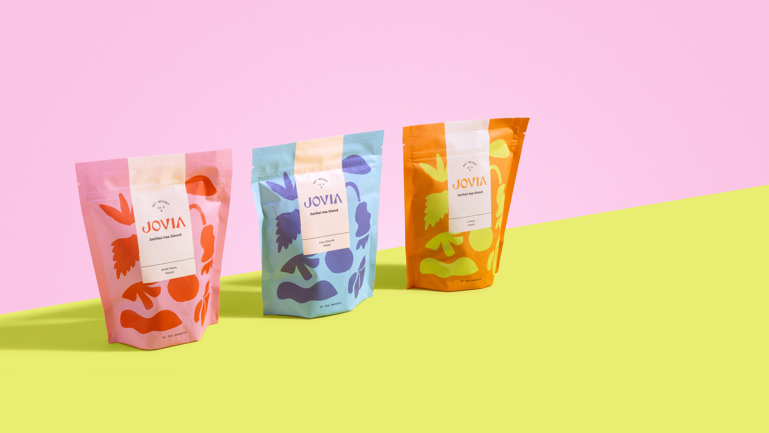
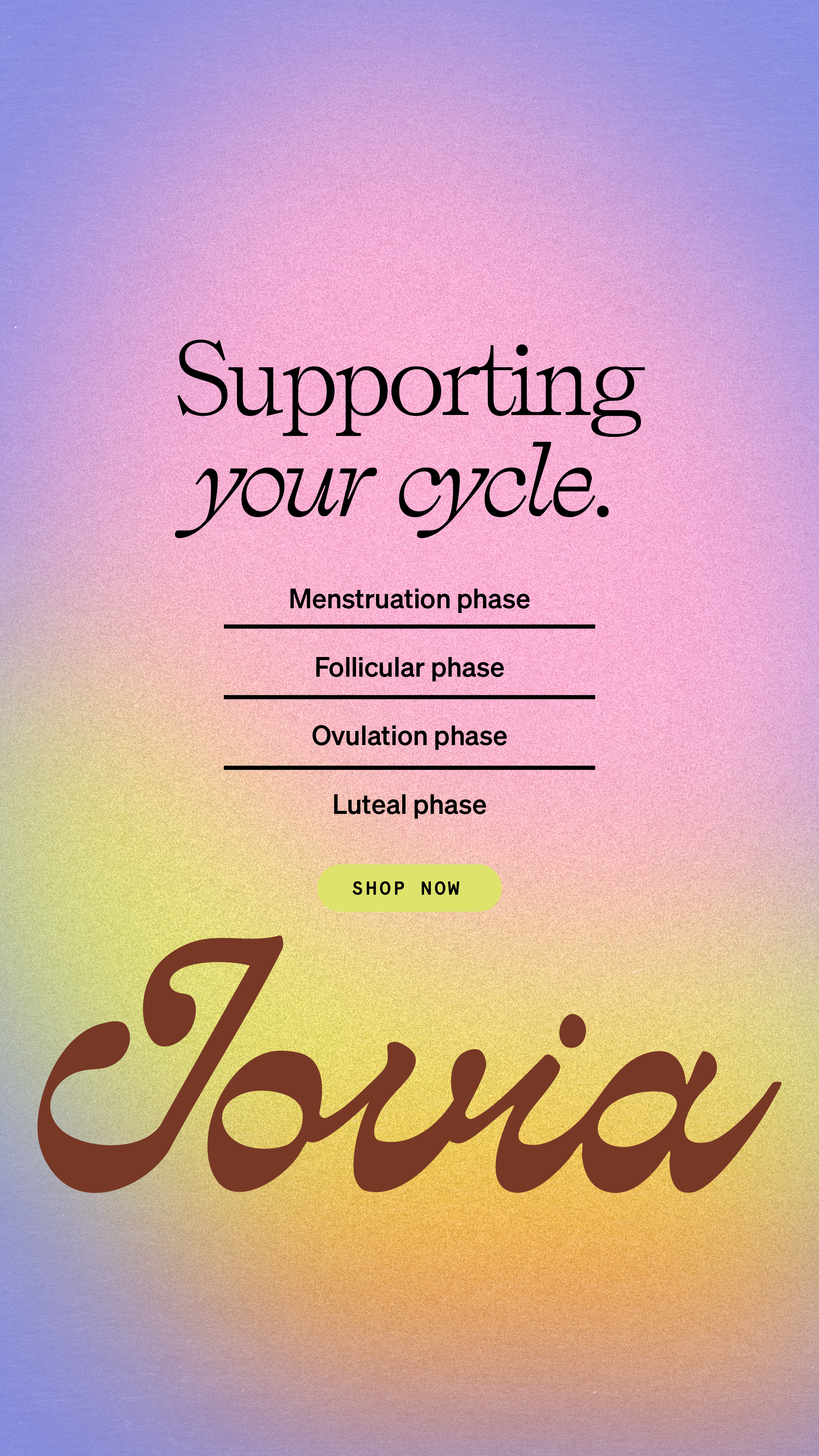
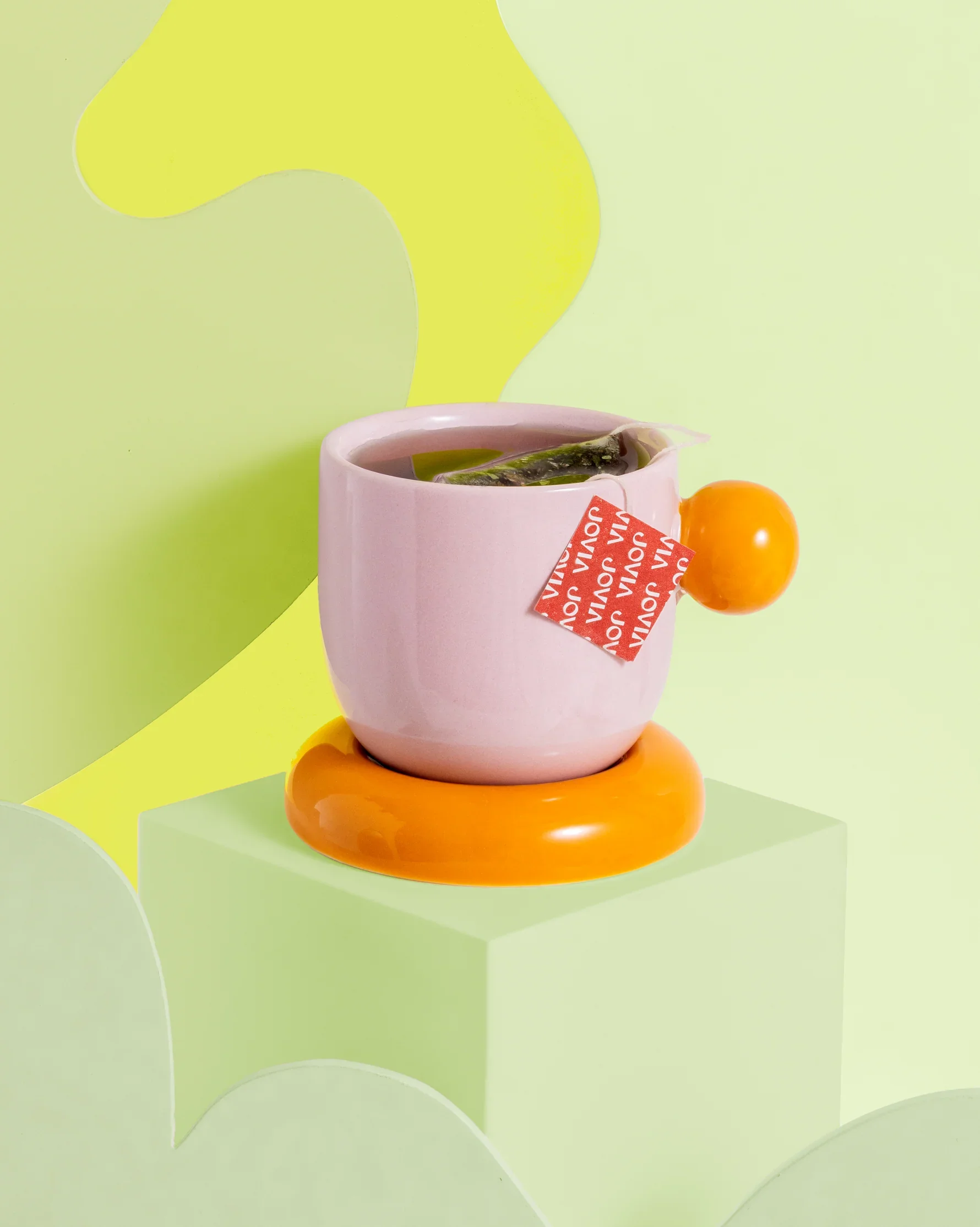
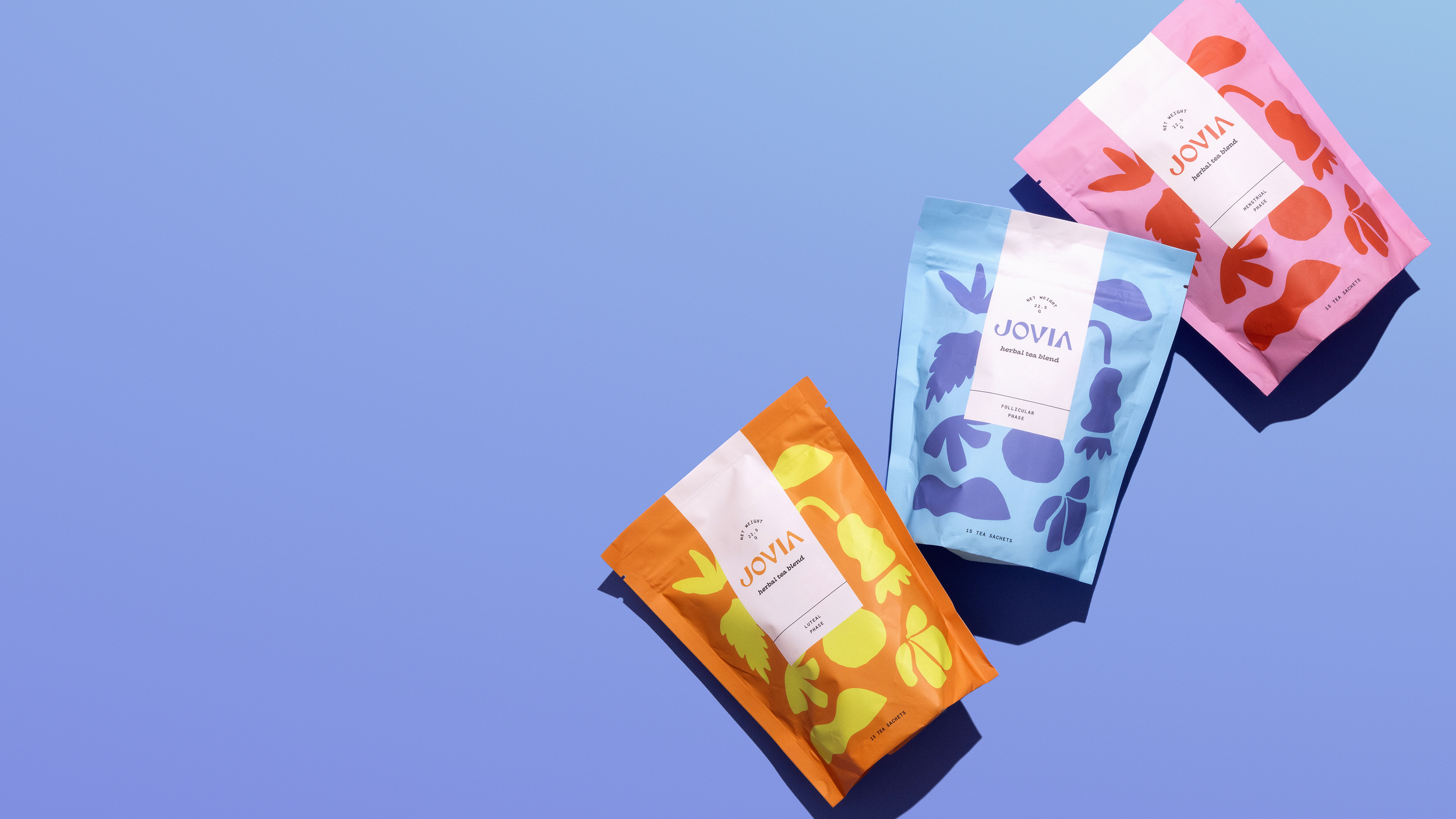
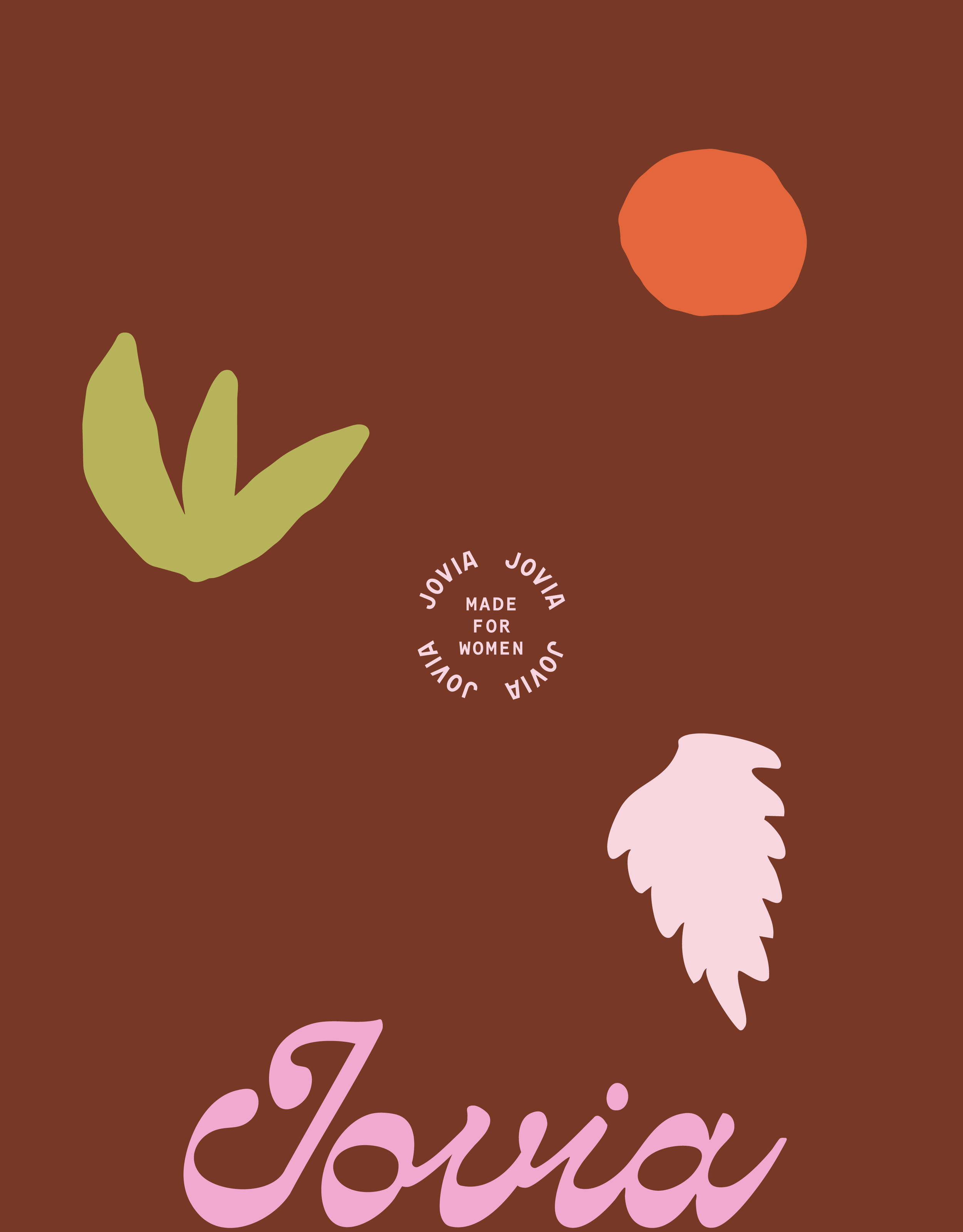
Jovia
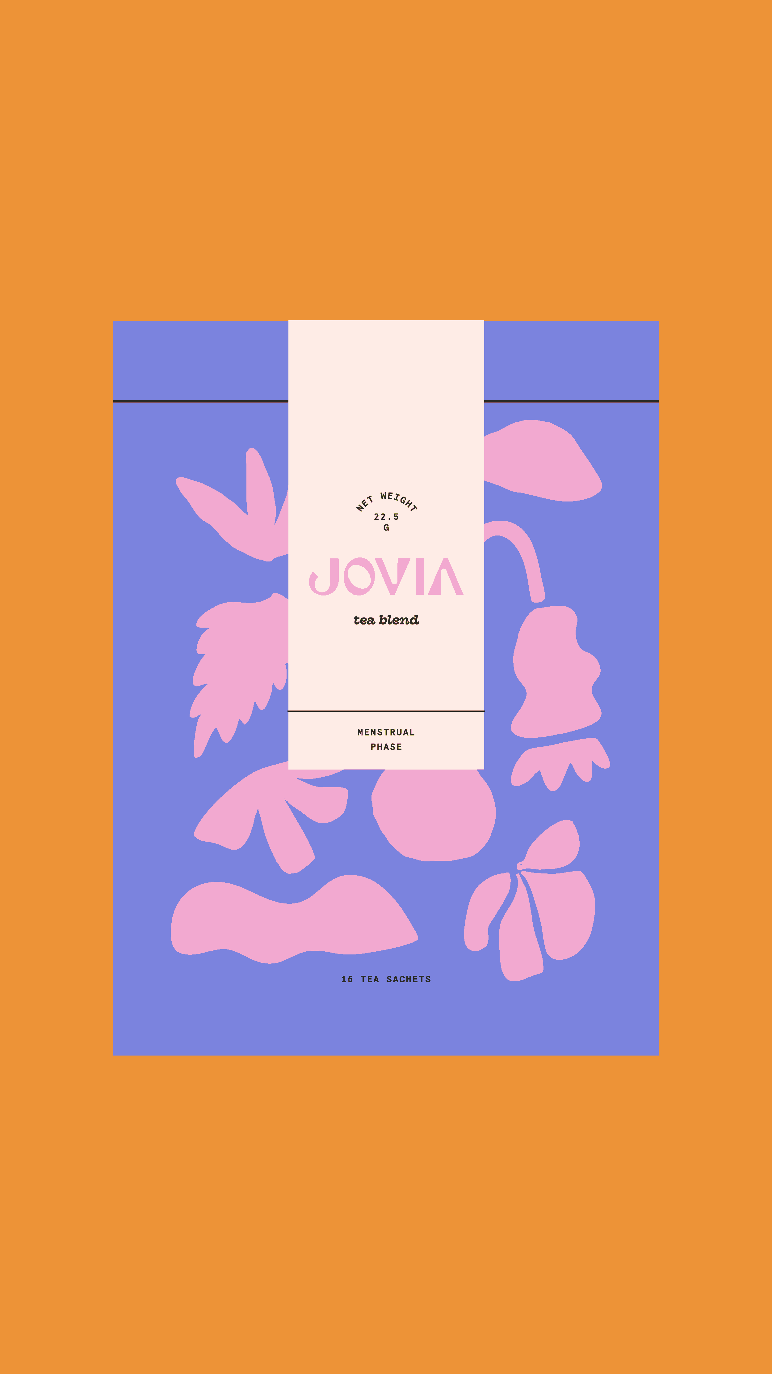
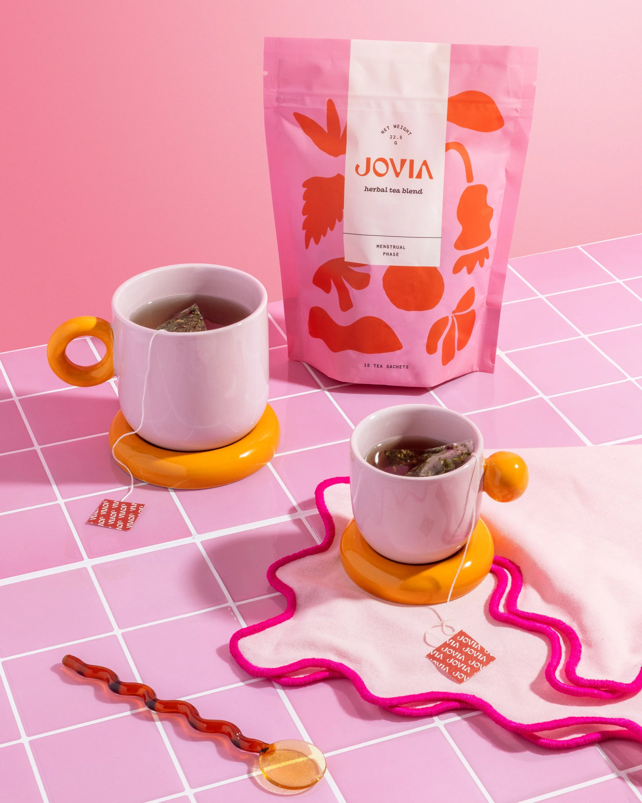
crafts dried tea blends designed to nurture and support women through their menstrual cycle
SCOPE: Branding, packagingfood+beverage
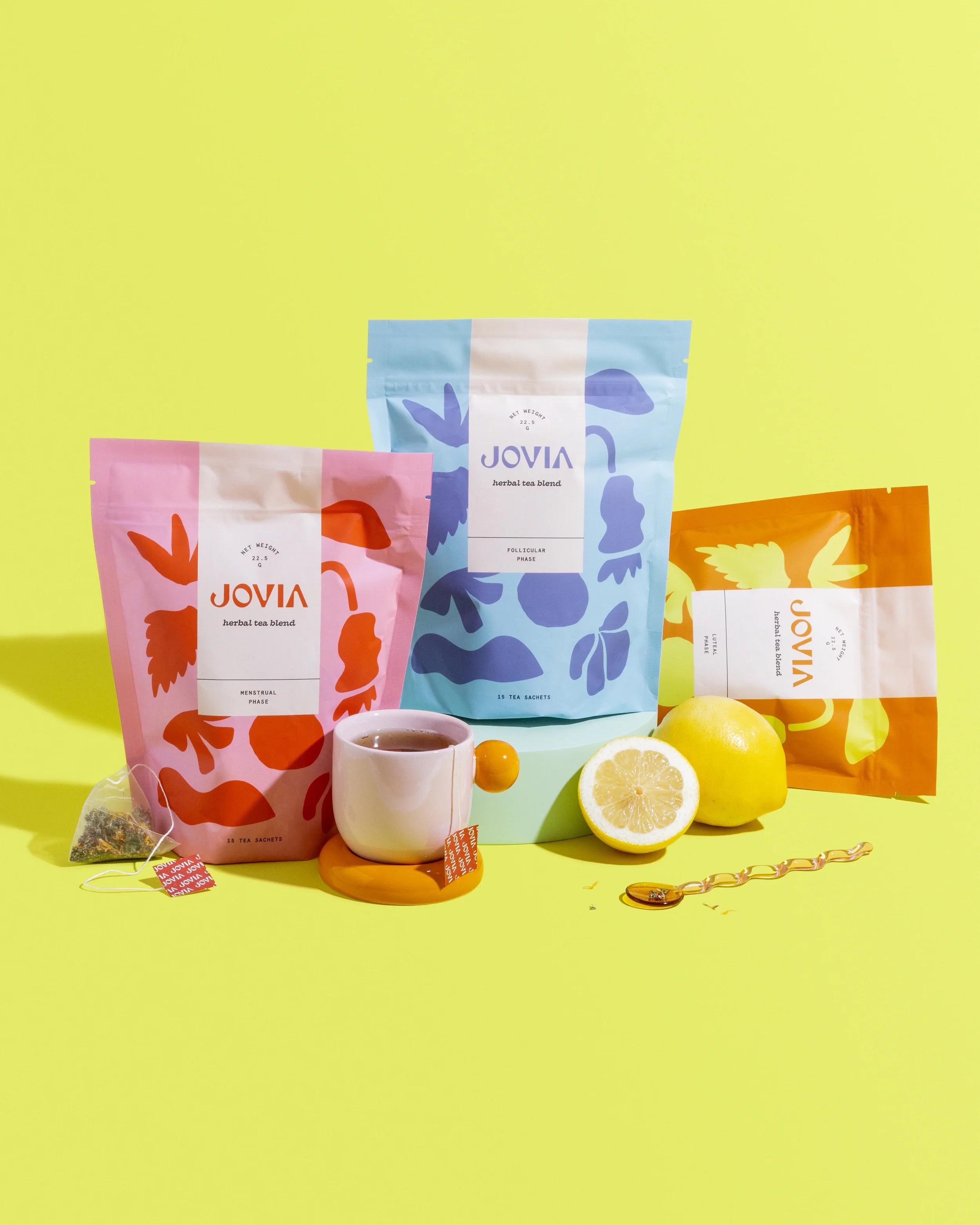
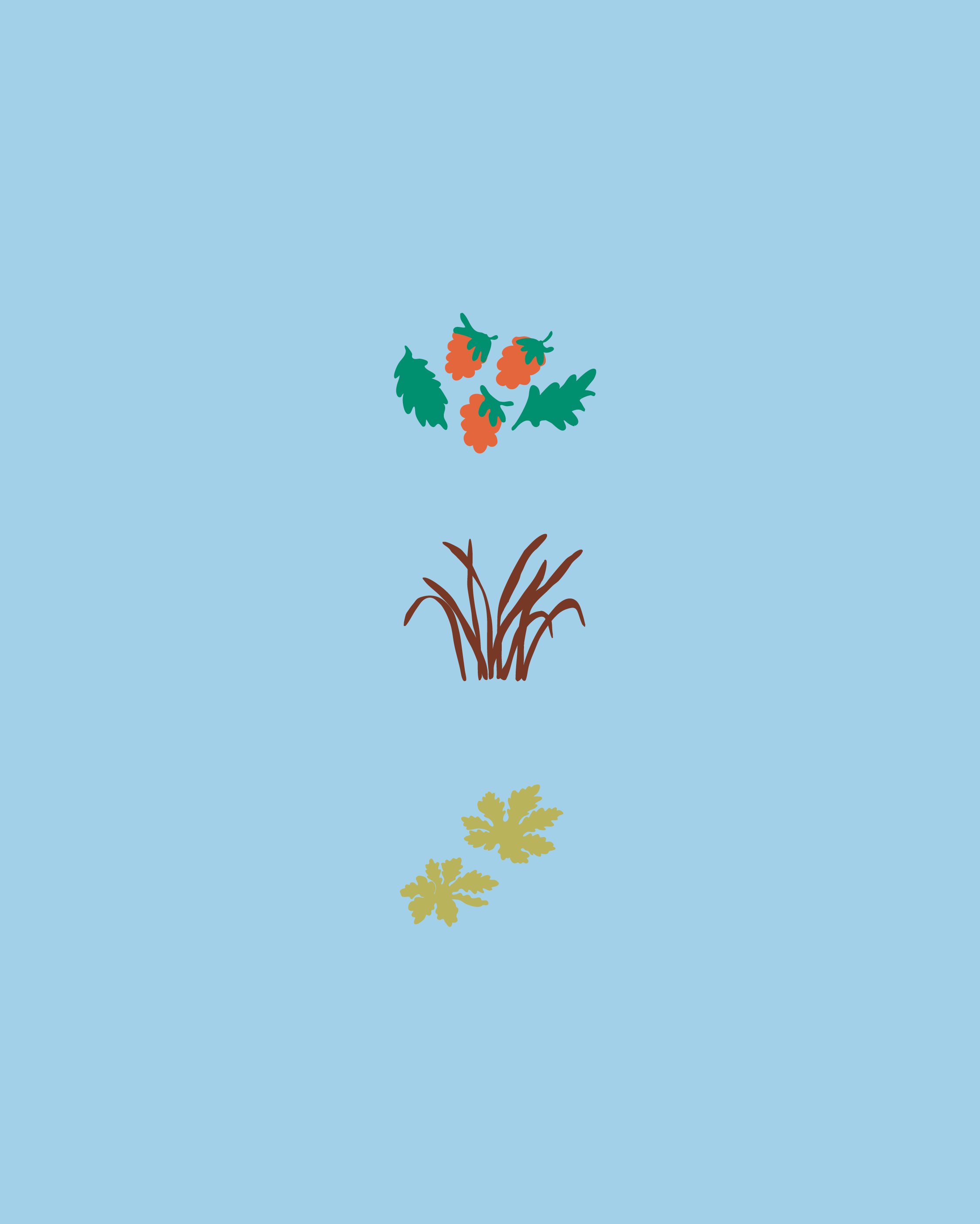

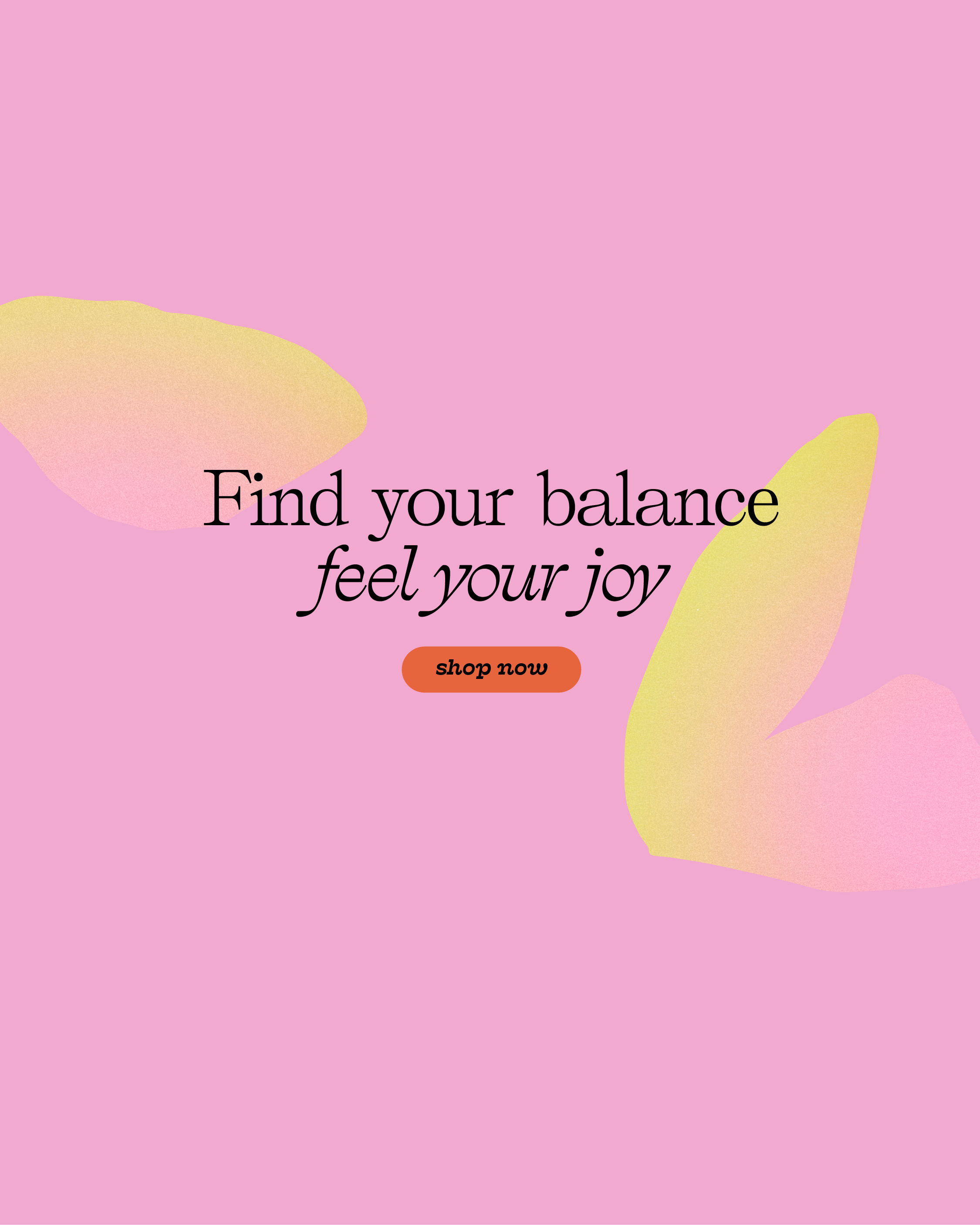
Using a bold, playful serif paired with a quirky script and clean sans-serif, we crafted a vibrant, approachable brand for Jovia. Hand-drawn abstract botanicals and a lively palette bring energy, warmth, and a holistic, empowering feel.
objective
Jovia is setting out to become a trusted, vibrant brand in women’s wellness — one that empowers women to naturally heal their hormones and embrace cycle care with confidence. With a playful, classic look and feel, the goal is to create a holistic branding experience that reflects vitality, ease, and authenticity while supporting every step from product creation to fulfillment.


-
Caitlin
OBSESSED!! I'm 100% convinced that you're going to see this packaging on the shelves of Target or Whole Foods someday! It's so darn good!
Related Work
-
![]()
Foam Coffee
food+beverage
-
![]()
Batch Balanced
food+bev
-
![]()
La Semilla
food+bev