a case study: the cove
6/3/26
recent work
a case study: the cove
a hidden gem, reimagined for its next chapter
The Cove didn’t start as The Cove. Former founder, Elise, and her sisters, Angela and Tina, originally came to us after we worked on Elise’s rebrand of From Juniper with Love. At the time, the plan was simple: Elysian Co. would function as a sub-brand of From Juniper. A sister extension, visually tied into From Juniper itself. Once we saw the inspo for the Elysian rebrand, it immediately became clear — this wasn’t a sub-brand at all. It was its own full experience and needed a complete brand identity to support it. Instead of forcing it to fit under another umbrella, we went back to Elise, Angela, and Tina with a different recommendation. If this boutique was stepping into a new season of growth, it deserved its own identity.
That conversation sparked something bigger. It prompted them to rethink the future of Elysian Co. from the ground up, and ultimately led to a name change that felt more aligned, intentional, and expansive. The Cove was born.
The struggle
Originally founded as Elysian Co., the boutique had grown from a blog celebrating fashion and family into a beloved shop in downtown Warsaw, Indiana. When Elise sold the business to Angela and Tina, the heart of the brand remained, but the vision started evolving.
Now, The Cove carries high-quality brands like Free People, Daydreamer, Billabong, Capri Blue, Paddywax, and Rifle Paper Co., yet it competes daily with customers opting for cheaper alternatives online — cough, cough, Amazon, we’re looking at you. Add in economic fluctuations, and the pressure to differentiate became even more important. Without a clear, defined identity and cohesive brand system, it was difficult for the brand to articulate what truly set them apart: experience, curation, and community.
The goal
We set out to create a brand identity that felt like a destination. Something modern, coastal, and effortlessly laidback, while still feeling grounded enough to grow with the business long-term. Our role was to build more than a logo (hi, are you new here!? Always, always, always more than just a logo). We developed a full brand identity that would position The Cove as a hidden gem in downtown Warsaw. Distinct from big-box competitors, elevated from online alternatives, and deeply rooted in the in-person experience.
The identity needed to feel feminine without leaning too delicate, playful without losing sophistication, and timeless enough to remain relevant for years to come. Most importantly, it had to create cohesion across the in-store experience, social content, seasonal launches, and future online growth. No biggie.
The solution
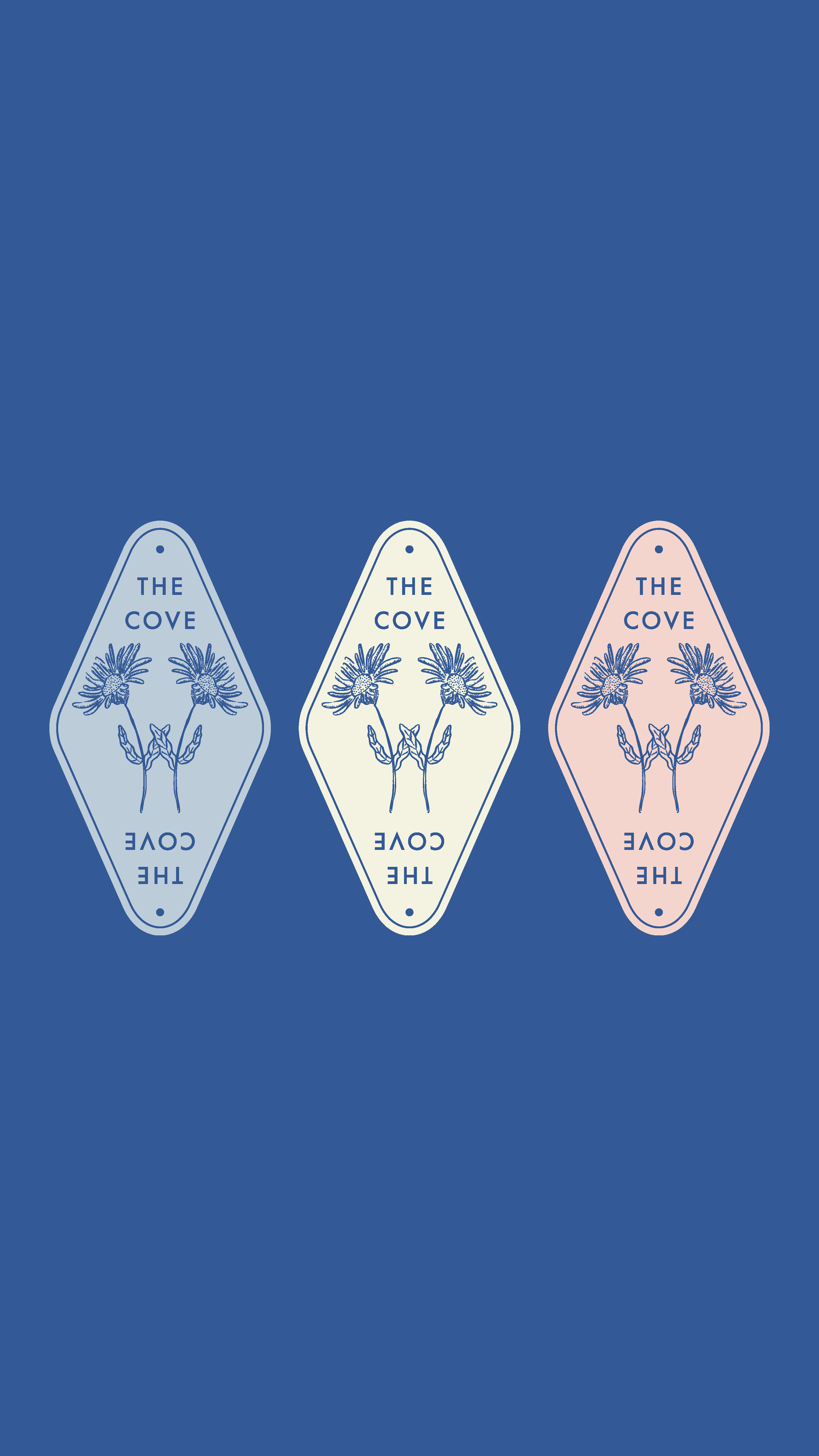
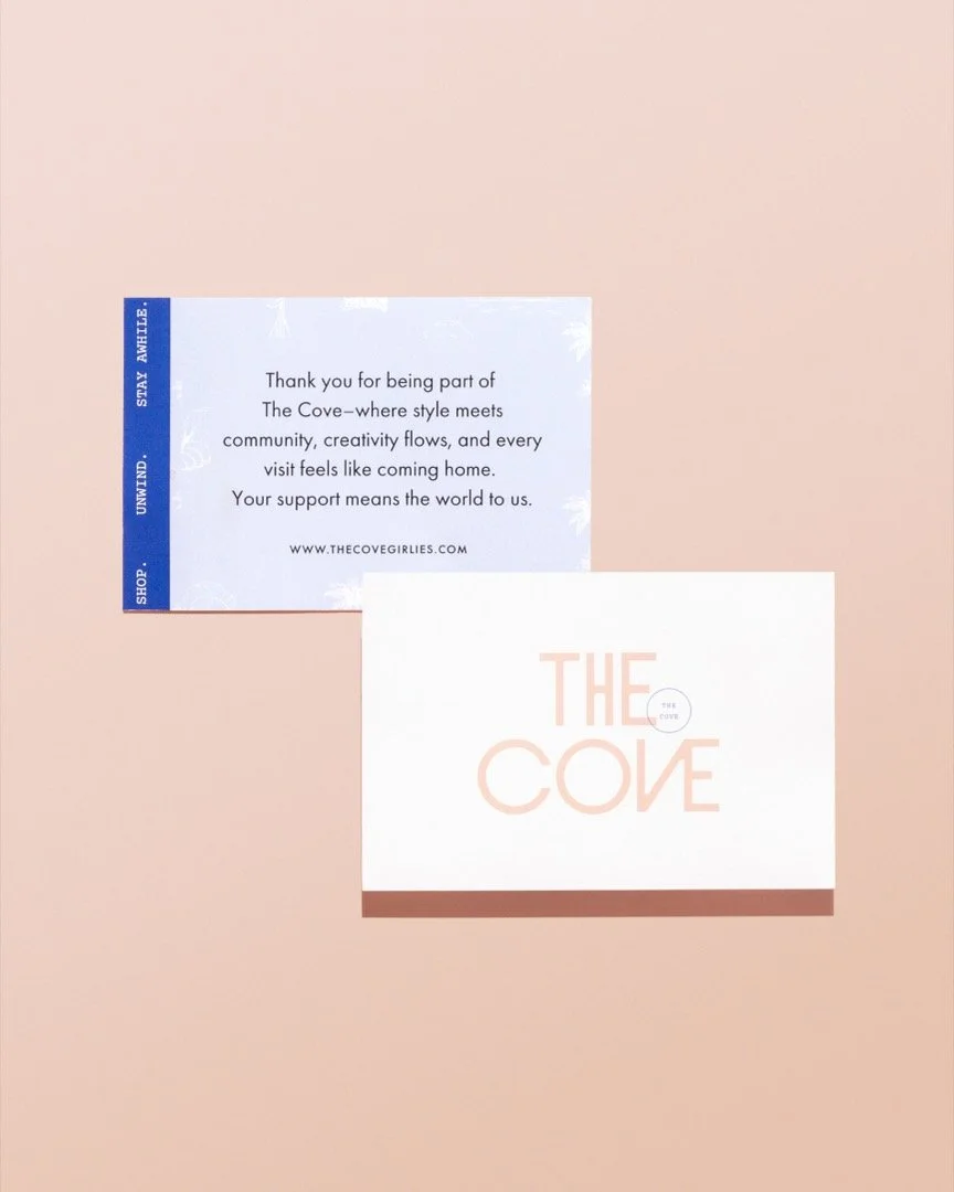
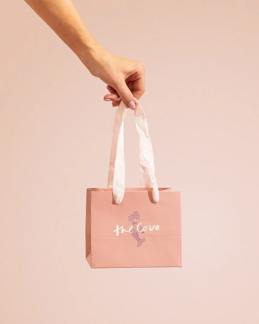
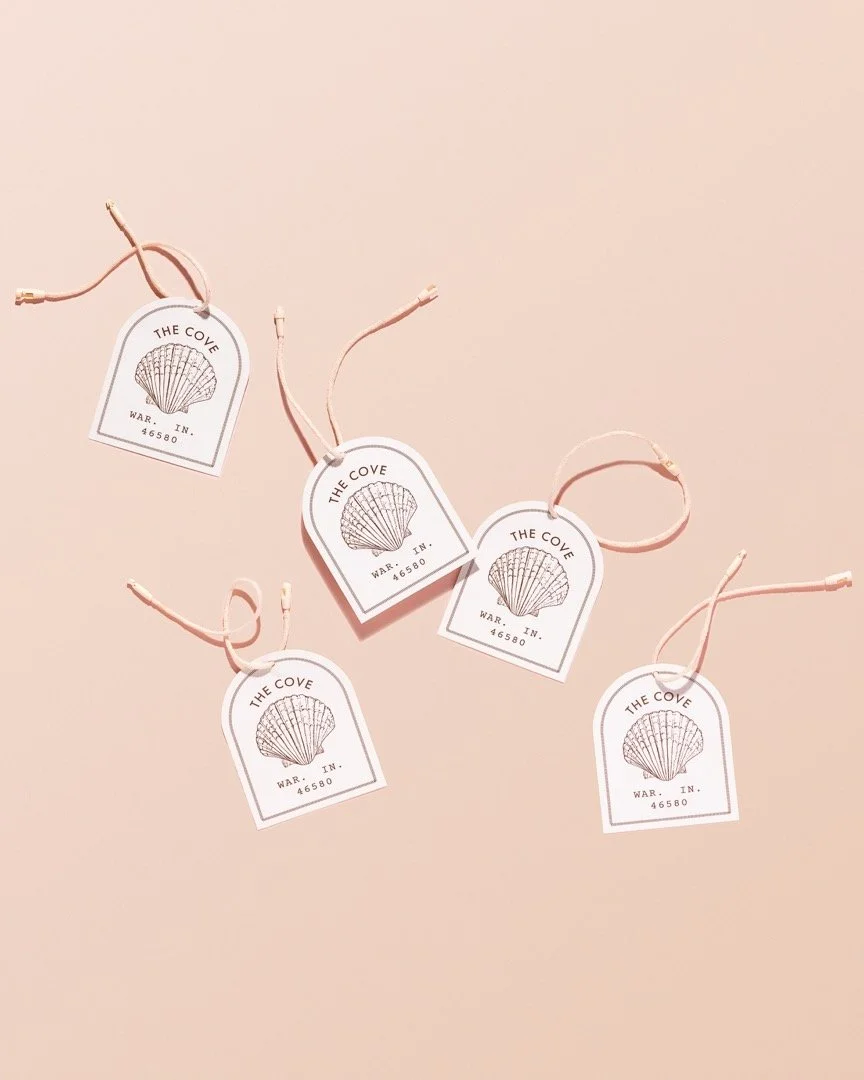
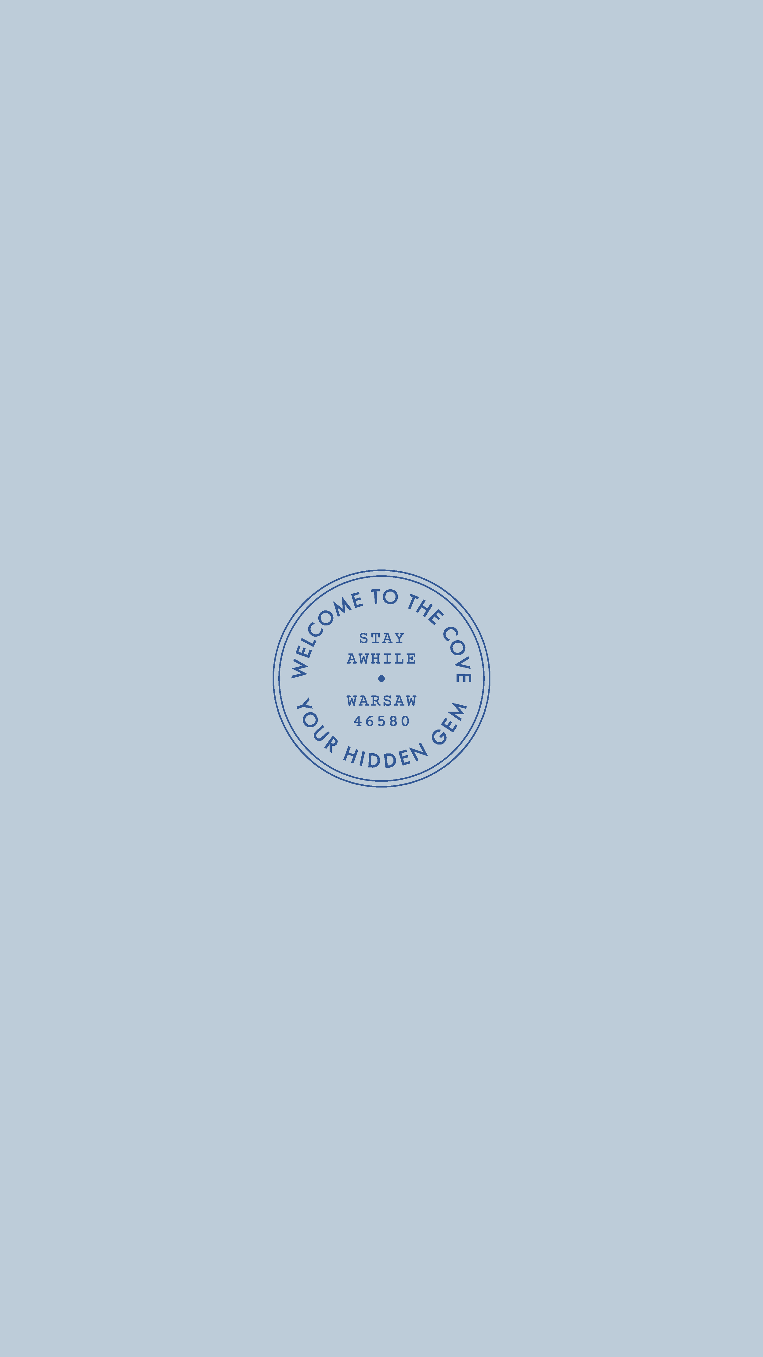
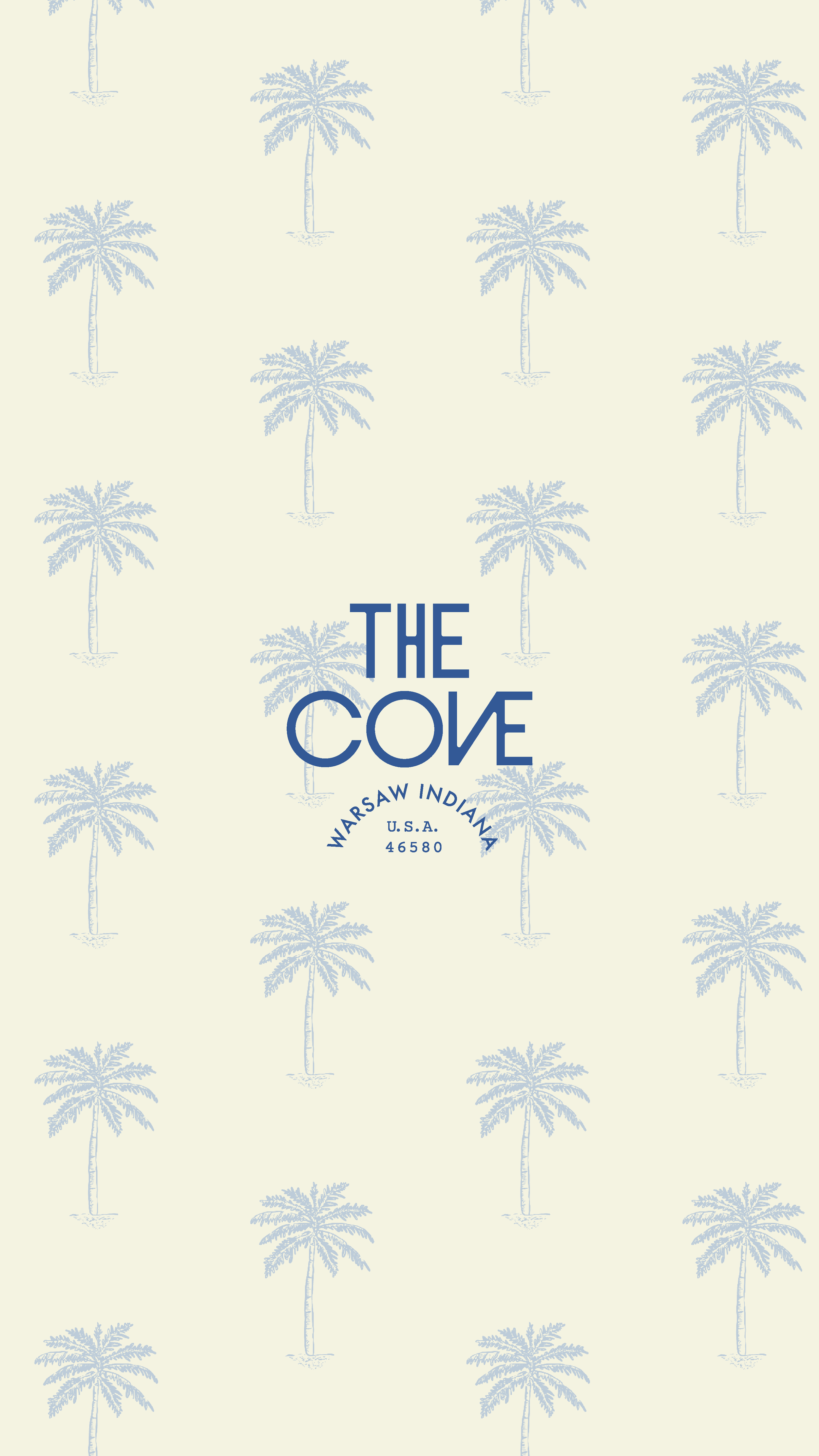
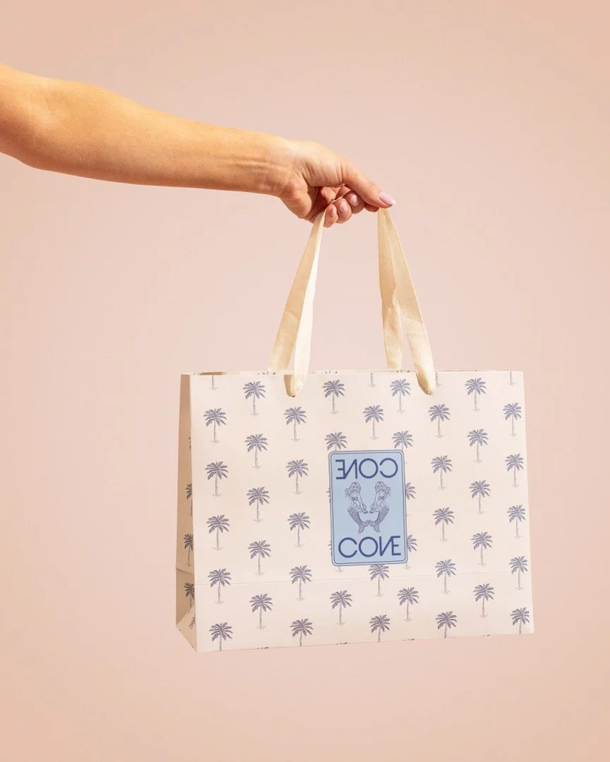
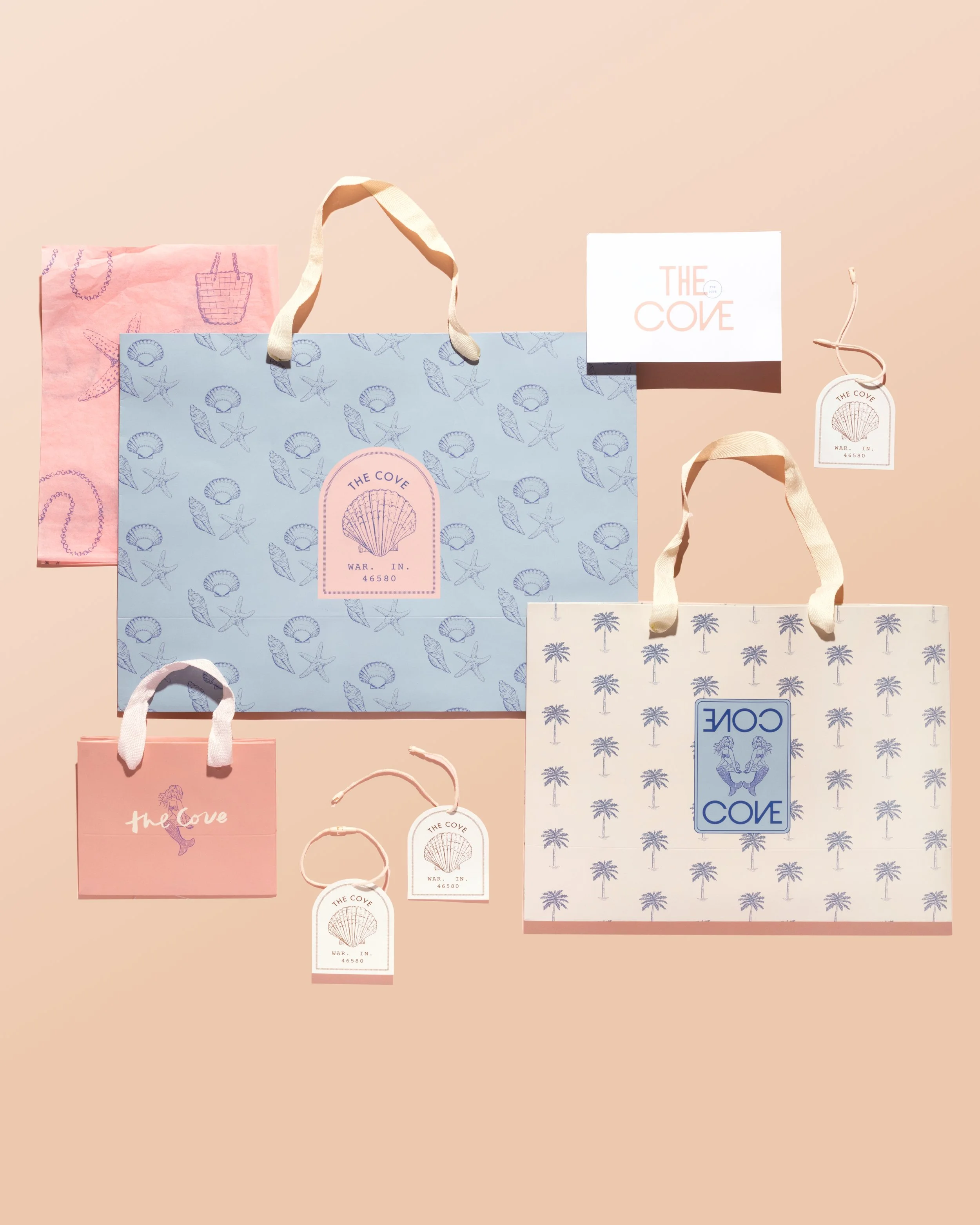
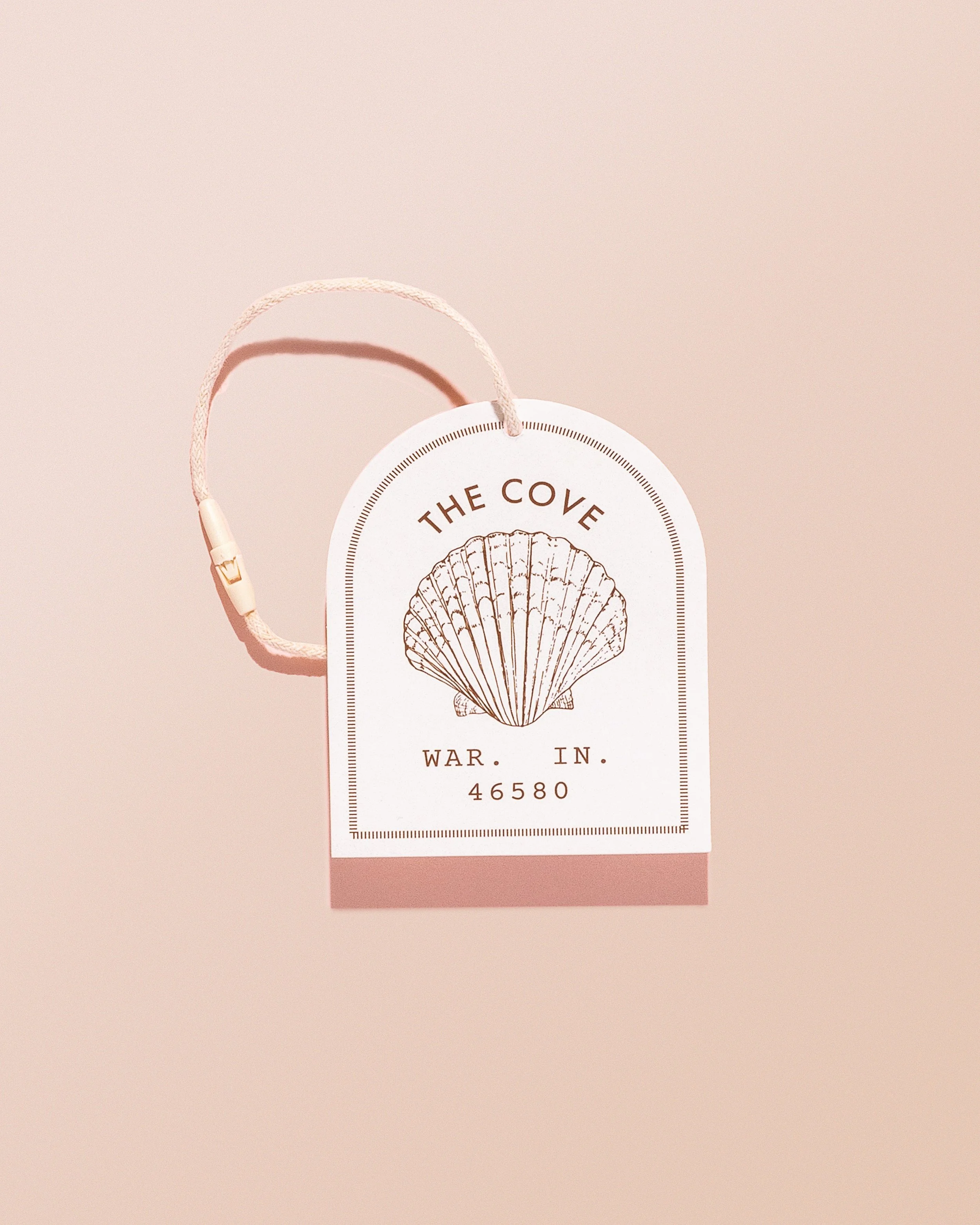
We began by anchoring the brand in typography that felt both modern and inviting. A custom sans-serif became the foundation. It was clean and structured, yet softened with organic curves and customization. We created a primary logo that strikes a balance between polished and playful, reinforcing The Cove as a thoughtfully curated space rather than just another boutique.
To introduce warmth and personality, we paired it with a complementary script brand mark. The contrast added a layer of femininity and ease, echoing the relaxed, coastal tone of the brand without leaning too thematic.
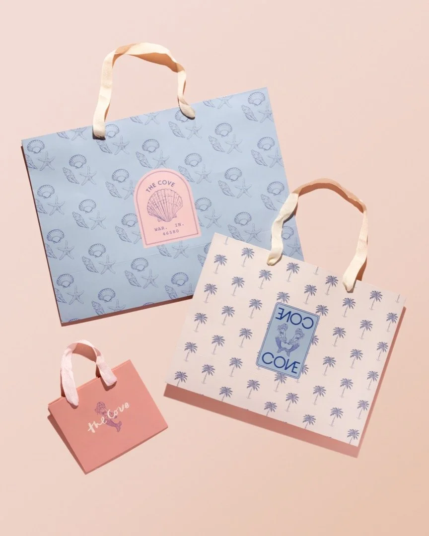
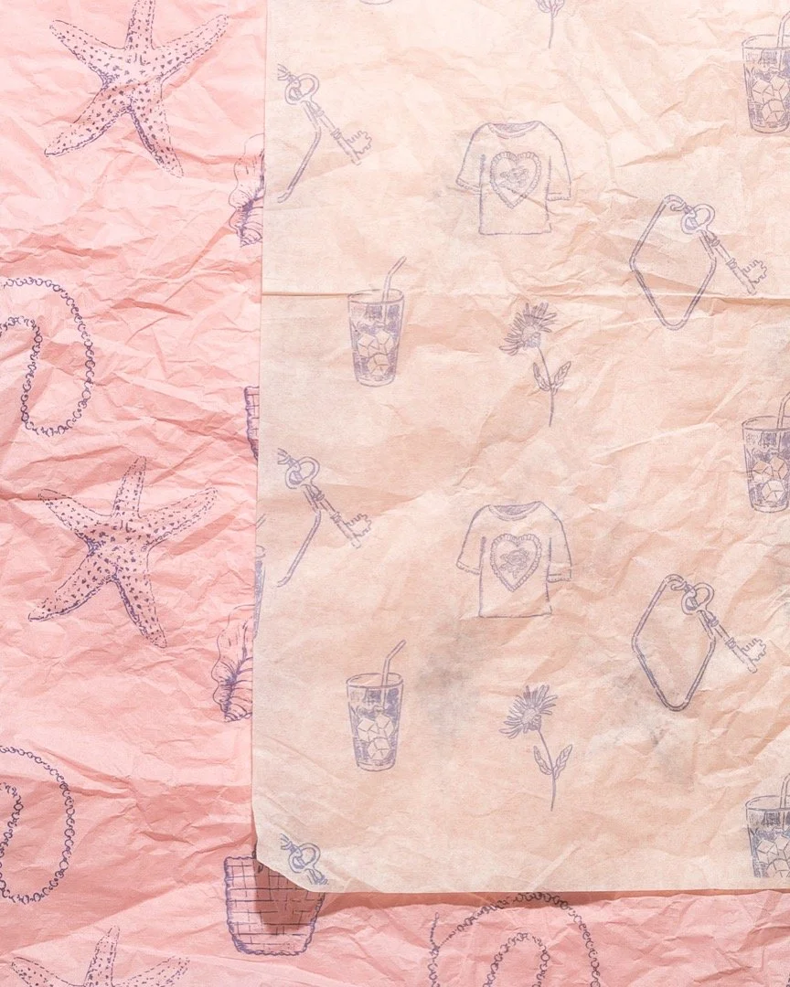
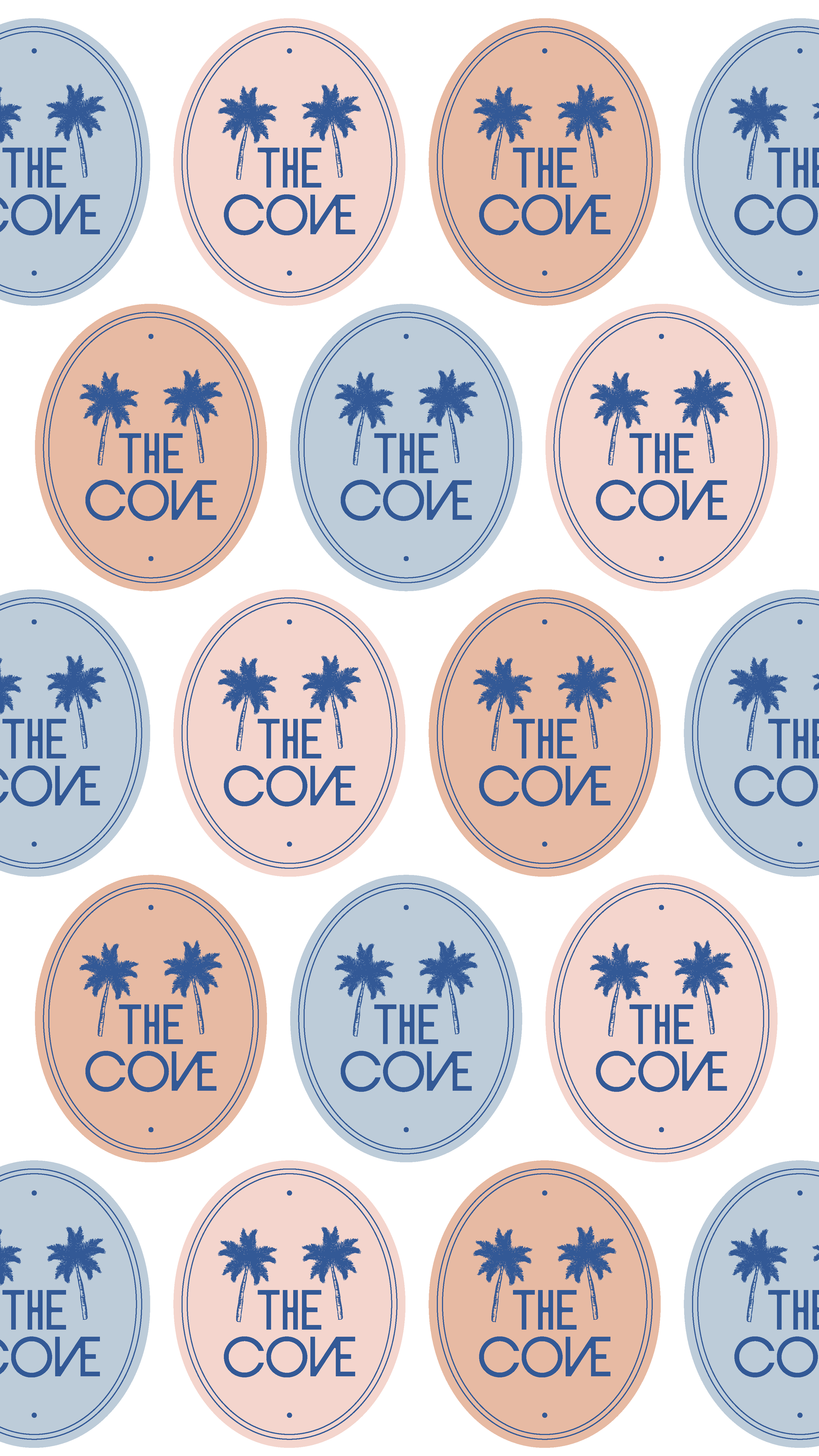
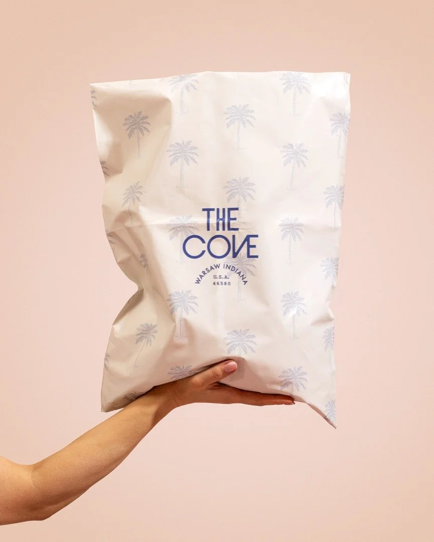
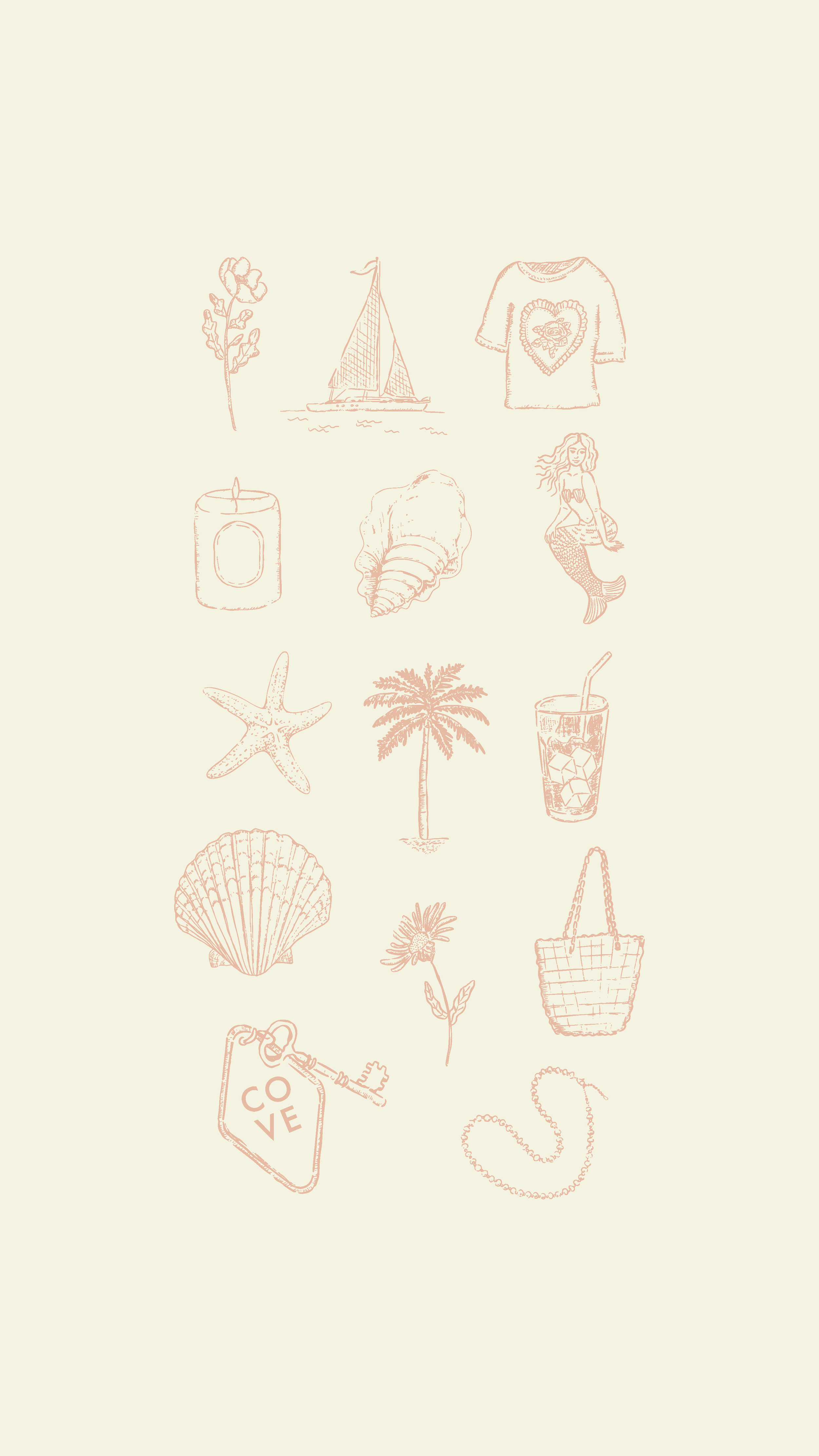
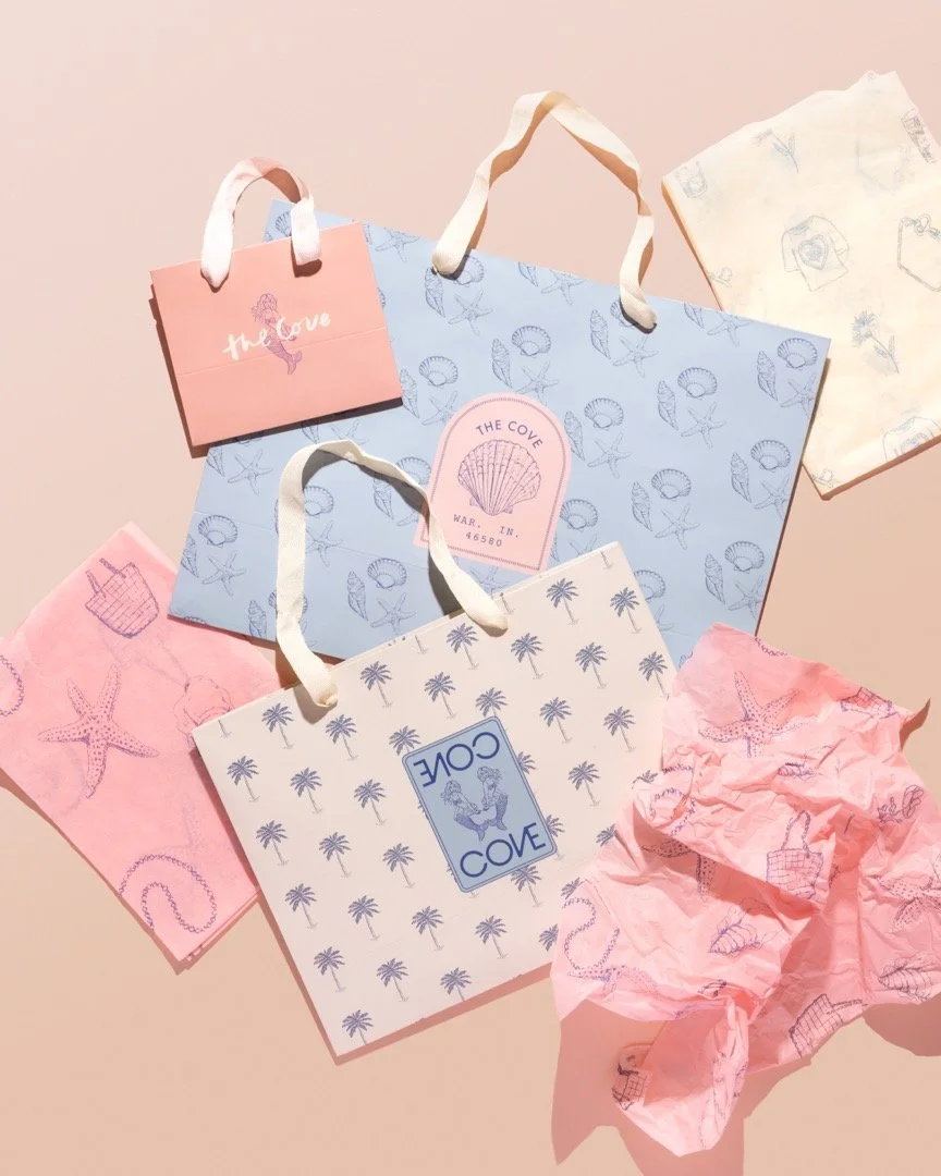
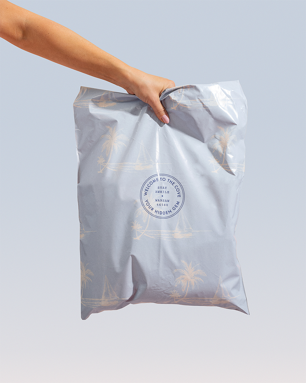
From there, we wanted to create something that would truly set The Cove apart. A suite of detailed, hand-drawn illustrations. Rather than relying on generic coastal motifs, we created intricate artwork that feels slightly vintage and really speaks to both the vibe of The Cove and what the shop itself carries. Think seashells, iced coffee, jewelry, and clothing elements. The result was visuals that not only reflected the products themselves, but also spoke to the feeling of wandering through the shop.
The illustrations weren’t designed as one-off accents. They were built to live within the brand system as a whole. We transformed them into repeating patterns reminiscent of boutique hotel wallpaper, creating an immersive effect that made the brand feel layered.
To ground everything, we used a versatile color palette rooted in classic blues. We added soft, muted pinks and warm neutrals to bring balance and depth, while slightly desaturated tones ensured the branding complemented the merchandise The Cove sold rather than competing with it. The result is a cohesive, flexible identity that feels coastal without being cliche, feminine without leaning fragile, and distinct enough to stand out confidently in both a small downtown storefront and a growing online presence.
The results